Marcel SaidovOffice for Type Design, Typography and Research
Granjon’s Italics of 1554
Marcel Saidov
  1. [01]

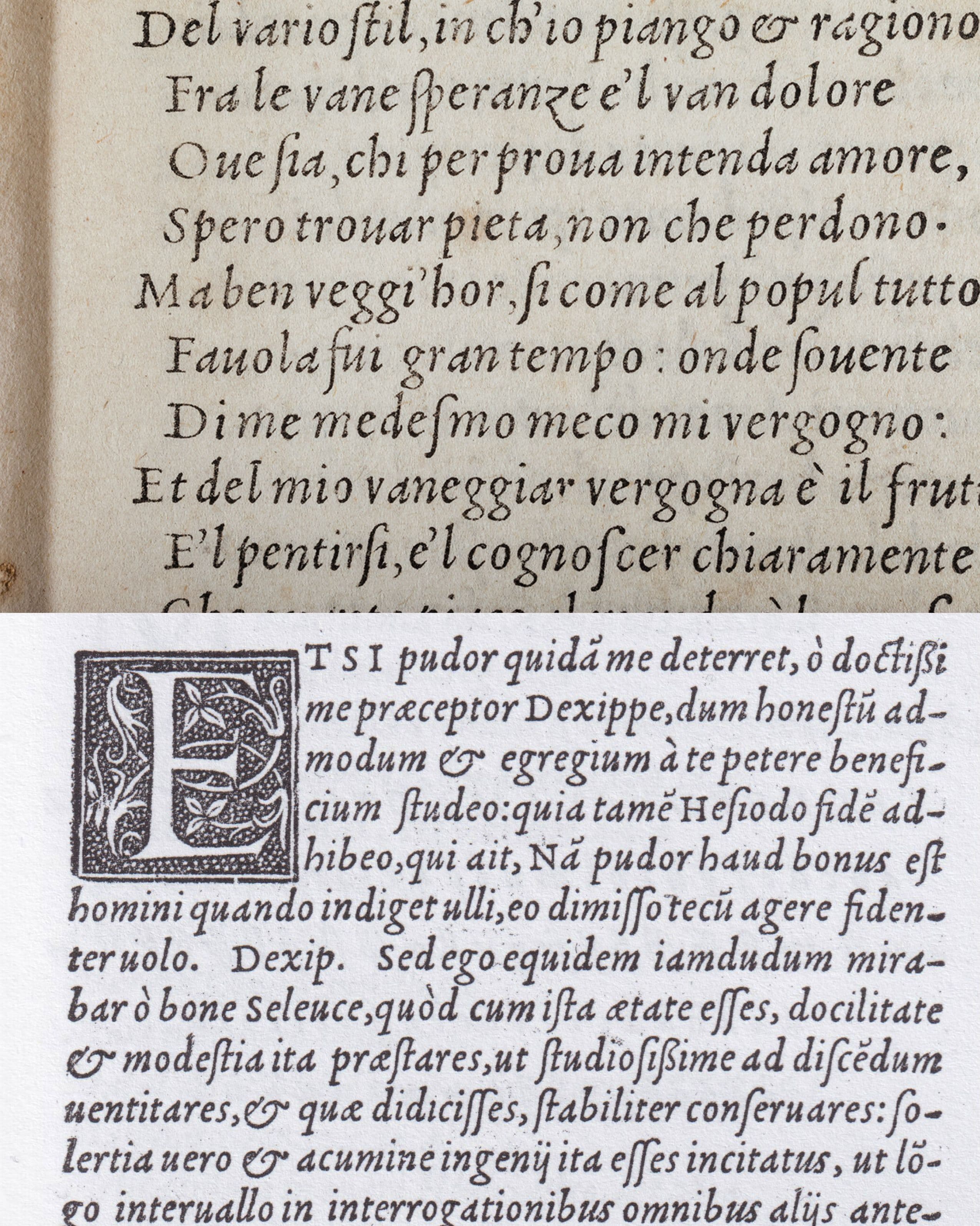
    To understand the significance of Robert Granjon’s Paragon Italic of 1554, it is first necessary to look briefly at the model from which sixteenth-century Italic developed. Around 1500, Italic type emerged from the contemporary handwritten forms of Renaissance humanists and chancery writing. The first Aldine Italic, cut by Francesco Griffo for Aldus Manutius, translated this narrow, right-inclined and highly cursive writing style into type. The compact forms were particularly suited to Aldus’s small-format editions and quickly established Italic as an important typographic form. The characteristic feature of this early Aldine Italic was therefore not simply its inclination, but its close relationship to handwriting: narrow proportions, a strong forward movement and a compact texture. Its forms translated the speed and continuity of chancery writing into the more repetitive and stable conditions of metal type.This model remained highly influential during the first decades of the sixteenth century. At the same time, Italic was gradually transformed as different punchcutters adapted its forms to new typographic contexts. It was no longer simply a transcription of a handwritten model, but became an increasingly independent system of type design.

  2. [02]

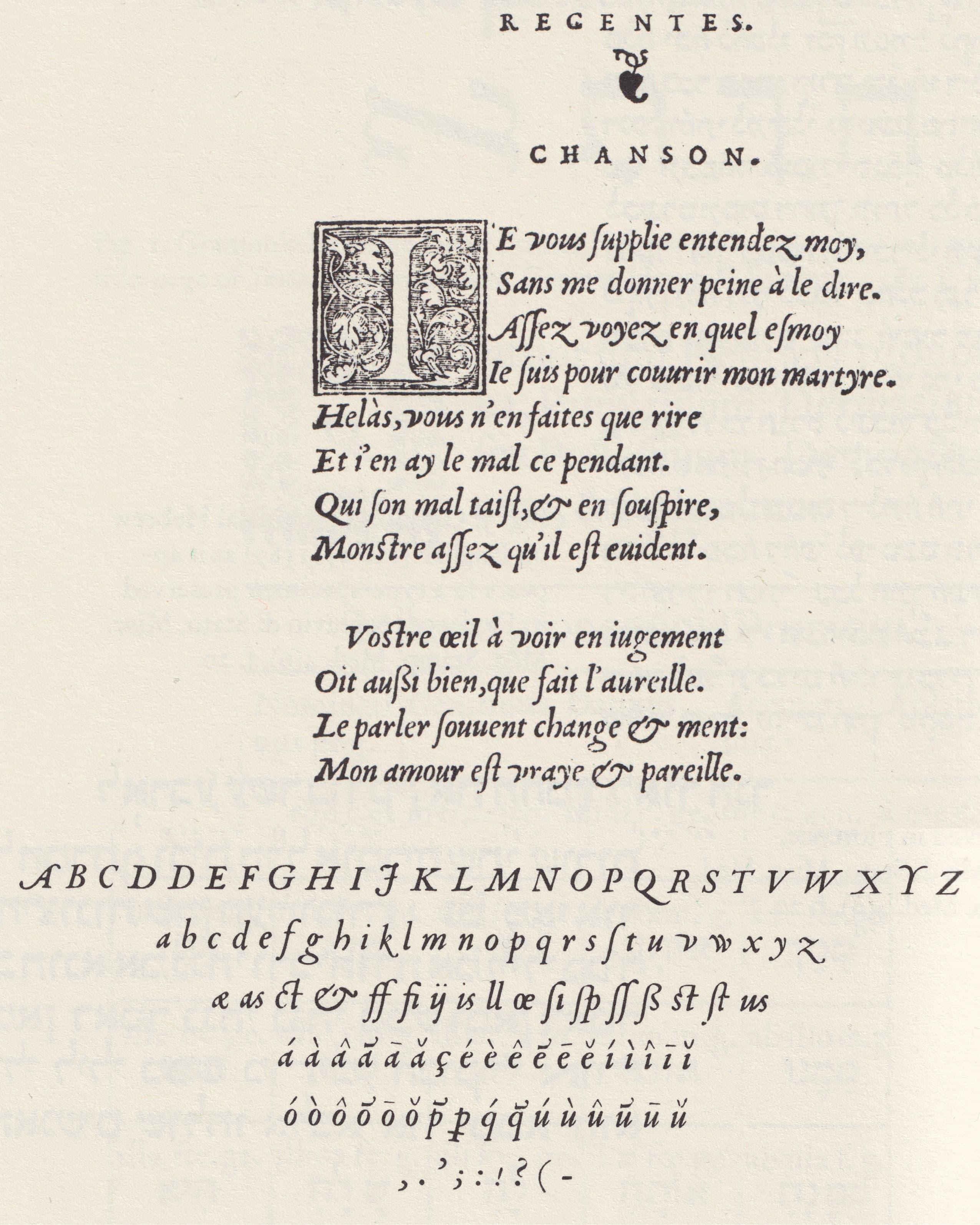
    Granjon’s earliest Italics belong to this period of transformation. His first English-sized Italic appeared in 1543, followed by further Italics in 1545, 1546, 1547 and 1548. Vervliet groups these designs as Granjon’s Early Style, describing the Italics of the 1540s as „more or less hesitant and experimental designs.“Rather than representing a sudden break with the Aldine tradition, these early designs can therefore be understood as part of Granjon’s gradual development of a new approach to Italic. The decisive change becomes visible in the treatment of inclination, particularly in the capitals. Vervliet argues that Granjon successfully established a balanced inclination of the capitals and that the optical harmony of this slope became a defining characteristic of his early Italics. Although he was not necessarily the first to use inclined capitals, he popularized them in a form that remained influential for later Old-face Italics.

  3. [03]

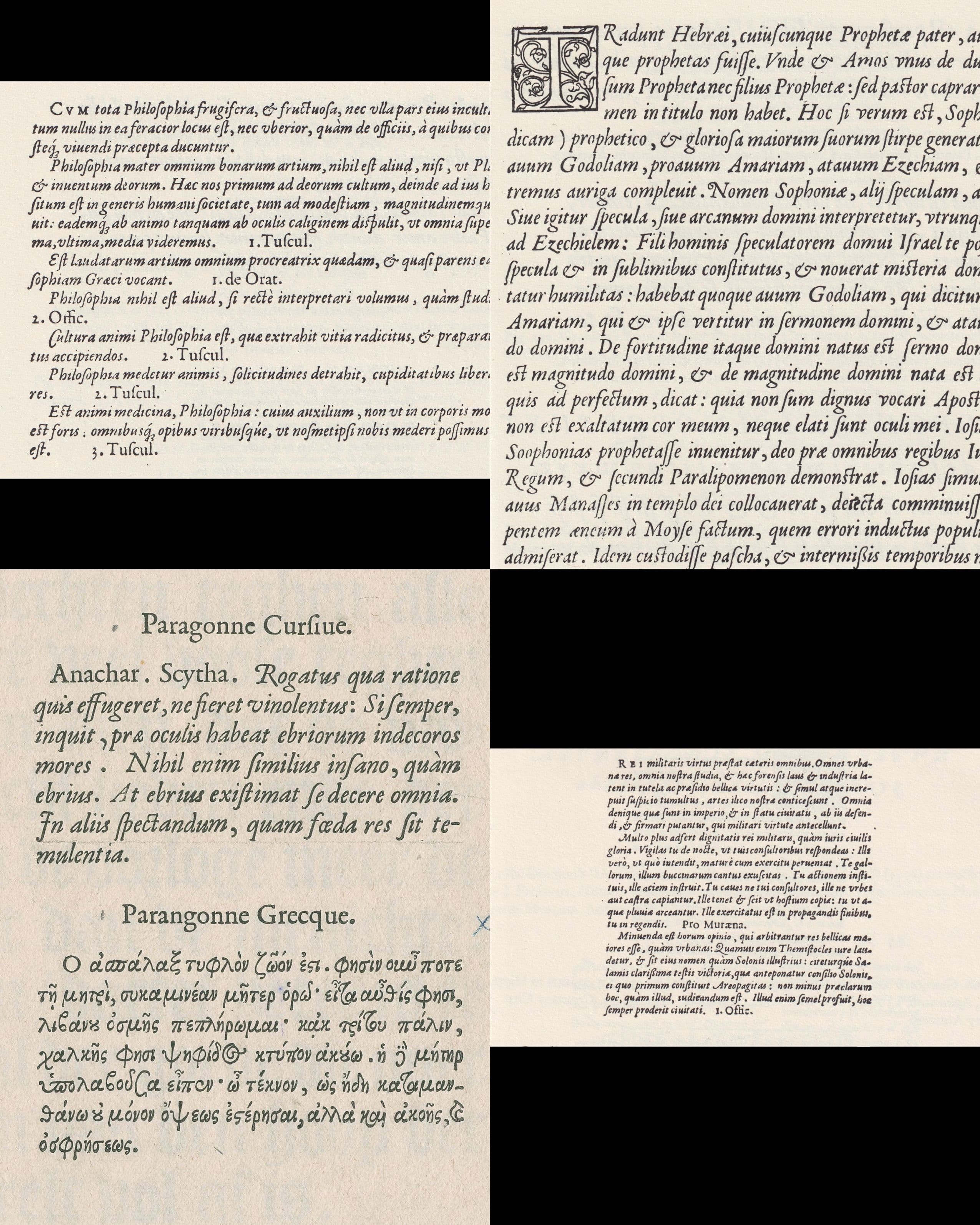
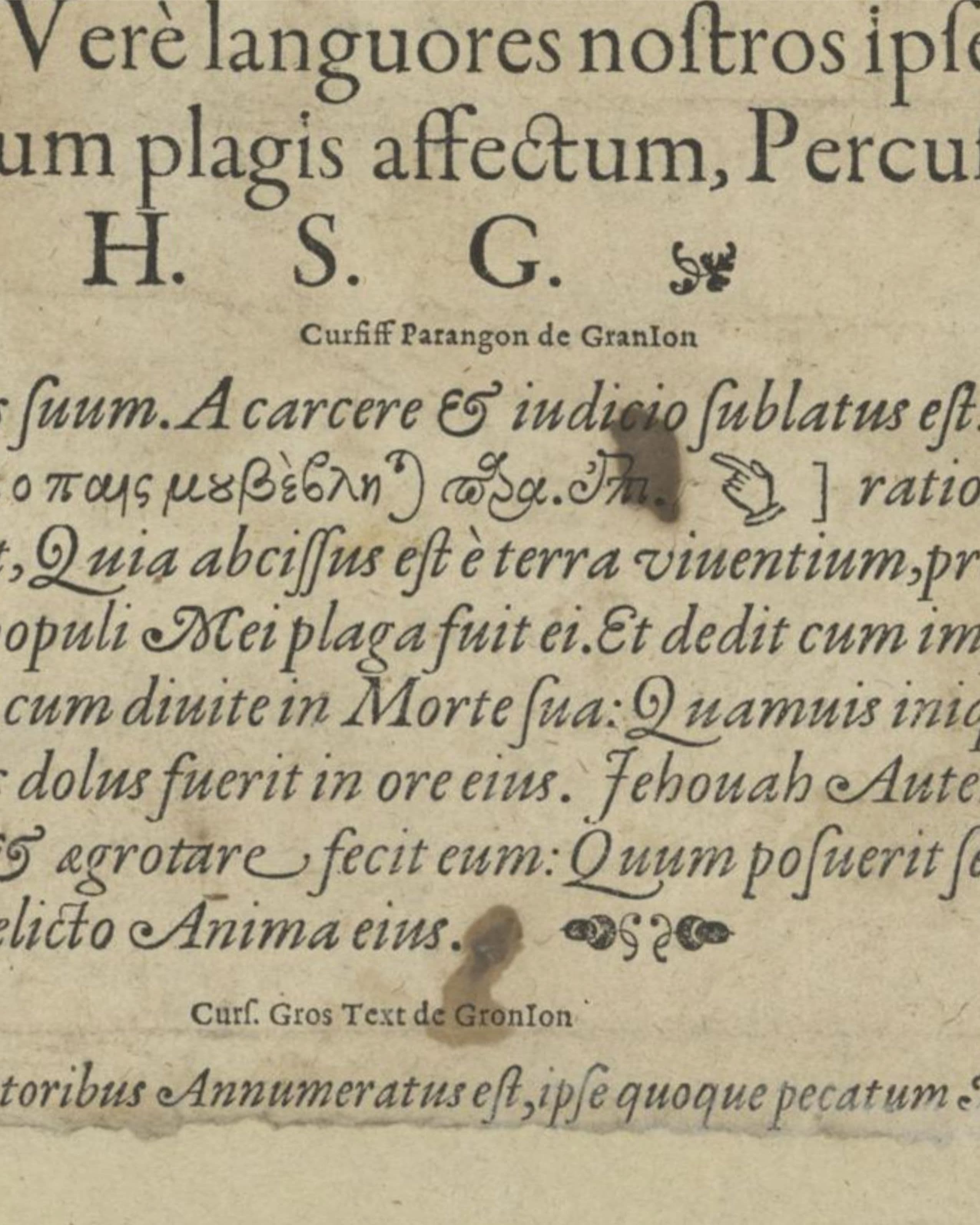
    By 1551, Granjon had entered what Vervliet identifies as his mature period. From 1551 to the middle of the 1560s, his Italics form the „mature“ „couché“ or inclined style, which Vervliet describes as becoming a model for subsequent Old-face Italics.This makes 1554 a particularly revealing moment. Four of Granjon’s Italics are recorded for this year: the Second Pica Italic, the Third Great Primer Italic, the Paragon Italic and the First Brevier Italic.

  4. [04]

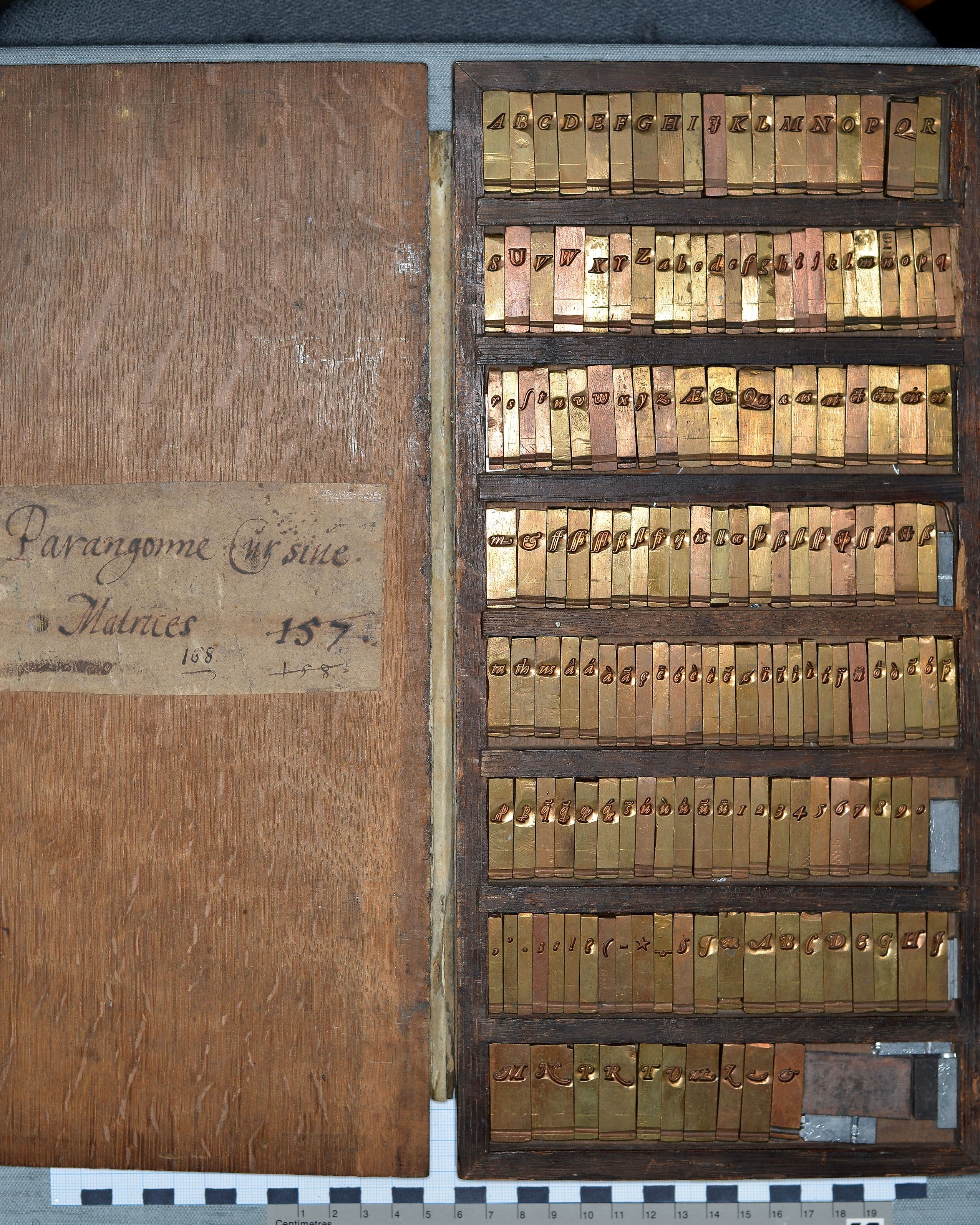
    The Paragon Italic first appeared in Lyon in 1554 in François Duarenus’s Commentarius, printed by Guillaume Rouillé. Vervliet attributes the type to Granjon on the basis of documentary and material evidence, including surviving matrices.Granjon’s significance, however, extends beyond the individual cutting of typefaces. Unlike many contemporary punchcutters who worked primarily on commission for printers or typefoundries, Granjon, quite exceptionally for the period, sold sets of matrices of his typefaces across Europe. Vervliet describes this as „quite exceptionally in the history of pre-industrial printing.“The surviving matrices of the Paragon Italic provide a particularly clear example of this practice. At the Museum Plantin-Moretus are a set of 163 matrices for Granjon’s Parangonne Cursive preserved. The earliest known use is Lyon, Guillaume Rouillé, in 1554, while Plantin began using the type in 1564.The importance of this practice was that matrices allowed printers and typefounders to cast new sorts themselves. Granjon’s designs could therefore circulate independently of their original place of production. Vervliet notes that French types by Granjon, Garamond and others, cast from different sets of matrices that had reached Antwerp, Venice, Rome, Frankfurt am Main, Amsterdam and London, can be found in books printed across a large part of Europe during the following two centuries.

  5. [05]

    Vervliet’s classification gives a useful name to the development described above. He divides Granjon’s Italics into four stylistic periods: an Early Style in the 1540s; a mature „couché“ or inclined style from 1551 to the middle of the 1560s; a later „droite“ style; and finally the „Baroque“ Italics of the 1570s. The term couché is particularly interesting because it can literally be under-stood as „lying“ or „laid down.“ In Vervliet’s classification, it refers to the pronounced inclination of Granjon’s mature and more calligraphic Italics.At first, the answer might seem obvious: the letters are inclined. But Granjon’s Paragon suggests a more complex relationship between inclination and movement. Their individual strokes, weight distribution and counterforms con-tribute to the sensation of leaning in different ways. The couché therefore might describe not only an angle, but a visual condition of movement.

  6. [06]

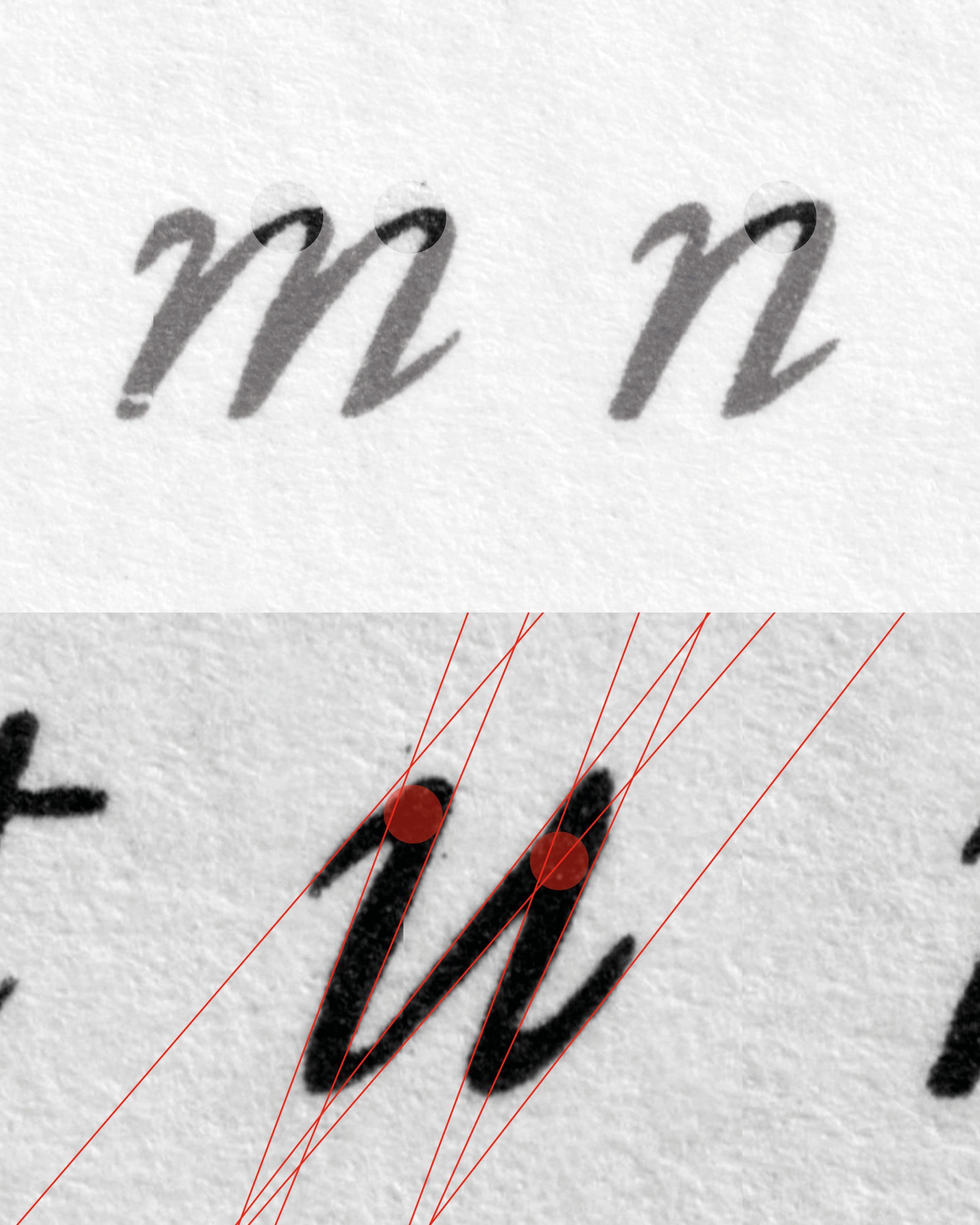
    Granjon creates dynamism not through one uniform angle, but through the optical negotiation of different angles. Some letters appear to contain more than one directional tendency. The entrance and exit strokes can suggest different movements from the main construction of the letter, creating the impression that the writing hand changes direction while continuing forward.
    This becomes particularly interesting when comparing different characters. Rather than under-standing the Italic simply as a set of uniformly slanted forms, it is more useful to consider each character as a gesture. The inclination is therefore not only a geometric property but something produced through the relationship between strokes.

  7. [07]

    Vervliet’s emphasis on the optical harmony of Granjon’s inclination provides a historical point of reference for this observation. His description suggests that the coherence of the Italic should be understood in terms of visual balance rather than simply identical geometric construction.

  8. [08]

    The distribution of weight reinforces this sense of movement. In several letters, the thinnest areas do not simply correspond to a predictable junction placement between stem and shoulder. Instead, weight can become particularly delicate at transitions of directions and to imply the contrast angle.

  9. [09]

    This produces what I would describe as an intermediate weight: the stroke does not appear to be constructed from a rigid opposition between thick and thin, but from a continuous movement that implies the presence of a writing instrument. However, Granjon does not view the shapes of his italics as belonging to the standard shape groups. He creates intermediate weights that come together to suggest the hint or illusion of a stem. The letters n and u are especially useful for reading this quality. Their construction allows the eye to imagine an uninterrupted movement of the stroke. The change in weight can therefore be perceived almost as a change in speed: where the stroke accelerates, it becomes lighter; where the movement slows or turns, more material appears.

  10. [10]

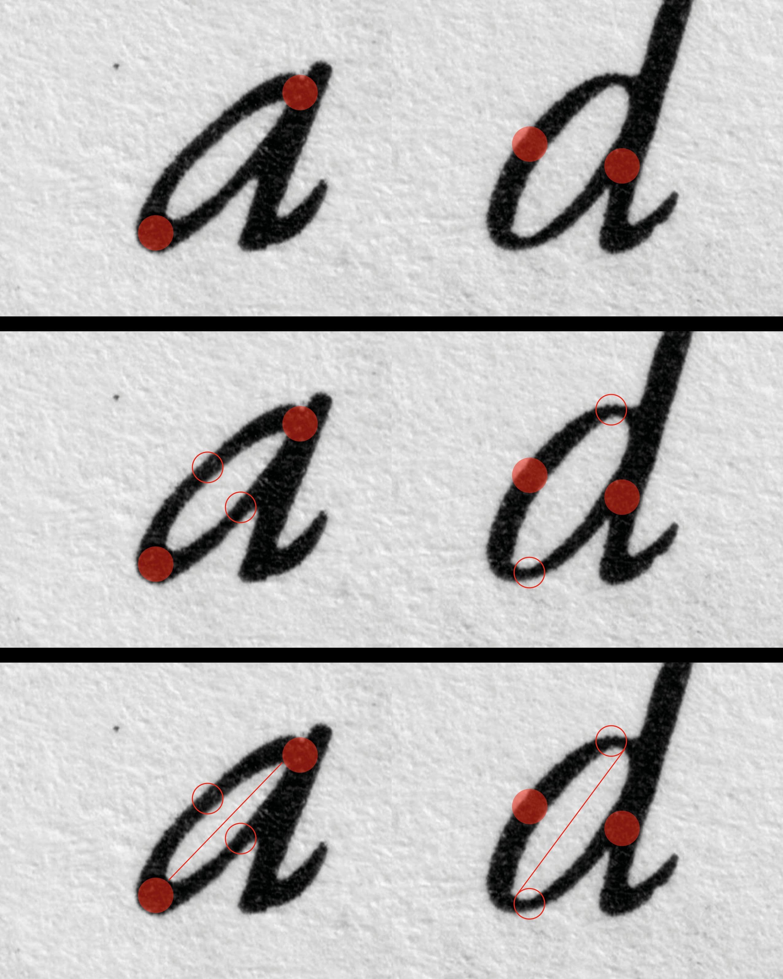
    When examining the counterforms, a whole new world of movement opens up. They do not always seem to follow exactly the same directional logic as the exterior contour of the letter. Instead, the internal space can suggest a different or steeper angle. This creates a dialogue between form and counterform. The direction of the white space becomes almost as important as the direction of the black stroke. Rather than merely filling the space between the strokes, the counterform actively contributes to the perception of inclination and rhythm.

  11. [11]

    The contrast becomes particularly striking in letters such as a and d. These letters are normally understood as belonging to the same basic shape group, sharing a related construction and ductus. In Granjon’s Italic, however, the distribution of weight is placed in almost completely opposing directions. The contrast between the heavier and lighter parts of the letters is therefore reversed, creating a distinctly different internal movement in each character. This difference is also reflected in their countershapes. Because the weight is organized in opposing directions, the negative spaces within the a and d respond differently to their surrounding strokes.

  12. [12]

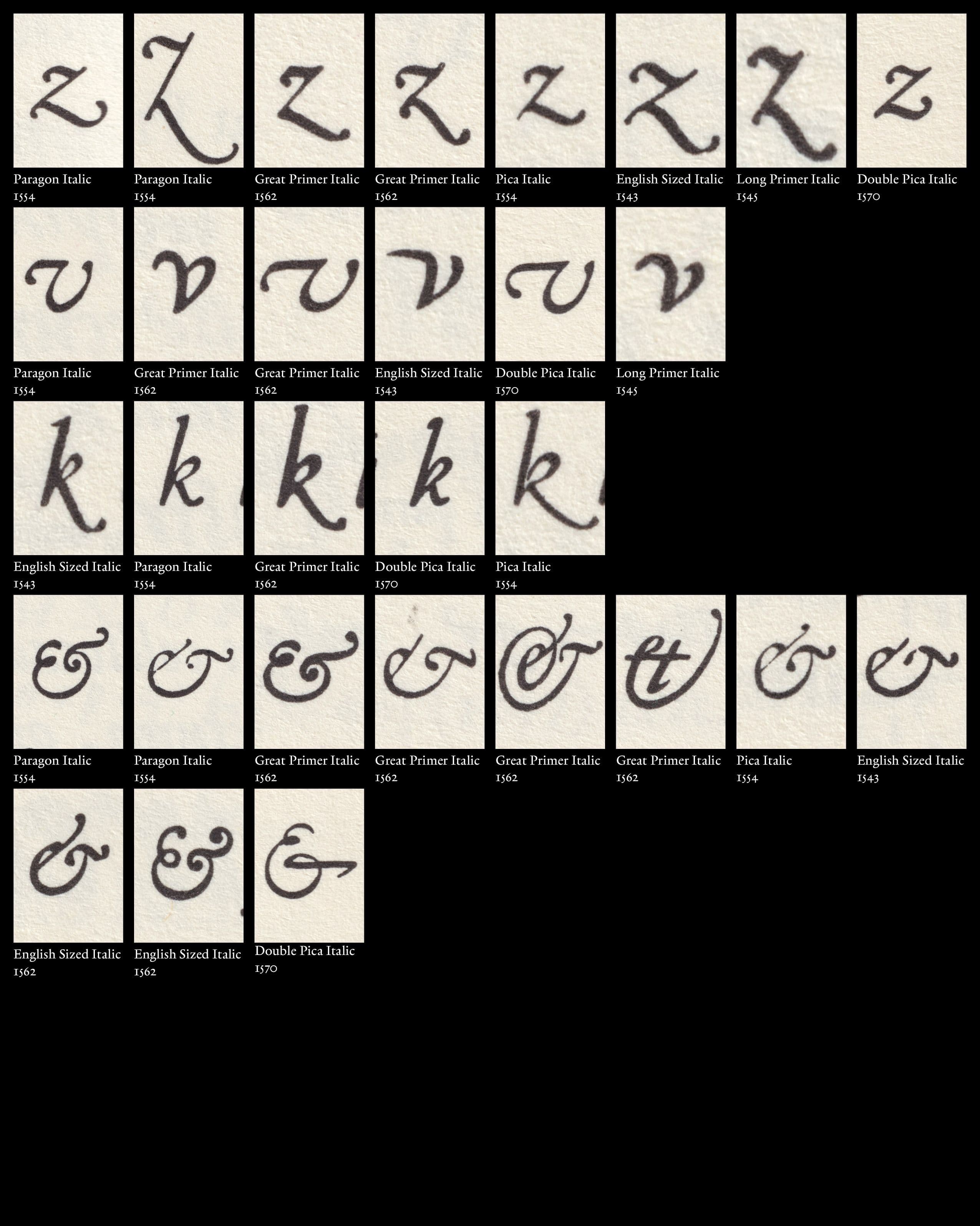
    This becomes particularly apparent in expressive characters such as z, v, w, and k. Granjon’s use of alternate forms gives him the opportunity to introduce variation and expression into the running text. Rather than repeating the same form mechanically, these alternatives can subtly change the direction, weight, or rhythm of a word. The alternates therefore become a means of expression. They allow individual words to gain a different rhythm and give the text a sense of movement and playfulness. What might appear as a small difference at the level of a single character can accumulate across a line, creating a more lively and varied typographic texture. The idea of controlled difference becomes particularly visible in Granjon’s ampersands. Their construction can depart substantially from the directional logic established by the surrounding alphabet. Rather than forcing the ampersand to conform to the same structural principles as the letters, Granjon appears to give it a greater degree of calligraphic freedom.

  13. [13]

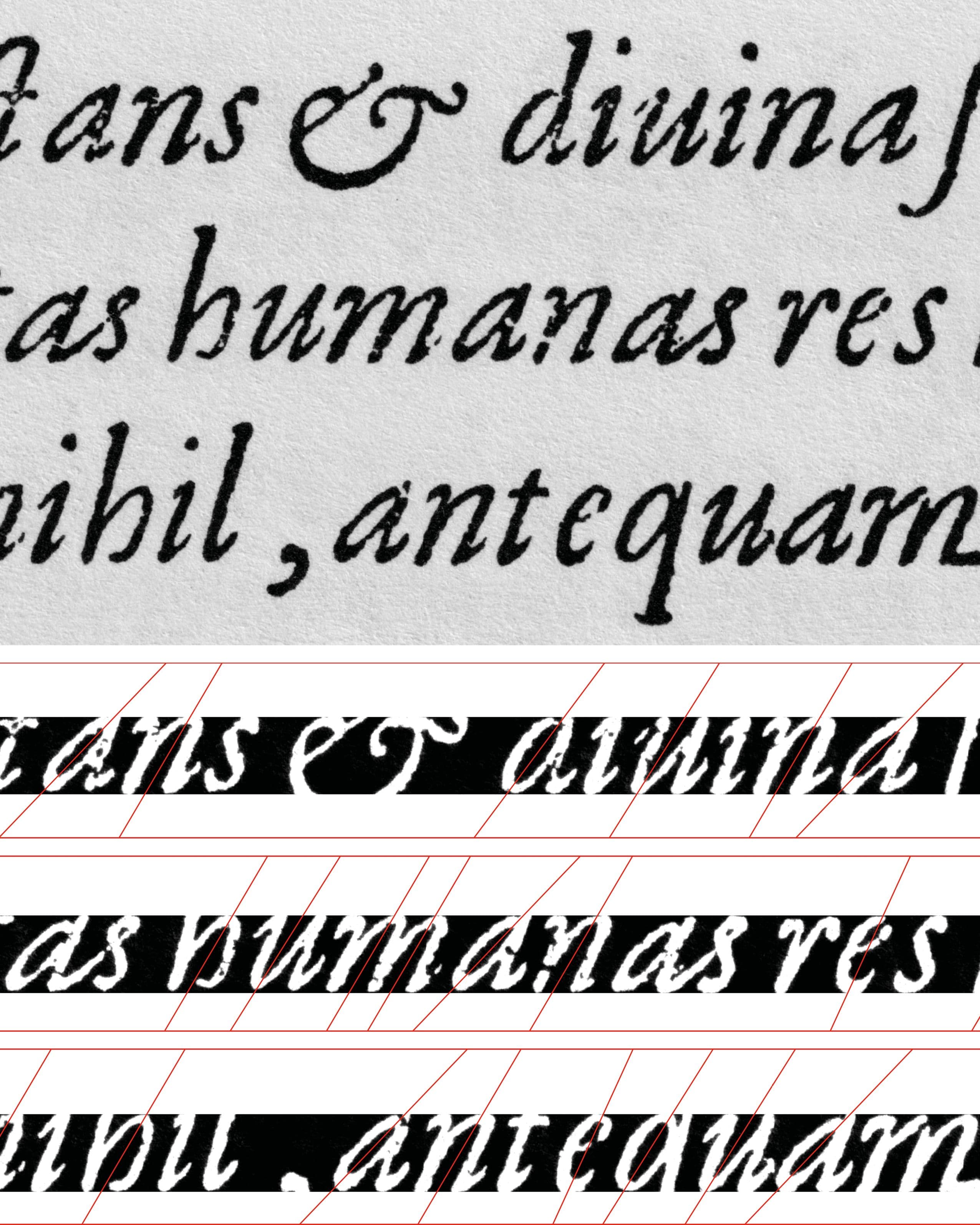
    The individual differences described above become particularly relevant when the letters are viewed as continuous text rather than in isolation. The eye encounters a sequence of forms, spaces, weights, and inclinations that constantly interact with one another. A single letter establishes a particular movement, while the following letter modifies or counterbalances it. Counterforms meet the contours of neighbouring letters, thick and thin areas alternate, and differences in inclination accumulate across the line. The variations between individual characters therefore become part of the overall texture. What appears as a difference between single letters becomes, through repetition, a recurring rhythm within the text. The dynamism of the Paragon thus does not depend on exaggerated individual forms alone. It results from the way different forms and movements follow, balance, and respond to one another across continuous text.
    The year 1554 can be understood as a moment of consolidation in Granjon’s development. It falls within the mature period that Vervliet dates from 1551 to the middle of the 1560s, when Granjon’s couché Italics had developed into the mature style that would become a model for subsequent Old-face Italics. The Paragon Italic of 1554 can be seen as a particularly clear expression of this development. 1554 therefore marks not the invention of a new Italic, but the maturity of an existing one.

Images
  1. [01]Griffo – Girolamo Soncino, Fano 1503 / Garamont – Pica Italic, Vascosan, 1549
  2. [02]Granjon’s English-sized Italic (1543)
  3. [03]Granjon 1554: Pica Italic, Great Primer Italic, Paragon Italic, First Brevier Italic
  4. [04]Museum Plantin-Moretus, „Matrijzen Italiek ‘Parangonne Cursive’,“ object no. MPM.MA.015
  5. [05]Granjon’s Paragon Italic (1554)
  6. [06]Close-up – Granjon’s Paragon Italic (1554)
  7. [07]Close-up – Granjon’s Paragon Italic (1554)
  8. [08]Close-up Paragon Italic "n" – Variations
  9. [09]Close-up – Granjon’s Paragon Italic (1554)
  10. [10]Granjon’s Paragon Italic (1554) – Folio Specimen
  11. [11]Close-up – Granjon’s Paragon Italic (1554)
  12. [12]Close-up Granjon’s Italics – Variations
  13. [13]Boissard, Jean-Jacques. Pars Romanae Urbis Topographiae [...] , 1597.
Text
  1. (1)Griffo, the great gala of letters. (o. D.).
  2. (2)Vervliet, Hendrik D. L.: The Palaeotypography of the French Renaissance: Selected Papers on Sixteenth-Century Typefaces. Vol. II, Leiden: Brill, 2008, S. 287.
  3. (3)Vervliet, Hendrik D. L.: The Palaeotypography of the French Renaissance: Selected Papers on Sixteenth-Century Typefaces. Vol. II, Leiden: Brill, 2008, S. 322.
  4. (4)Vervliet, Hendrik D. L.: The Palaeotypography of the French Renaissance: Selected Papers on Sixteenth-Century Typefaces. Vol. II, Leiden: Brill, 2008, S. 322.
  5. (5)Vervliet, Hendrik D. L.: The Palaeotypography of the French Renaissance: Selected Papers on Sixteenth-Century Typefaces. Vol. II, Leiden: Brill, 2008, S. 335.
  6. (6)Vervliet, Hendrik D. L.: The Palaeotypography of the French Renaissance: Selected Papers on Sixteenth-Century Typefaces. Vol. II, Leiden: Brill, 2008, S. 335-336.
  7. (7)Vervliet, Hendrik D. L.: The Palaeotypography of the French Renaissance: Selected Papers on Sixteenth-Century Typefaces. Vol. II, Leiden: Brill, 2008, S. 339-341.
  8. (8)Hendrik D. L. Vervliet, Robert Granjon, Letter-Cutter, 1513–1590: An Oeuvre-Catalogue (New Castle, DE: Oak Knoll Press, 2018), Introduction, S. 8.
  9. (9)Museum Plantin-Moretus, „Matrijzen Italiek ‘Parangonne Cursive’,“ object no. MPM.MA.015.
  10. (10)French Renaissance Printing Types: A Conspectus. London/New Castle, Oak Knoll Press, 2010, S. 44.
  11. (11)Vervliet, Hendrik D. L.: The Palaeotypography of the French Renaissance: Selected Papers on Sixteenth-Century Typefaces. Vol. II, Leiden: Brill, 2008, S. 363.
  12. (12)Vervliet, Hendrik D. L.: The Palaeotypography of the French Renaissance: Selected Papers on Sixteenth-Century Typefaces. Vol. II, Leiden: Brill, 2008, S. 363.
Boissard, Jean-Jacques. Pars Romanae Urbis Topographiae [...] , 1597.
 Egenolff-Berner specimen – Frankfurt: Berner, 1592
Griffo – Girolamo Soncino, Fano 1503 / Garamont – Pica Italic, Vascosan, 1549
Granjon’s English-sized Italic (1543)
Granjon 1554: Pica Italic, Great Primer Italic, Paragon Italic, First Brevier Italic
Museum Plantin-Moretus, „Matrijzen Italiek ‘Parangonne Cursive’,“ object no. MPM.MA.015
Granjon’s Paragon Italic (1554)
Close-up – Granjon’s Paragon Italic (1554)
Close-up Paragon Italic "n" – Variations
Close-up – Granjon’s Paragon Italic (1554)
Granjon’s Paragon Italic (1554) – Folio Specimen
Close-up – Granjon’s Paragon Italic (1554)
Close-up Granjon’s Italics – Variations
Boissard, Jean-Jacques. Pars Romanae Urbis Topographiae [...] , 1597.
 Egenolff-Berner specimen – Frankfurt: Berner, 1592

Granjon’s Italics of 1554

Marcel Saidov

  1. [01]

    To understand the significance of Robert Granjon’s Paragon Italic of 1554, it is first necessary to look briefly at the model from which sixteenth-century Italic developed. Around 1500, Italic type emerged from the contemporary handwritten forms of Renaissance humanists and chancery writing. The first Aldine Italic, cut by Francesco Griffo for Aldus Manutius, translated this narrow, right-inclined and highly cursive writing style into type. The compact forms were particularly suited to Aldus’s small-format editions and quickly established Italic as an important typographic form. The characteristic feature of this early Aldine Italic was therefore not simply its inclination, but its close relationship to handwriting: narrow proportions, a strong forward movement and a compact texture. Its forms translated the speed and continuity of chancery writing into the more repetitive and stable conditions of metal type.This model remained highly influential during the first decades of the sixteenth century. At the same time, Italic was gradually transformed as different punchcutters adapted its forms to new typographic contexts. It was no longer simply a transcription of a handwritten model, but became an increasingly independent system of type design.

  2. [02]

    Granjon’s earliest Italics belong to this period of transformation. His first English-sized Italic appeared in 1543, followed by further Italics in 1545, 1546, 1547 and 1548. Vervliet groups these designs as Granjon’s Early Style, describing the Italics of the 1540s as „more or less hesitant and experimental designs.“Rather than representing a sudden break with the Aldine tradition, these early designs can therefore be understood as part of Granjon’s gradual development of a new approach to Italic. The decisive change becomes visible in the treatment of inclination, particularly in the capitals. Vervliet argues that Granjon successfully established a balanced inclination of the capitals and that the optical harmony of this slope became a defining characteristic of his early Italics. Although he was not necessarily the first to use inclined capitals, he popularized them in a form that remained influential for later Old-face Italics.

  3. [03]

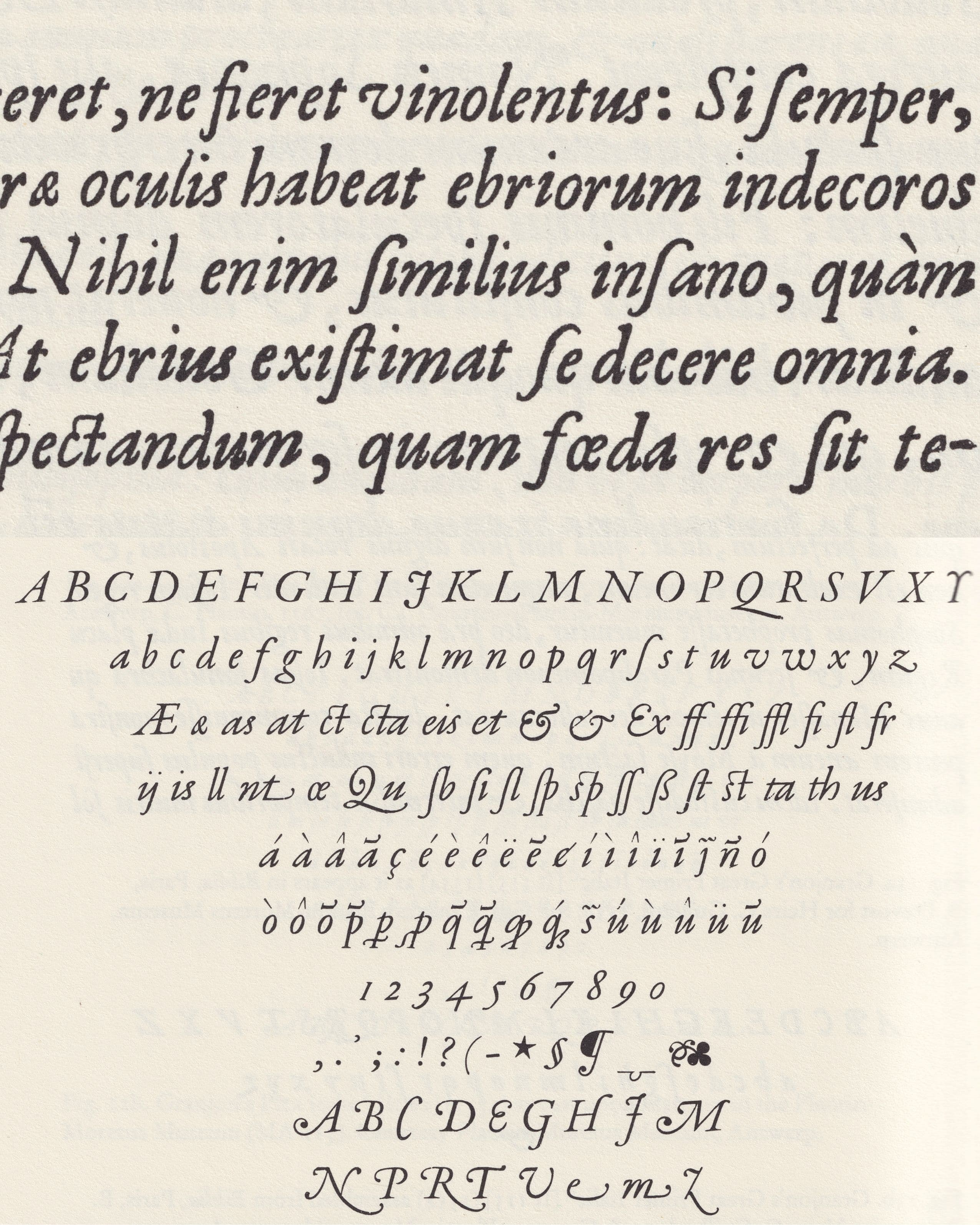
    By 1551, Granjon had entered what Vervliet identifies as his mature period. From 1551 to the middle of the 1560s, his Italics form the „mature“ „couché“ or inclined style, which Vervliet describes as becoming a model for subsequent Old-face Italics.This makes 1554 a particularly revealing moment. Four of Granjon’s Italics are recorded for this year: the Second Pica Italic, the Third Great Primer Italic, the Paragon Italic and the First Brevier Italic.

  4. [04]

    The Paragon Italic first appeared in Lyon in 1554 in François Duarenus’s Commentarius, printed by Guillaume Rouillé. Vervliet attributes the type to Granjon on the basis of documentary and material evidence, including surviving matrices.Granjon’s significance, however, extends beyond the individual cutting of typefaces. Unlike many contemporary punchcutters who worked primarily on commission for printers or typefoundries, Granjon, quite exceptionally for the period, sold sets of matrices of his typefaces across Europe. Vervliet describes this as „quite exceptionally in the history of pre-industrial printing.“The surviving matrices of the Paragon Italic provide a particularly clear example of this practice. At the Museum Plantin-Moretus are a set of 163 matrices for Granjon’s Parangonne Cursive preserved. The earliest known use is Lyon, Guillaume Rouillé, in 1554, while Plantin began using the type in 1564.The importance of this practice was that matrices allowed printers and typefounders to cast new sorts themselves. Granjon’s designs could therefore circulate independently of their original place of production. Vervliet notes that French types by Granjon, Garamond and others, cast from different sets of matrices that had reached Antwerp, Venice, Rome, Frankfurt am Main, Amsterdam and London, can be found in books printed across a large part of Europe during the following two centuries.

  5. [05]

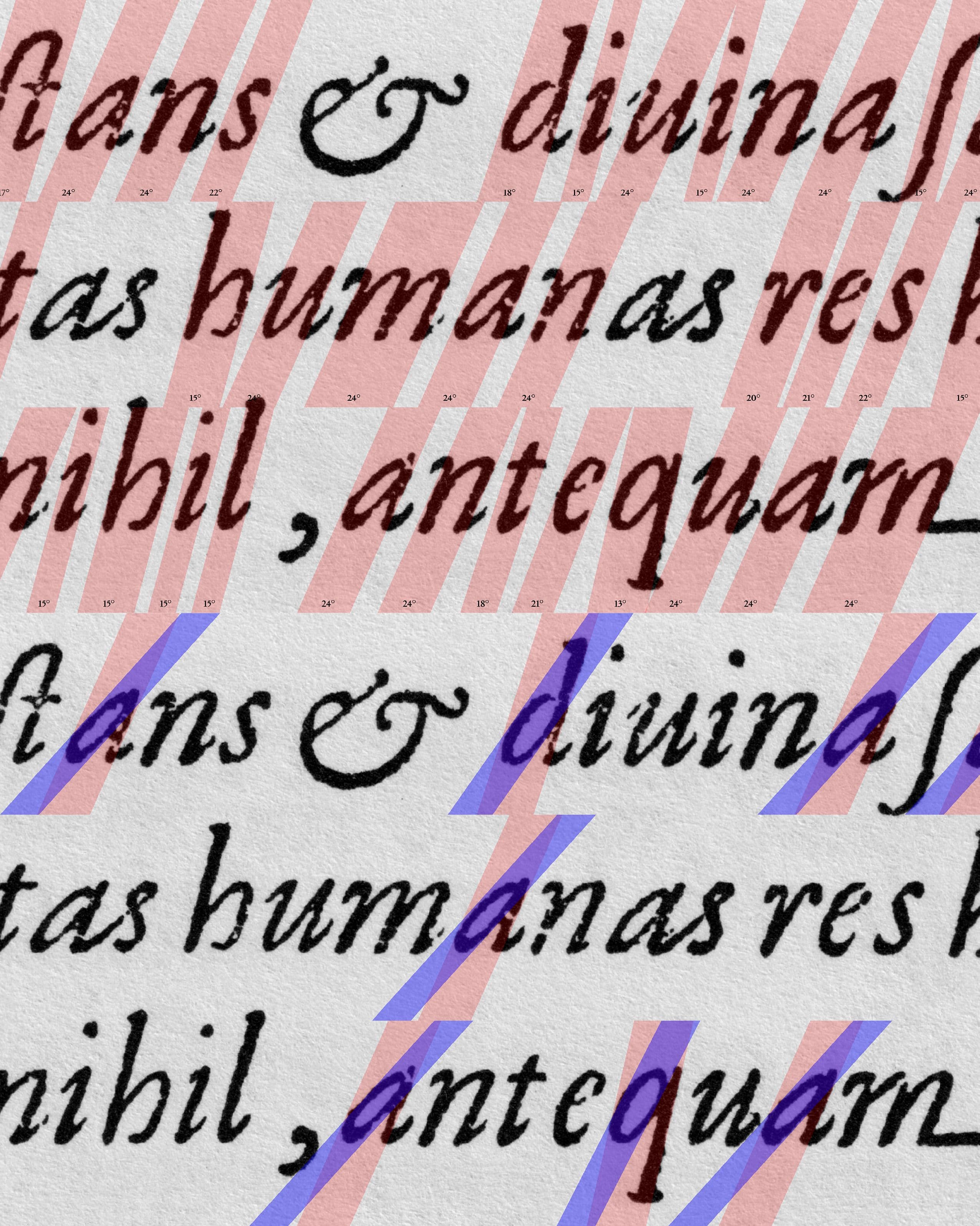
    Vervliet’s classification gives a useful name to the development described above. He divides Granjon’s Italics into four stylistic periods: an Early Style in the 1540s; a mature „couché“ or inclined style from 1551 to the middle of the 1560s; a later „droite“ style; and finally the „Baroque“ Italics of the 1570s. The term couché is particularly interesting because it can literally be under-stood as „lying“ or „laid down.“ In Vervliet’s classification, it refers to the pronounced inclination of Granjon’s mature and more calligraphic Italics.At first, the answer might seem obvious: the letters are inclined. But Granjon’s Paragon suggests a more complex relationship between inclination and movement. Their individual strokes, weight distribution and counterforms con-tribute to the sensation of leaning in different ways. The couché therefore might describe not only an angle, but a visual condition of movement.

  6. [06]

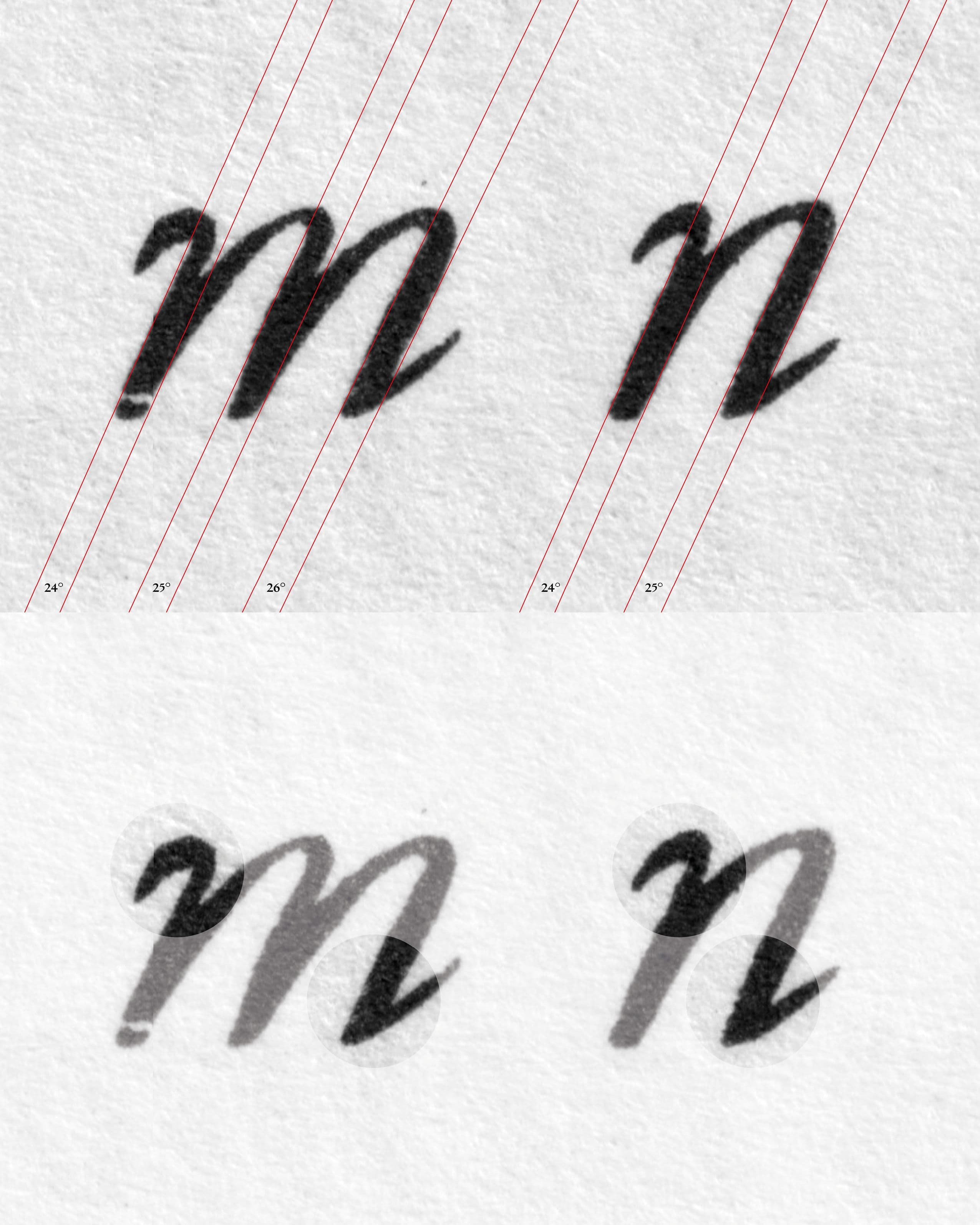
    Granjon creates dynamism not through one uniform angle, but through the optical negotiation of different angles. Some letters appear to contain more than one directional tendency. The entrance and exit strokes can suggest different movements from the main construction of the letter, creating the impression that the writing hand changes direction while continuing forward.
    This becomes particularly interesting when comparing different characters. Rather than under-standing the Italic simply as a set of uniformly slanted forms, it is more useful to consider each character as a gesture. The inclination is therefore not only a geometric property but something produced through the relationship between strokes.

  7. [07]

    Vervliet’s emphasis on the optical harmony of Granjon’s inclination provides a historical point of reference for this observation. His description suggests that the coherence of the Italic should be understood in terms of visual balance rather than simply identical geometric construction.

  8. [08]

    The distribution of weight reinforces this sense of movement. In several letters, the thinnest areas do not simply correspond to a predictable junction placement between stem and shoulder. Instead, weight can become particularly delicate at transitions of directions and to imply the contrast angle.

  9. [09]

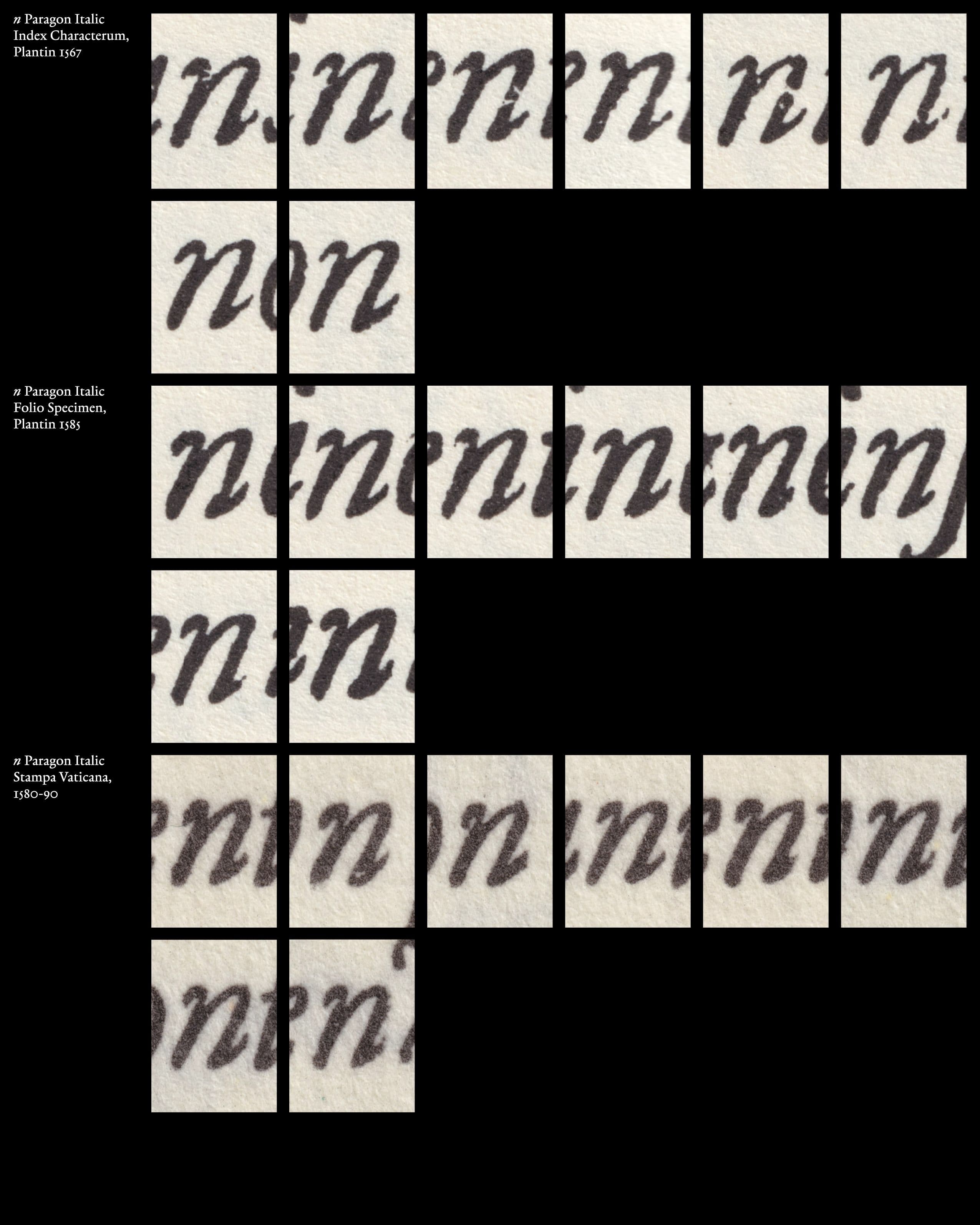
    This produces what I would describe as an intermediate weight: the stroke does not appear to be constructed from a rigid opposition between thick and thin, but from a continuous movement that implies the presence of a writing instrument. However, Granjon does not view the shapes of his italics as belonging to the standard shape groups. He creates intermediate weights that come together to suggest the hint or illusion of a stem. The letters n and u are especially useful for reading this quality. Their construction allows the eye to imagine an uninterrupted movement of the stroke. The change in weight can therefore be perceived almost as a change in speed: where the stroke accelerates, it becomes lighter; where the movement slows or turns, more material appears.

  10. [10]

    When examining the counterforms, a whole new world of movement opens up. They do not always seem to follow exactly the same directional logic as the exterior contour of the letter. Instead, the internal space can suggest a different or steeper angle. This creates a dialogue between form and counterform. The direction of the white space becomes almost as important as the direction of the black stroke. Rather than merely filling the space between the strokes, the counterform actively contributes to the perception of inclination and rhythm.

  11. [11]

    The contrast becomes particularly striking in letters such as a and d. These letters are normally understood as belonging to the same basic shape group, sharing a related construction and ductus. In Granjon’s Italic, however, the distribution of weight is placed in almost completely opposing directions. The contrast between the heavier and lighter parts of the letters is therefore reversed, creating a distinctly different internal movement in each character. This difference is also reflected in their countershapes. Because the weight is organized in opposing directions, the negative spaces within the a and d respond differently to their surrounding strokes.

  12. [12]

    This becomes particularly apparent in expressive characters such as z, v, w, and k. Granjon’s use of alternate forms gives him the opportunity to introduce variation and expression into the running text. Rather than repeating the same form mechanically, these alternatives can subtly change the direction, weight, or rhythm of a word. The alternates therefore become a means of expression. They allow individual words to gain a different rhythm and give the text a sense of movement and playfulness. What might appear as a small difference at the level of a single character can accumulate across a line, creating a more lively and varied typographic texture. The idea of controlled difference becomes particularly visible in Granjon’s ampersands. Their construction can depart substantially from the directional logic established by the surrounding alphabet. Rather than forcing the ampersand to conform to the same structural principles as the letters, Granjon appears to give it a greater degree of calligraphic freedom.

  13. [13]

    The individual differences described above become particularly relevant when the letters are viewed as continuous text rather than in isolation. The eye encounters a sequence of forms, spaces, weights, and inclinations that constantly interact with one another. A single letter establishes a particular movement, while the following letter modifies or counterbalances it. Counterforms meet the contours of neighbouring letters, thick and thin areas alternate, and differences in inclination accumulate across the line. The variations between individual characters therefore become part of the overall texture. What appears as a difference between single letters becomes, through repetition, a recurring rhythm within the text. The dynamism of the Paragon thus does not depend on exaggerated individual forms alone. It results from the way different forms and movements follow, balance, and respond to one another across continuous text.
    The year 1554 can be understood as a moment of consolidation in Granjon’s development. It falls within the mature period that Vervliet dates from 1551 to the middle of the 1560s, when Granjon’s couché Italics had developed into the mature style that would become a model for subsequent Old-face Italics. The Paragon Italic of 1554 can be seen as a particularly clear expression of this development. 1554 therefore marks not the invention of a new Italic, but the maturity of an existing one.

Images
  1. [01]Griffo – Girolamo Soncino, Fano 1503 / Garamont – Pica Italic, Vascosan, 1549
  2. [02]Granjon’s English-sized Italic (1543)
  3. [03]Granjon 1554: Pica Italic, Great Primer Italic, Paragon Italic, First Brevier Italic
  4. [04]Museum Plantin-Moretus, „Matrijzen Italiek ‘Parangonne Cursive’,“ object no. MPM.MA.015
  5. [05]Granjon’s Paragon Italic (1554)
  6. [06]Close-up – Granjon’s Paragon Italic (1554)
  7. [07]Close-up – Granjon’s Paragon Italic (1554)
  8. [08]Close-up Paragon Italic "n" – Variations
  9. [09]Close-up – Granjon’s Paragon Italic (1554)
  10. [10]Granjon’s Paragon Italic (1554) – Folio Specimen
  11. [11]Close-up – Granjon’s Paragon Italic (1554)
  12. [12]Close-up Granjon’s Italics – Variations
  13. [13]Boissard, Jean-Jacques. Pars Romanae Urbis Topographiae [...] , 1597.
Text
  1. (1)Griffo, the great gala of letters. (o. D.).
  2. (2)Vervliet, Hendrik D. L.: The Palaeotypography of the French Renaissance: Selected Papers on Sixteenth-Century Typefaces. Vol. II, Leiden: Brill, 2008, S. 287.
  3. (3)Vervliet, Hendrik D. L.: The Palaeotypography of the French Renaissance: Selected Papers on Sixteenth-Century Typefaces. Vol. II, Leiden: Brill, 2008, S. 322.
  4. (4)Vervliet, Hendrik D. L.: The Palaeotypography of the French Renaissance: Selected Papers on Sixteenth-Century Typefaces. Vol. II, Leiden: Brill, 2008, S. 322.
  5. (5)Vervliet, Hendrik D. L.: The Palaeotypography of the French Renaissance: Selected Papers on Sixteenth-Century Typefaces. Vol. II, Leiden: Brill, 2008, S. 335.
  6. (6)Vervliet, Hendrik D. L.: The Palaeotypography of the French Renaissance: Selected Papers on Sixteenth-Century Typefaces. Vol. II, Leiden: Brill, 2008, S. 335-336.
  7. (7)Vervliet, Hendrik D. L.: The Palaeotypography of the French Renaissance: Selected Papers on Sixteenth-Century Typefaces. Vol. II, Leiden: Brill, 2008, S. 339-341.
  8. (8)Hendrik D. L. Vervliet, Robert Granjon, Letter-Cutter, 1513–1590: An Oeuvre-Catalogue (New Castle, DE: Oak Knoll Press, 2018), Introduction, S. 8.
  9. (9)Museum Plantin-Moretus, „Matrijzen Italiek ‘Parangonne Cursive’,“ object no. MPM.MA.015.
  10. (10)French Renaissance Printing Types: A Conspectus. London/New Castle, Oak Knoll Press, 2010, S. 44.
  11. (11)Vervliet, Hendrik D. L.: The Palaeotypography of the French Renaissance: Selected Papers on Sixteenth-Century Typefaces. Vol. II, Leiden: Brill, 2008, S. 363.
  12. (12)Vervliet, Hendrik D. L.: The Palaeotypography of the French Renaissance: Selected Papers on Sixteenth-Century Typefaces. Vol. II, Leiden: Brill, 2008, S. 363.