The Office for Type Design, Typography and Research by Marcel Saidov is an independent design practice based in Munich, Germany. Established in 2016, the office works across type design, typography, editorial design and research, developing custom and retail typefaces, publications and typographic identities for clients and collaborators in the field of culture. The practice focuses on type and typography as tools for developing clear, contemporary and distinctive visual solutions, with steady research-based foundations. The practice maintains close collaborations with leading universities and cultural institutions, where research is shared and developed through teaching, workshops and ongoing exchange. The Office for Type Design, Typography and Research is open to commissions, collaborations and conversations around type design and typography.
To understand the significance of Robert Granjon’s Paragon Italic of 1554, it is first necessary to look briefly at the model from which sixteenth-century Italic developed. Around 1500, Italic type emerged from the contemporary handwritten forms of Renaissance humanists and chancery writing. The first Aldine Italic, cut by Francesco Griffo for Aldus Manutius, translated this narrow, right-inclined and highly cursive writing style into type. The compact forms were particularly suited to Aldus’s small-format editions and quickly established Italic as an important typographic form.Griffo, the great gala of letters. (o. D.). The characteristic feature of this early Aldine Italic was therefore not simply its inclination, but its close relationship to handwriting: narrow proportions, a strong… read more
- img-001 Egenolff-Berner specimen – Frankfurt: Berner, 1592
- img-002 Griffo – Girolamo Soncino, Fano 1503 / Garamont – Pica Italic, Vascosan, 1549
- img-003 Granjon’s English-sized Italic (1543)
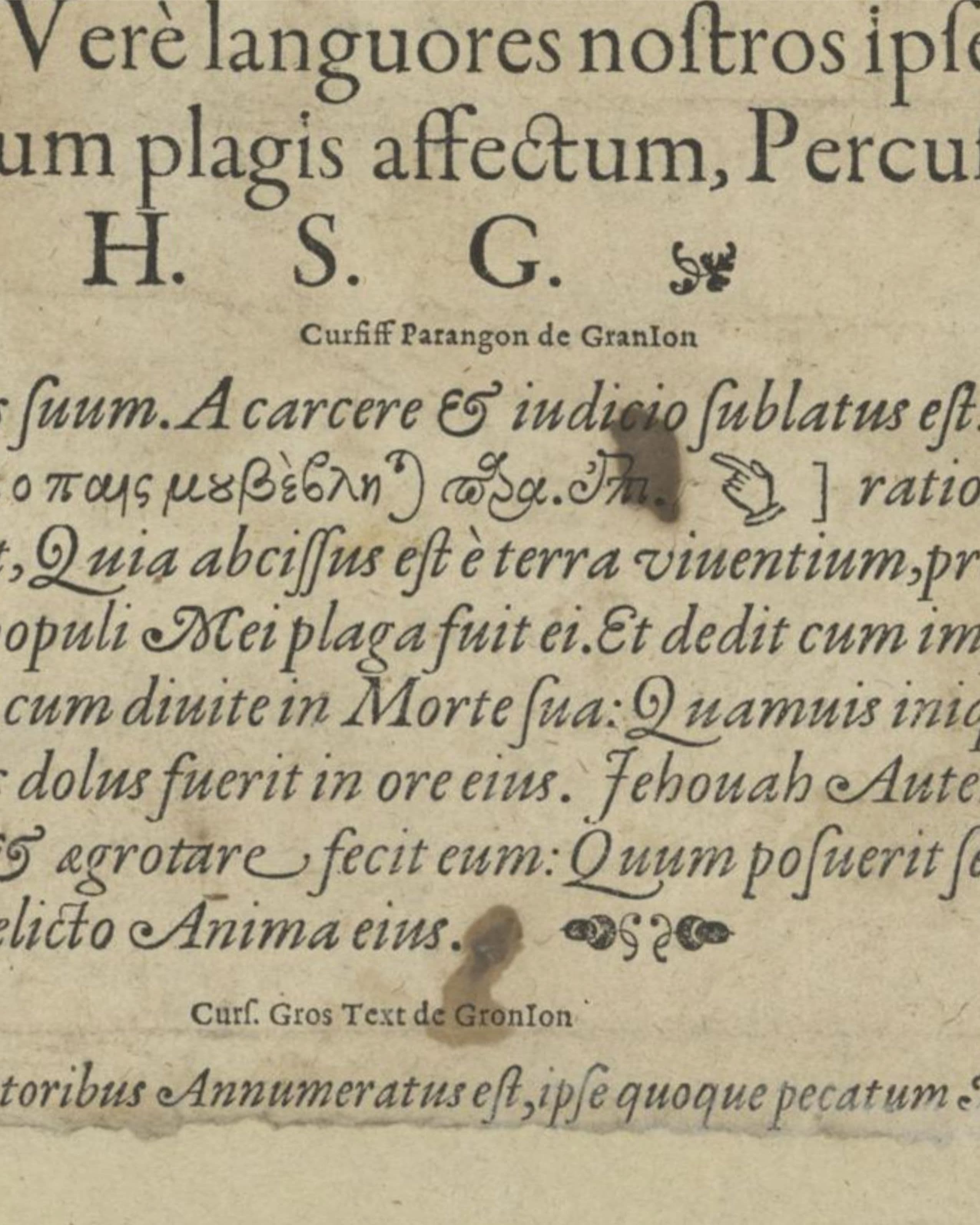
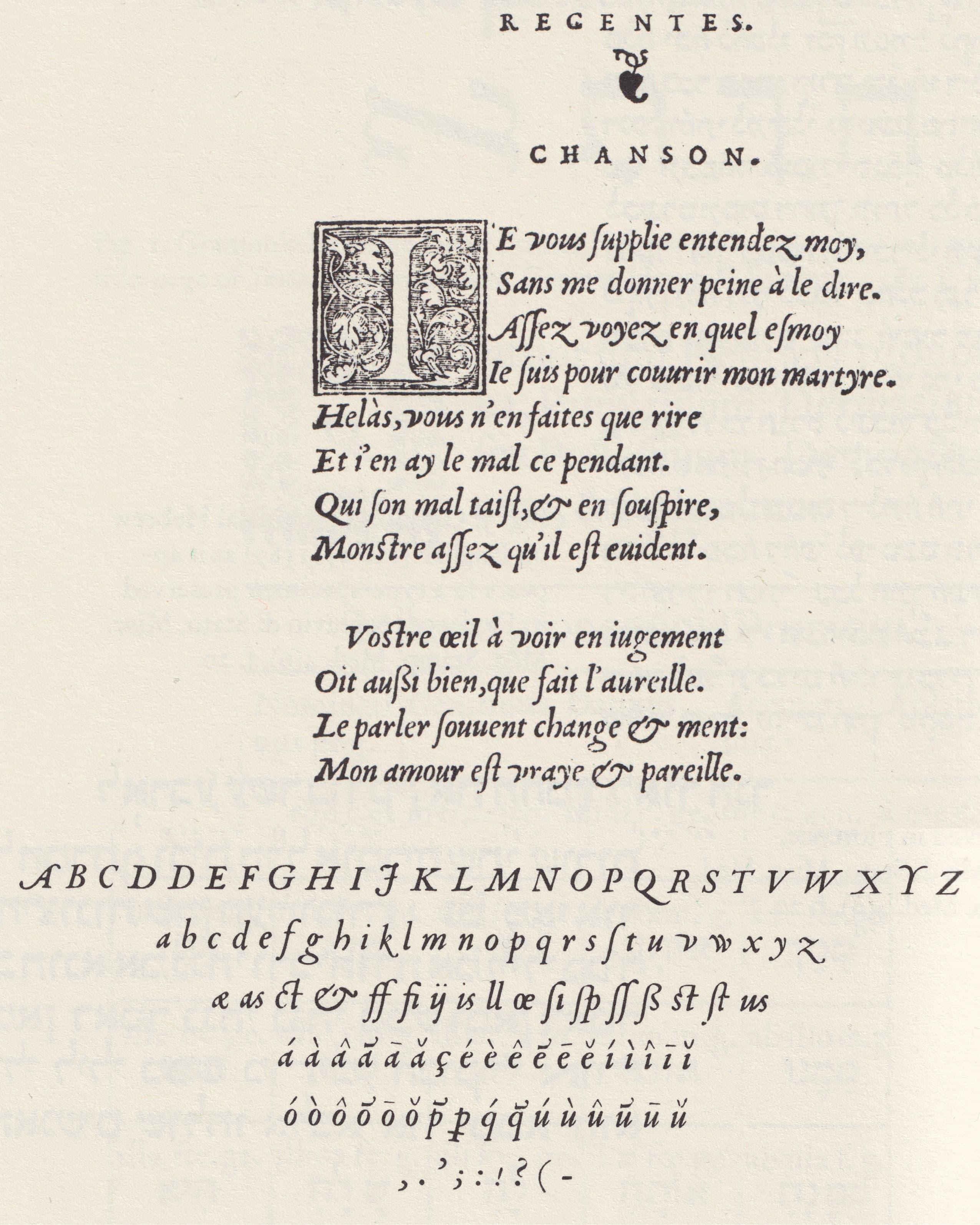
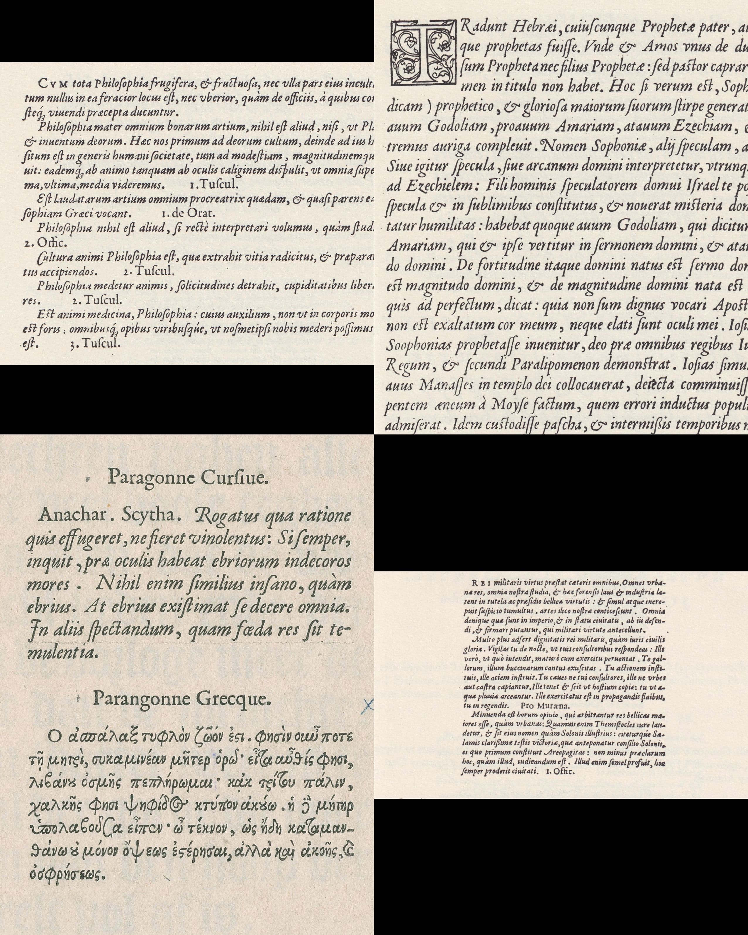
- img-004 Granjon 1554: Pica Italic, Great Primer Italic, Paragon Italic, First Brevier Italic
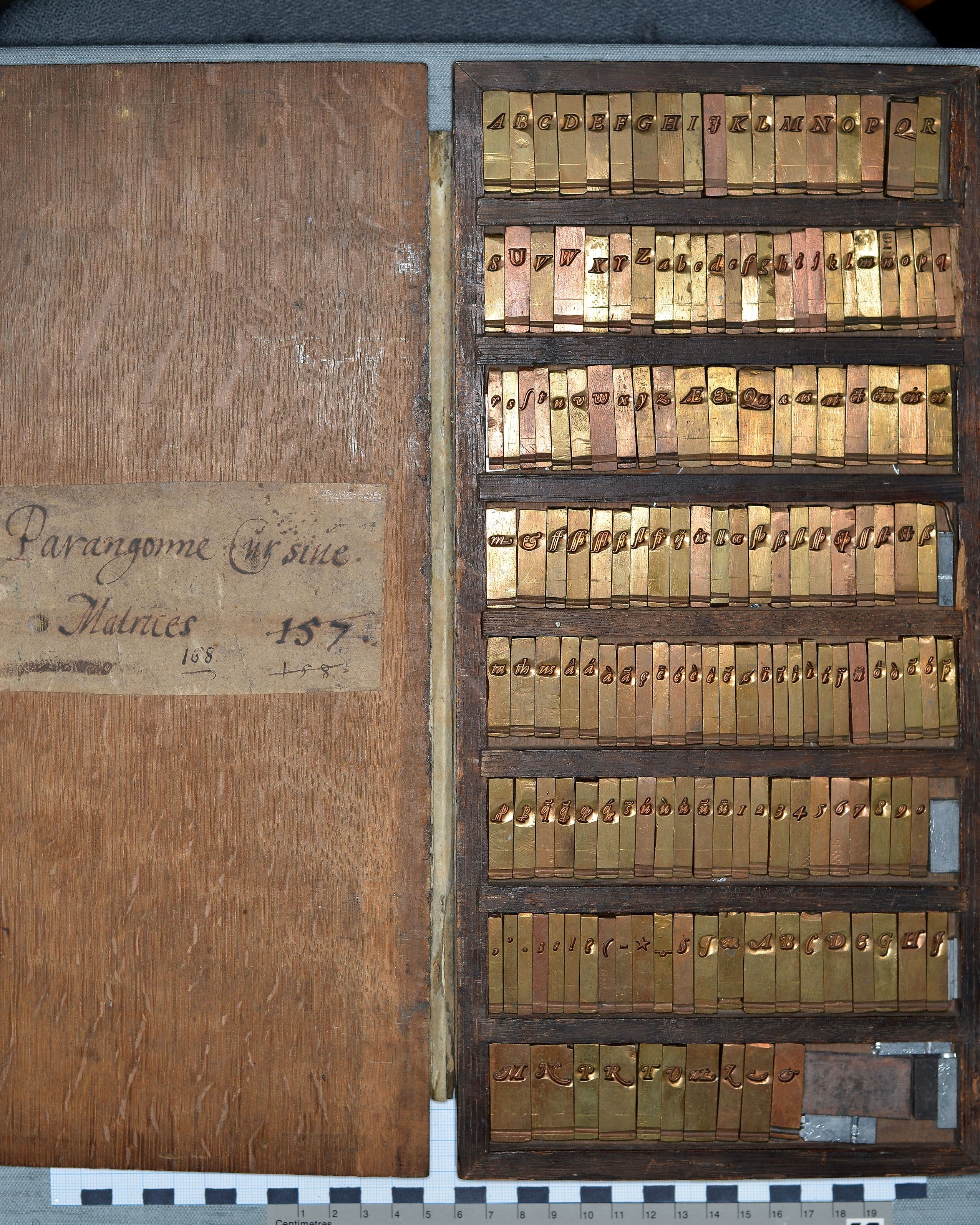
- img-005 Museum Plantin-Moretus, „Matrijzen Italiek ‘Parangonne Cursive’,“ object no. MPM.MA.015
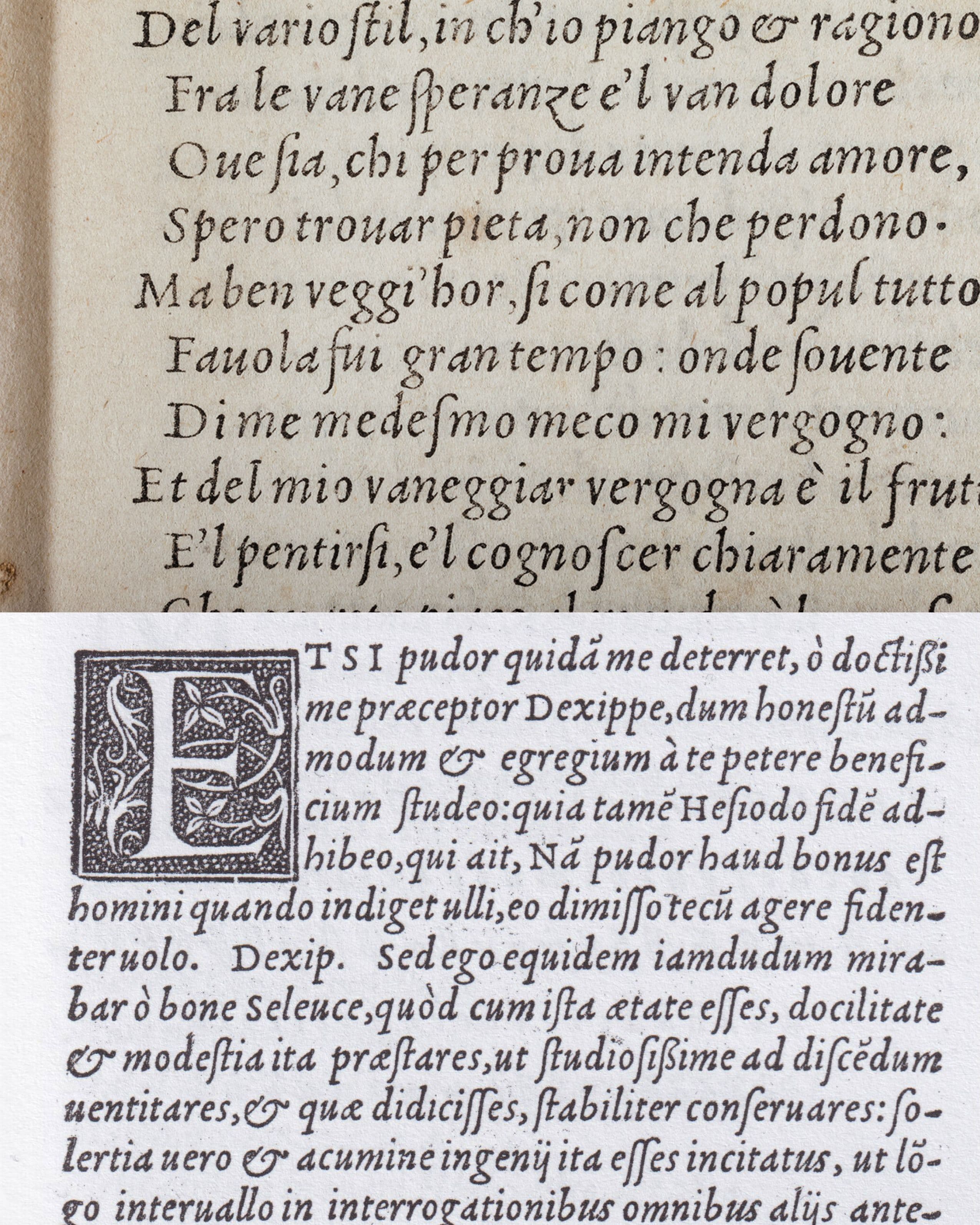
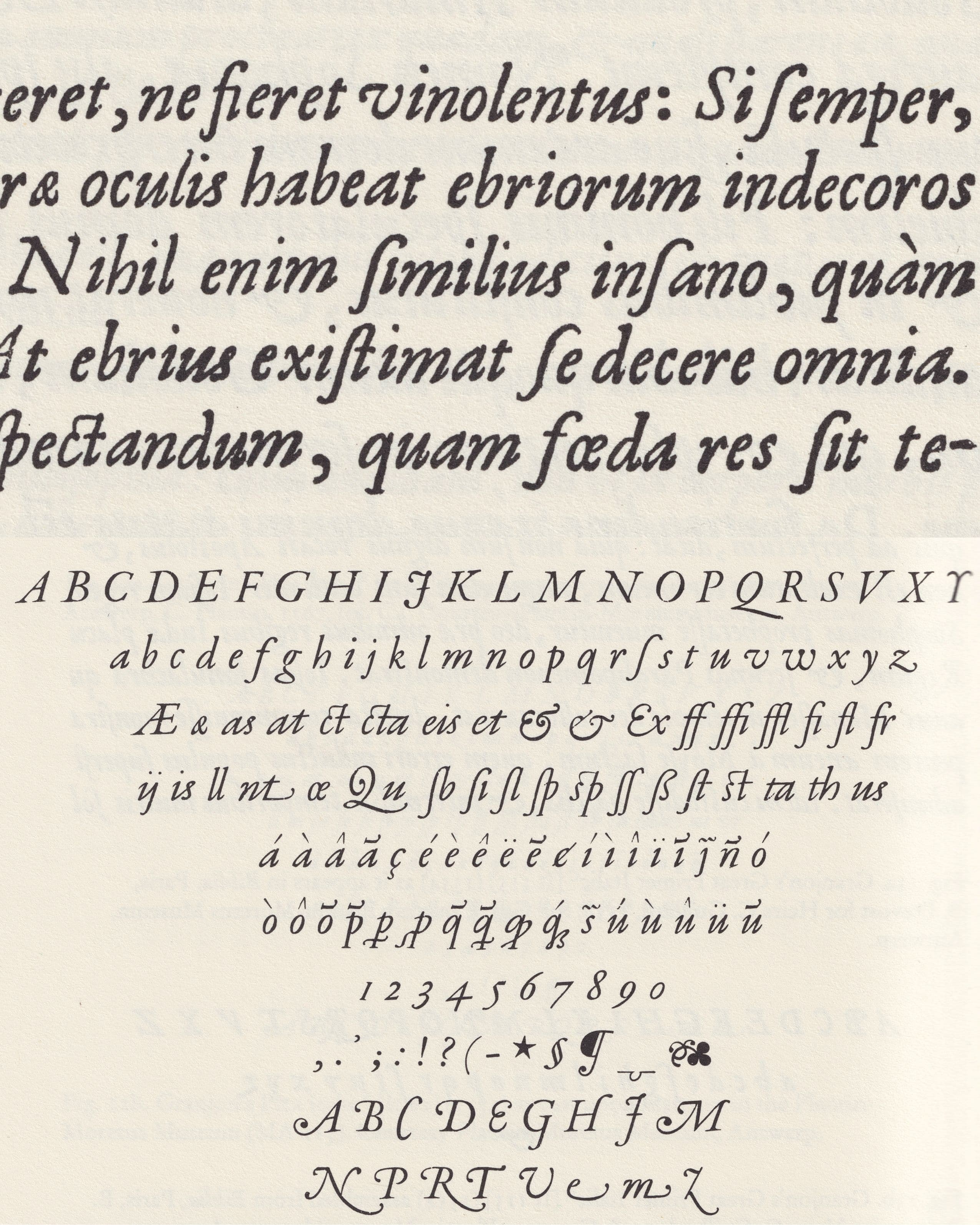
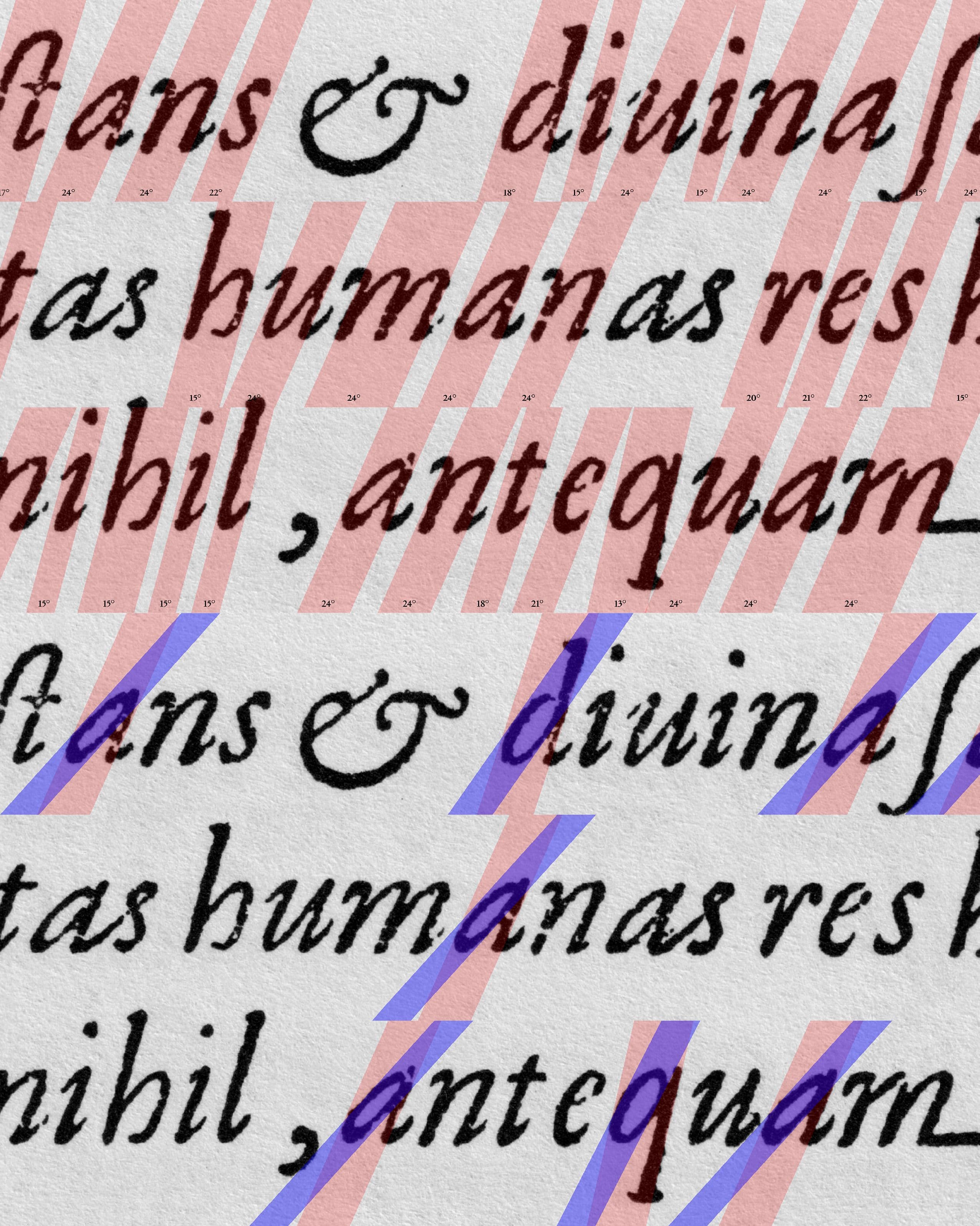
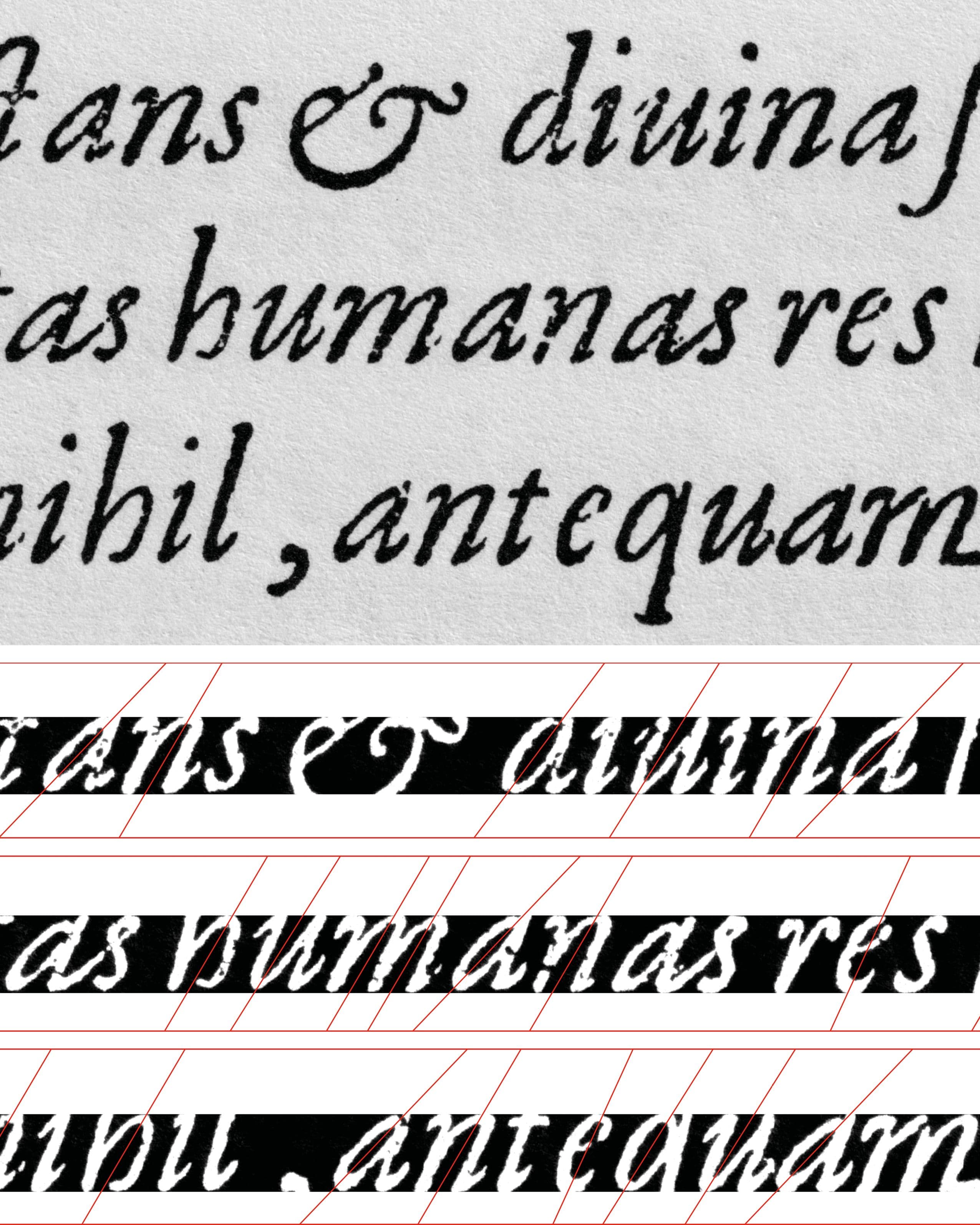
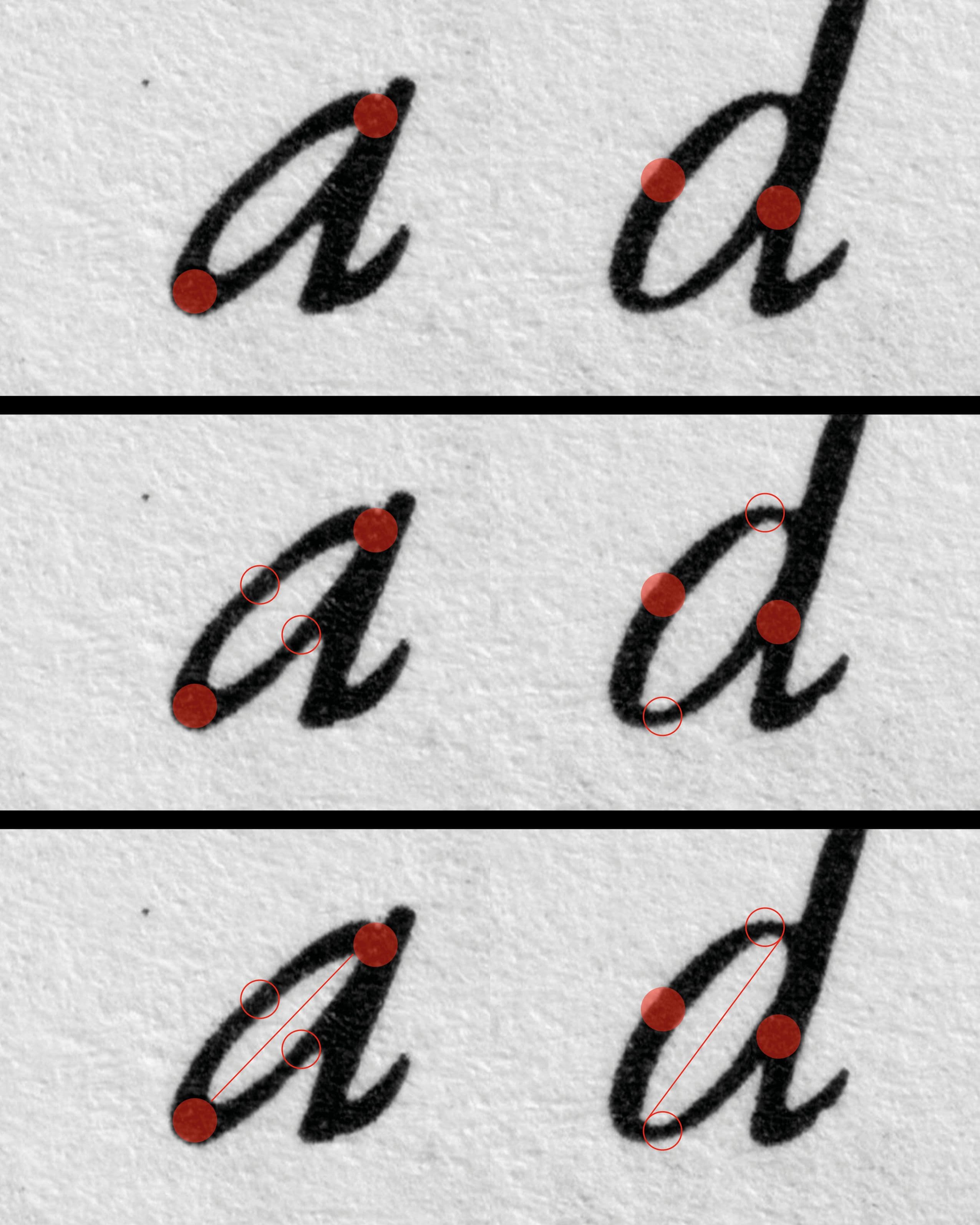
- img-006 Granjon’s Paragon Italic (1554)
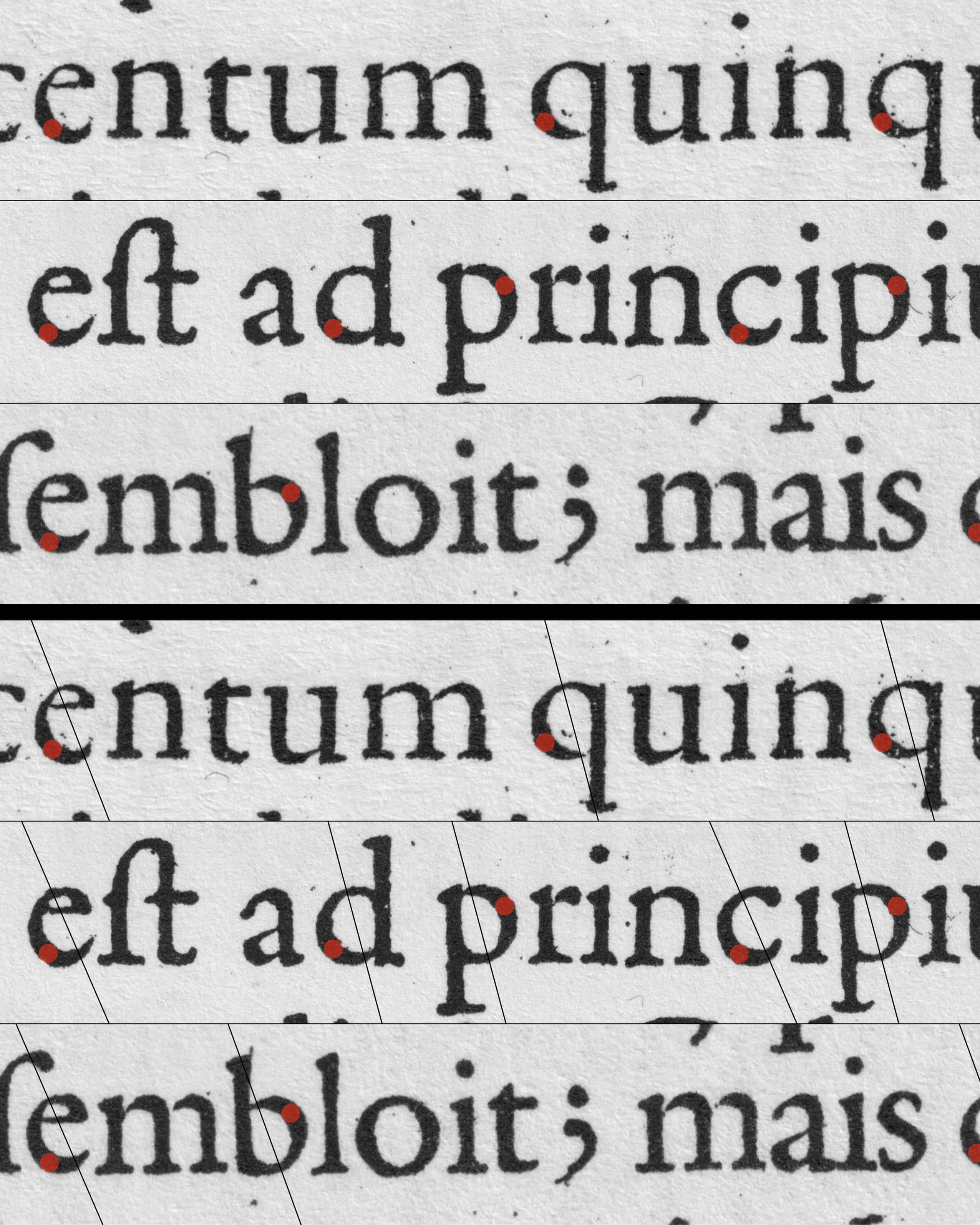
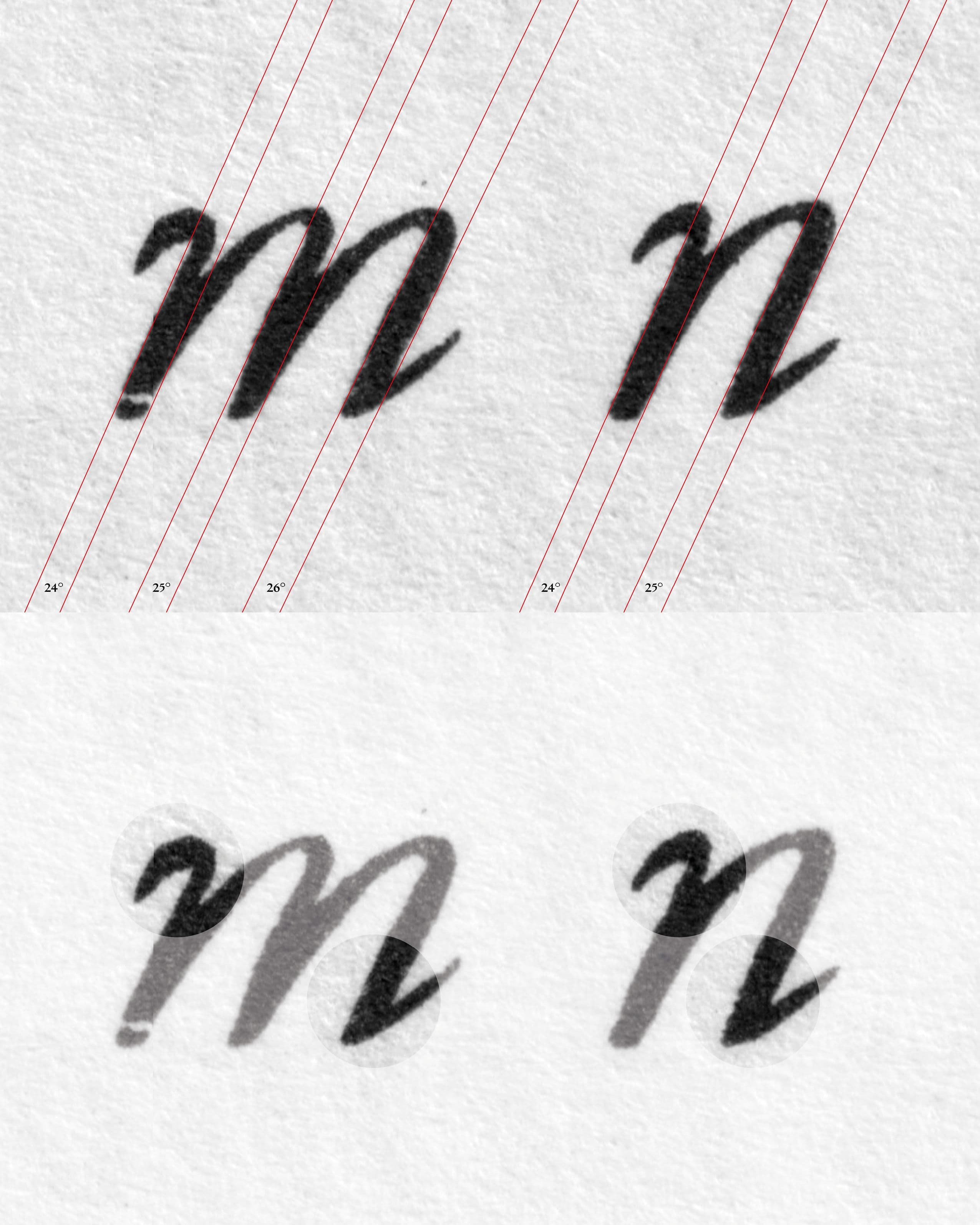
- img-007 Close-up – Granjon’s Paragon Italic (1554)
- img-008 Close-up – Granjon’s Paragon Italic (1554)
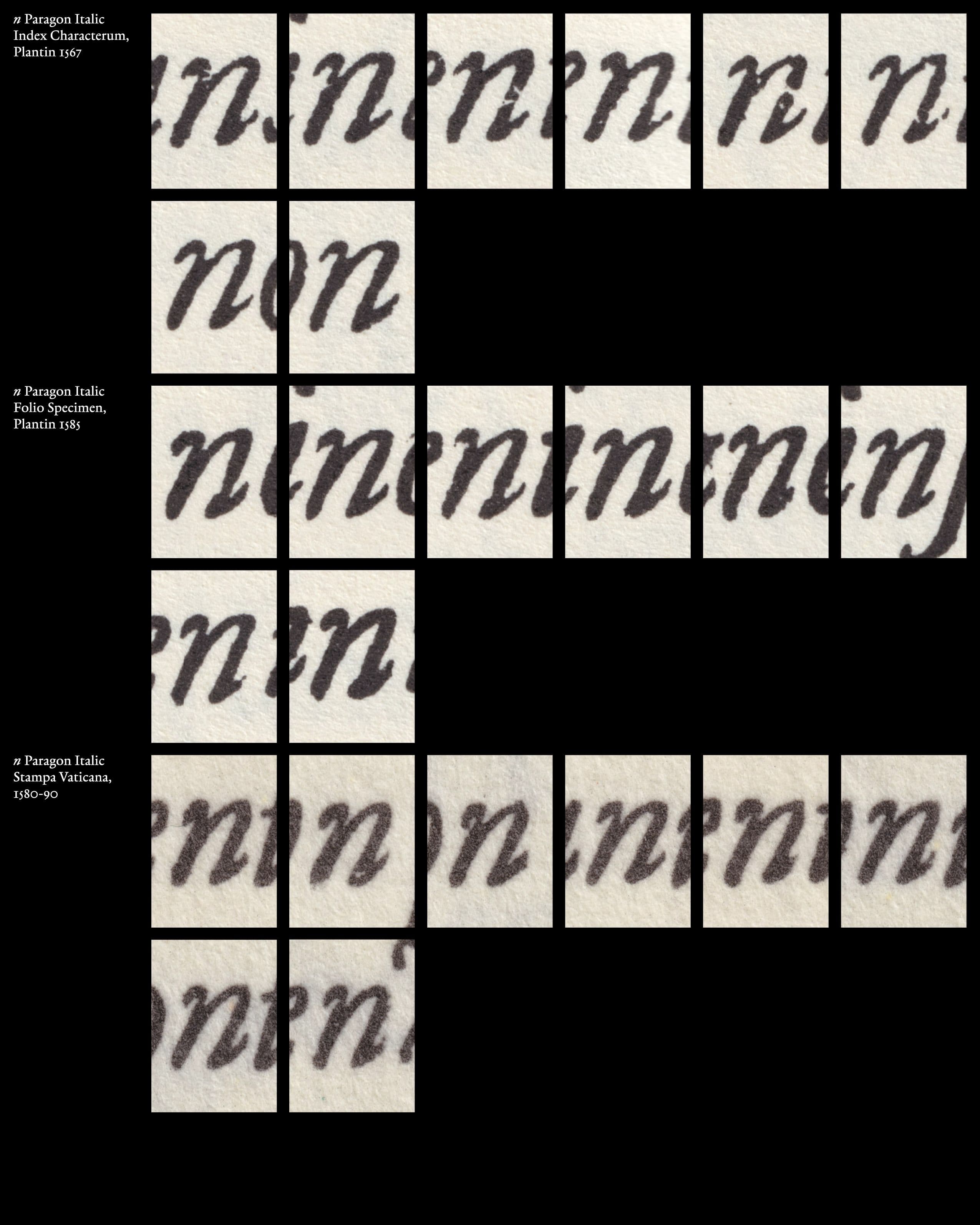
- img-009 Close-up Paragon Italic "n" – Variations
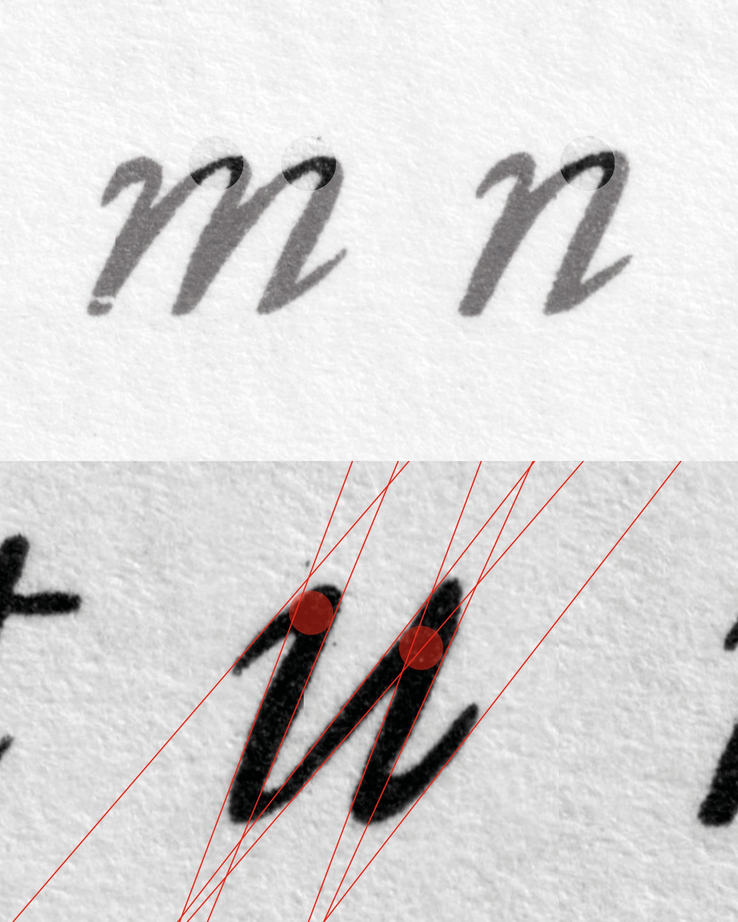
- img-010 Close-up – Granjon’s Paragon Italic (1554)
- img-011 Granjon’s Paragon Italic (1554) – Folio Specimen
- img-012 Close-up – Granjon’s Paragon Italic (1554)
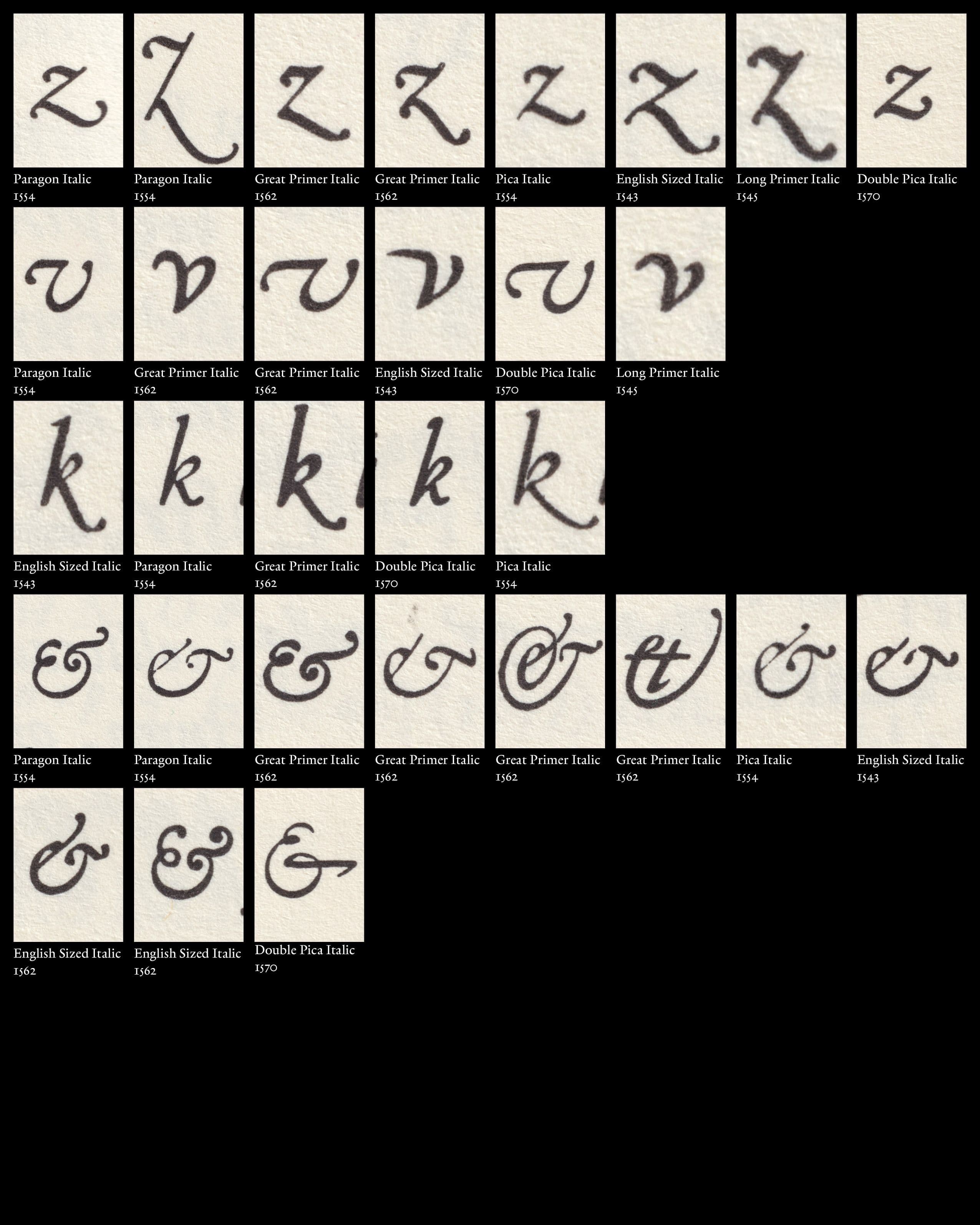
- img-013 Close-up Granjon’s Italics – Variations
- img-014 Boissard, Jean-Jacques. Pars Romanae Urbis Topographiae [...] , 1597.
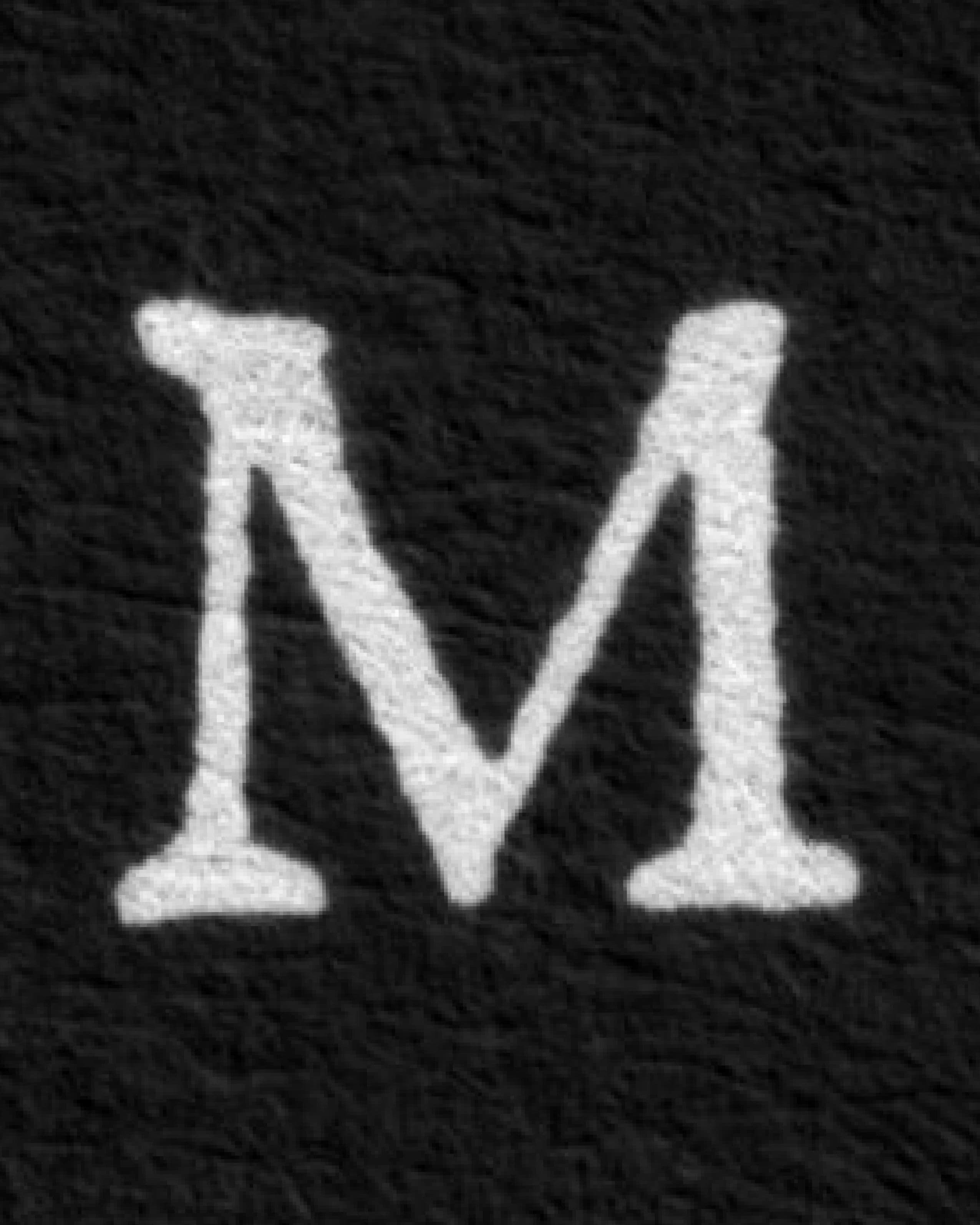
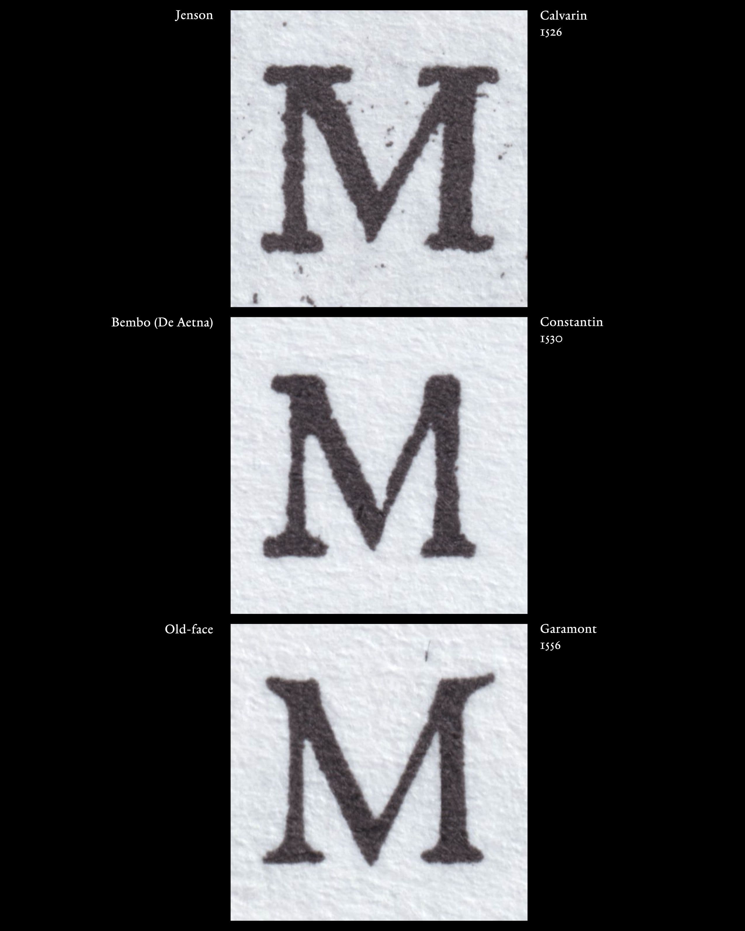
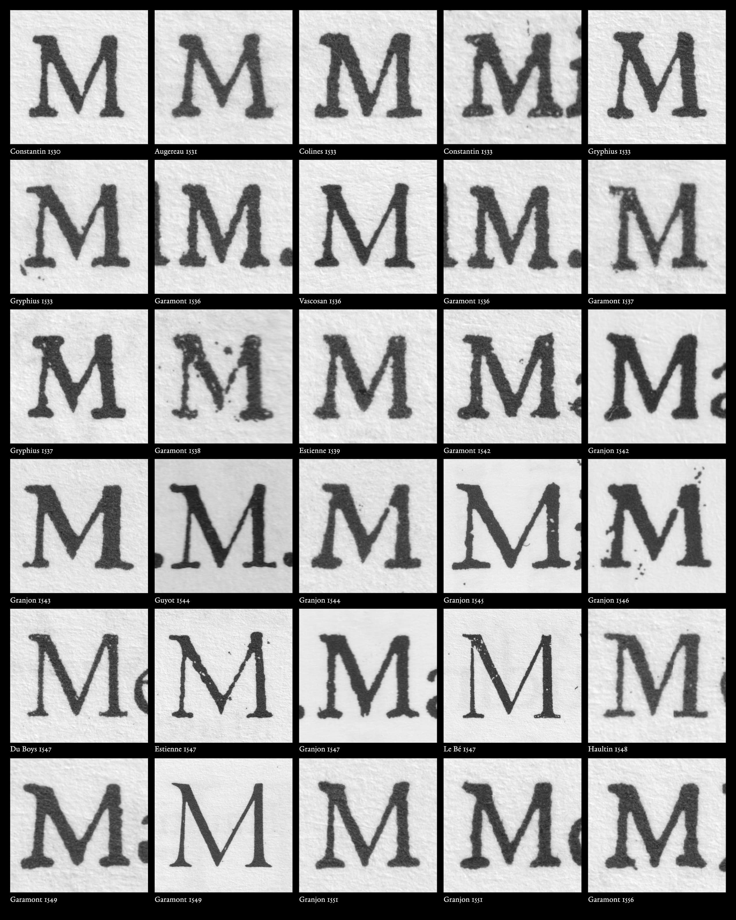
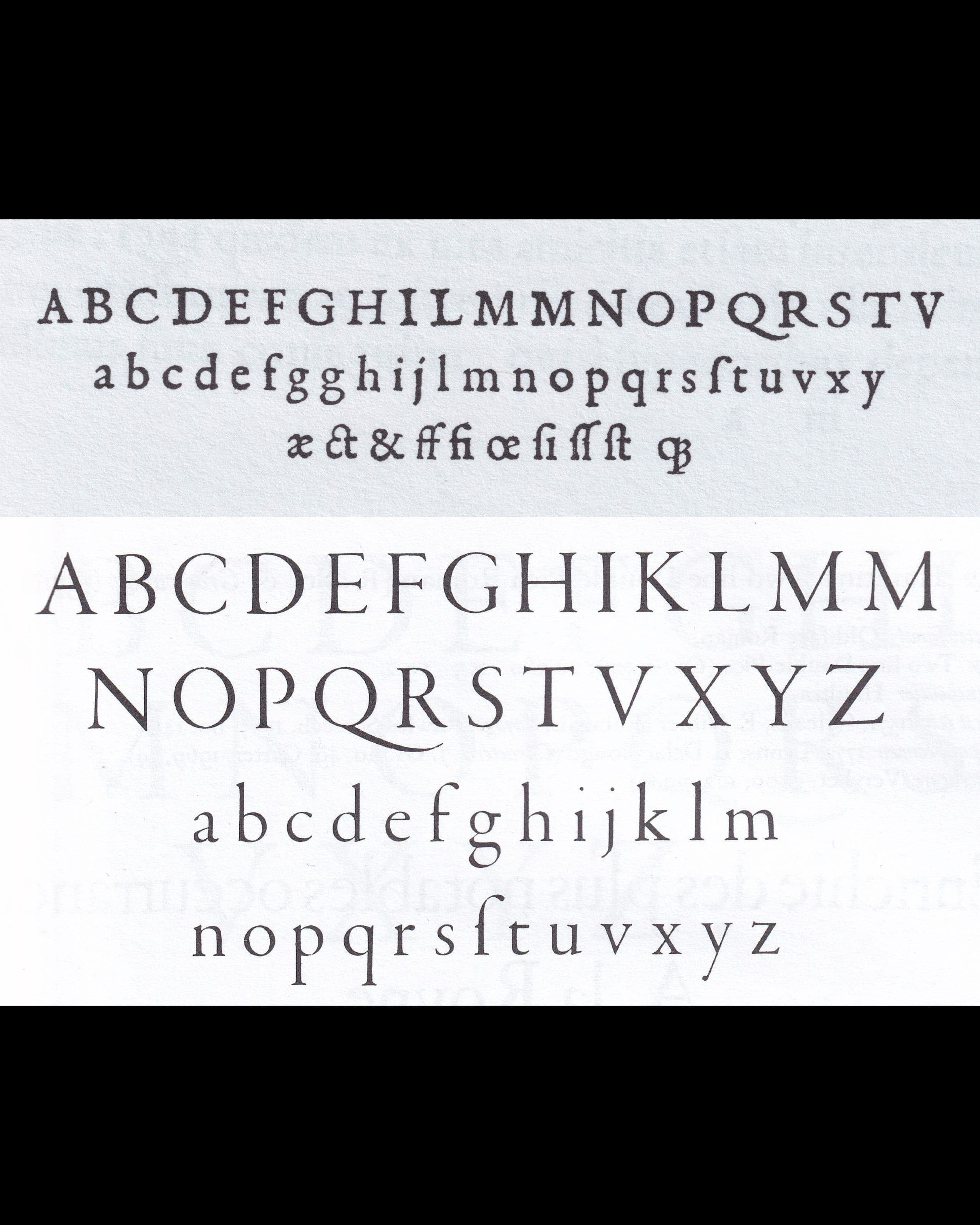
The transition from Bembo Roman to Old-face Roman was not a sudden replacement of one clearly defined style by another. Instead, different formal conventions remained visible and could coexist during the period in which Old-face Romans were developing. The capital M provides one of the clearest examples of this transition. Hendrik D. L. Vervliet distinguishes between Jenson Roman, Bembo Roman, and Old-face Roman through a number of characteristic letterforms. For the Bembo Roman, he identifies, among other features, „an M that is one-eared and lacking a right-hand upper serif“.French Renaissance Printing Types: A Conspectus. London/New Castle, Oak Knoll Press, 2010, S. 55. In contrast, the Old-face Roman retains many characteristics of the Bembo tradition but develops an M that „becomes… read more
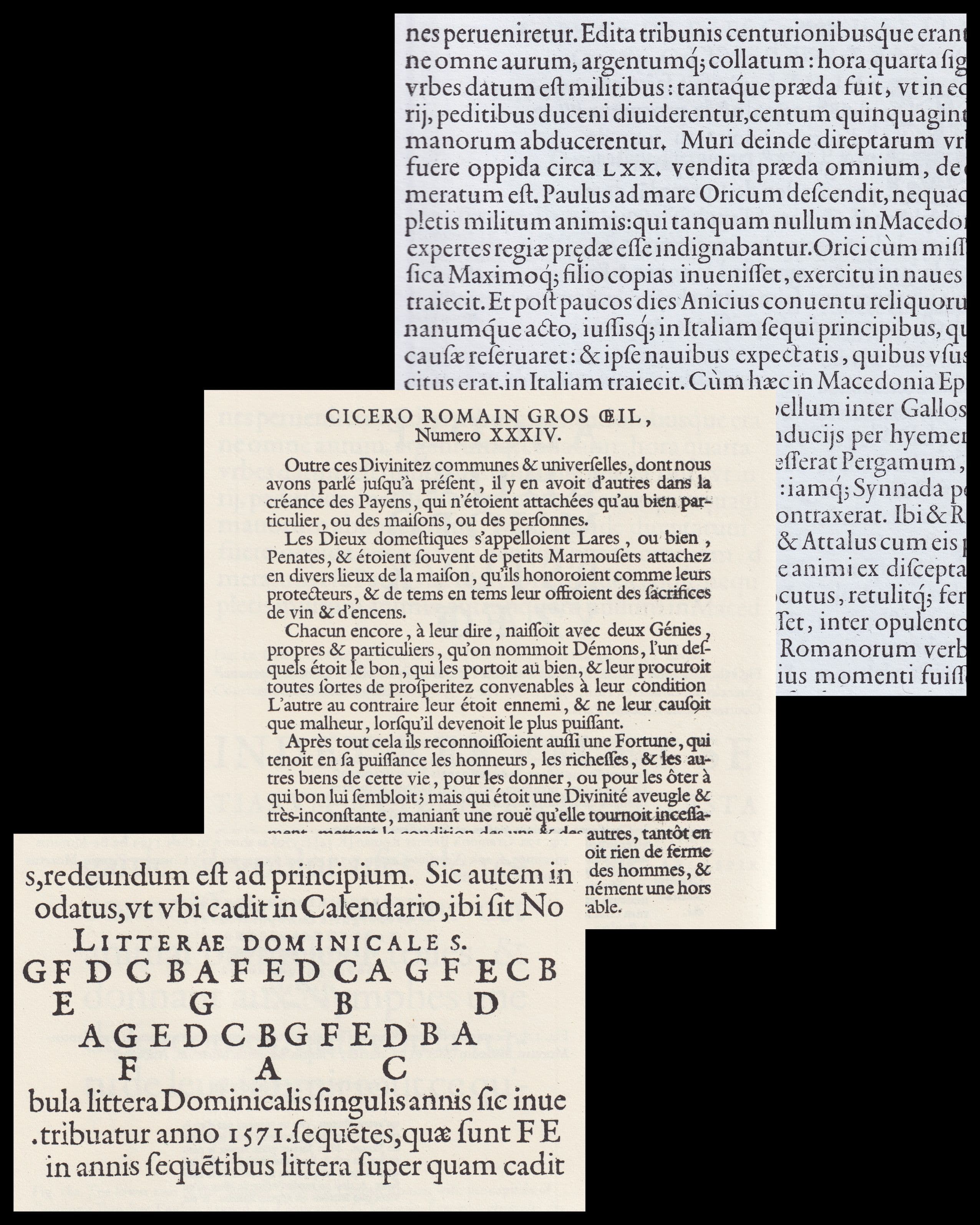
- img-015 Robert Granjon, Great Primer Roman (1551)
- img-016 Letter M development – Jenson, Bembo, Old-face
- img-017 Transitional M – variations
- img-018 Colines’s Saint Augustin (1533) / Garamont’s Gros-canon (1549)
- img-019 Granjon’s Double Pica Roman (1570), Pica Roman (1569), Great Primer Roman (1566)
- img-020 Granjon’s Great Primer Roman (1566), Double Pica Roman (1570), Pica Roman (1569)
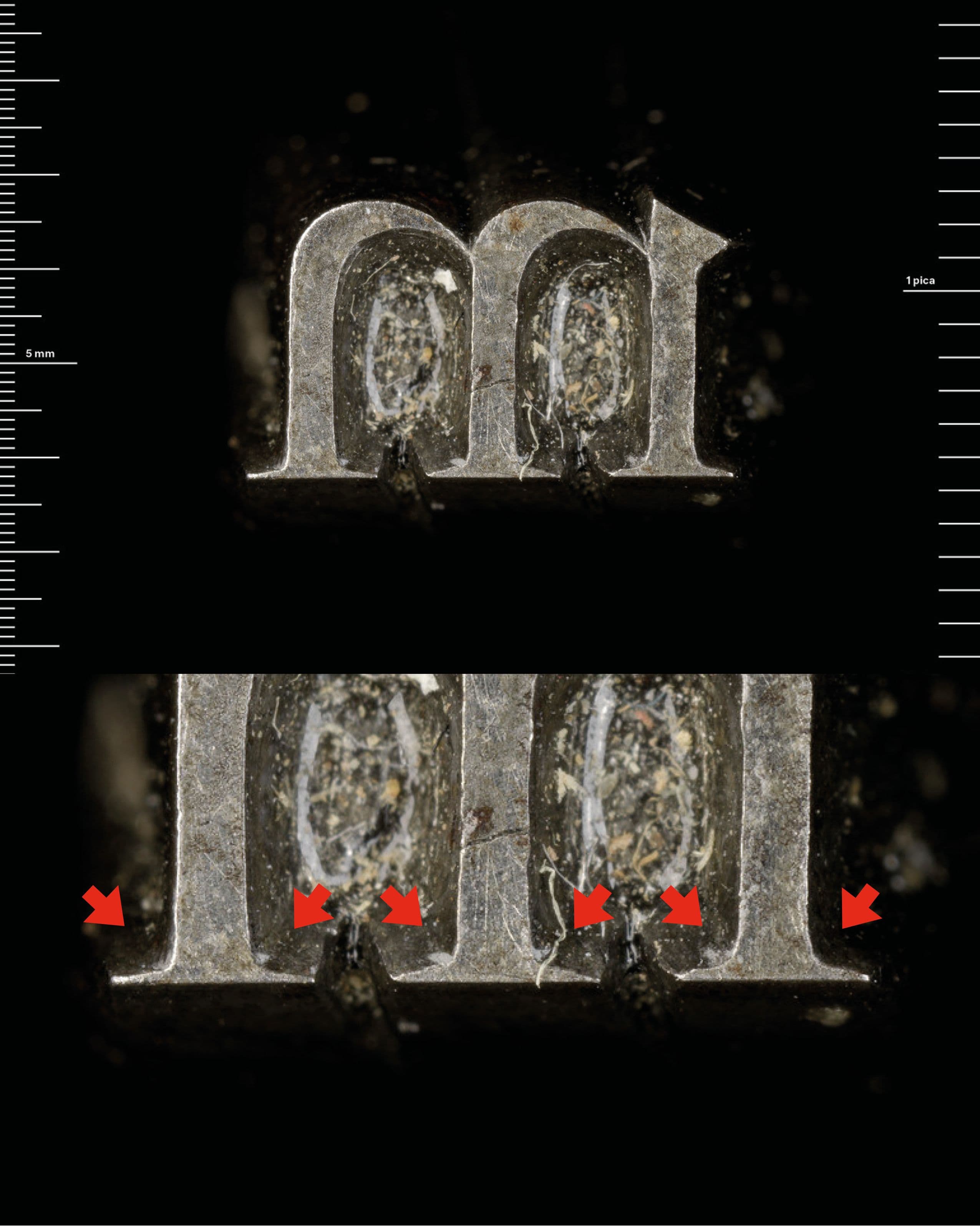
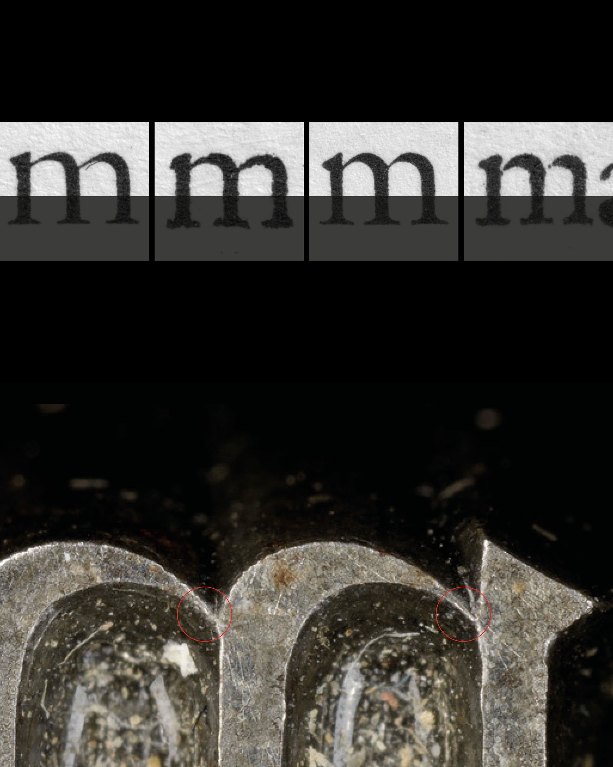
- img-021 Stempel, Granjon, Museum Plantin-Moretus, object no. MPM_ST_009
- img-022 Granjon’s Serif – Great Primer Roman (1566), Double Pica Roman (1570)
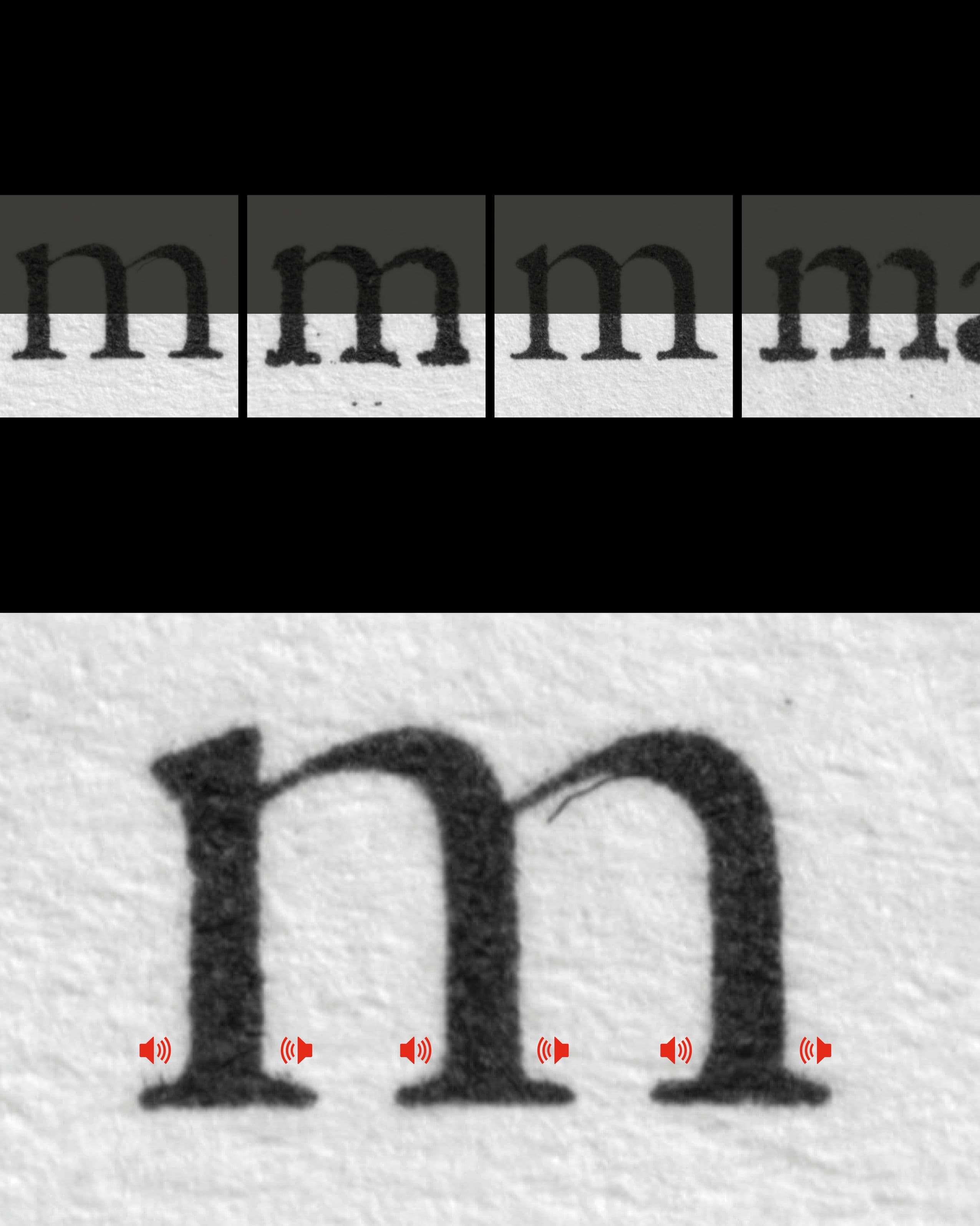
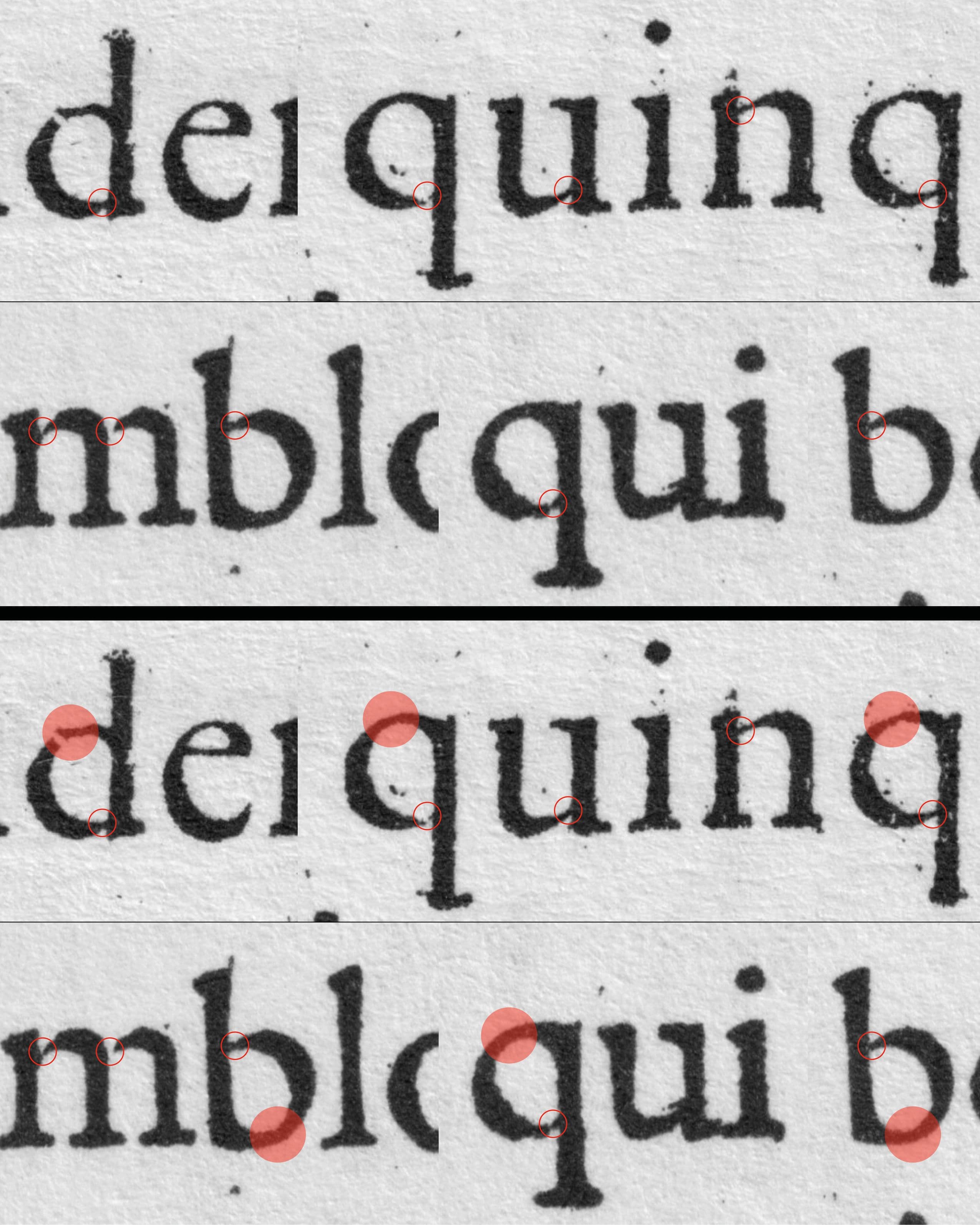
- img-023 Granjon’s Junctions – Great Primer Roman (1566), Double Pica Roman (1570)
- img-024 Granjon’s Great Primer Roman (1566), Double Pica Roman (1570)
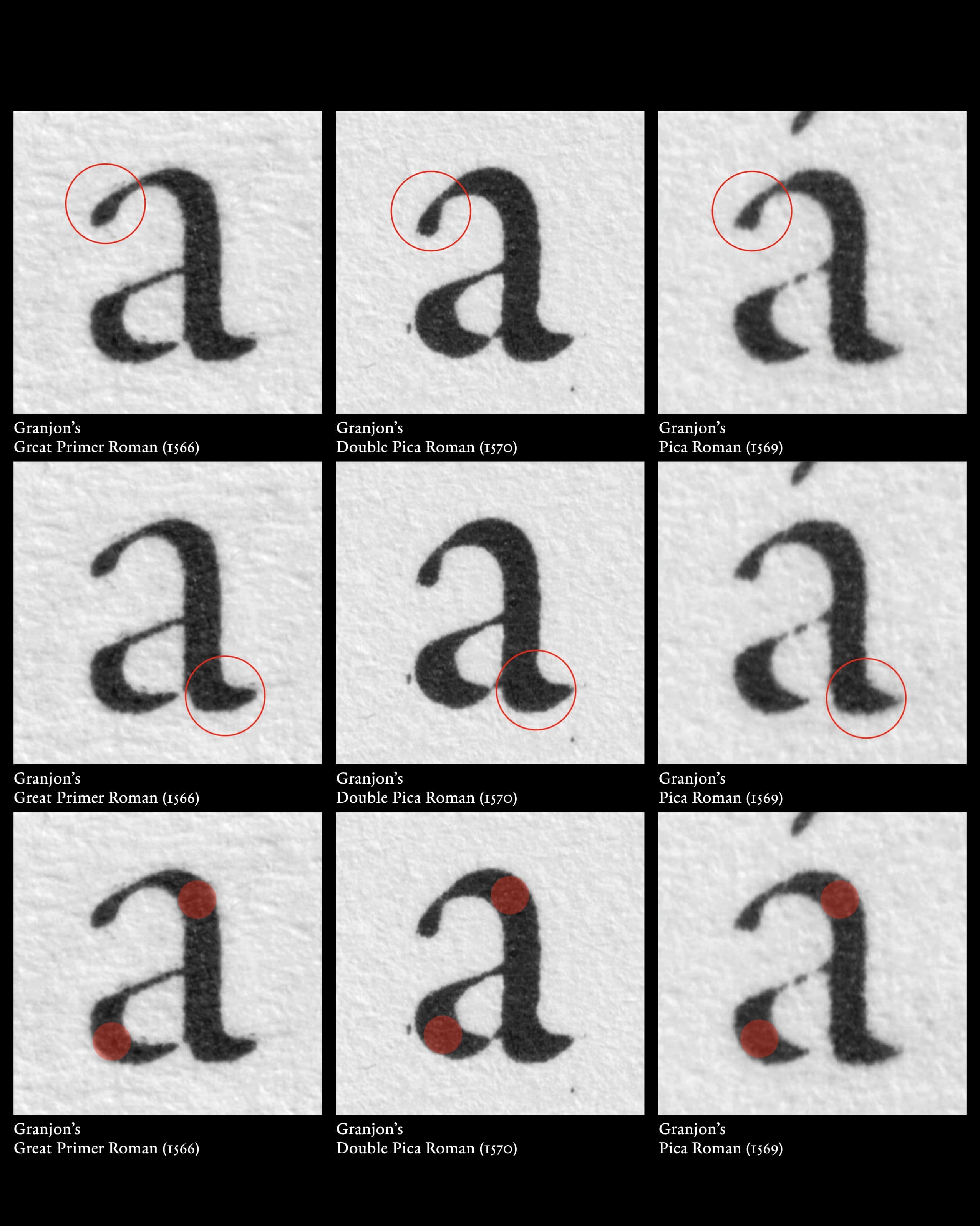
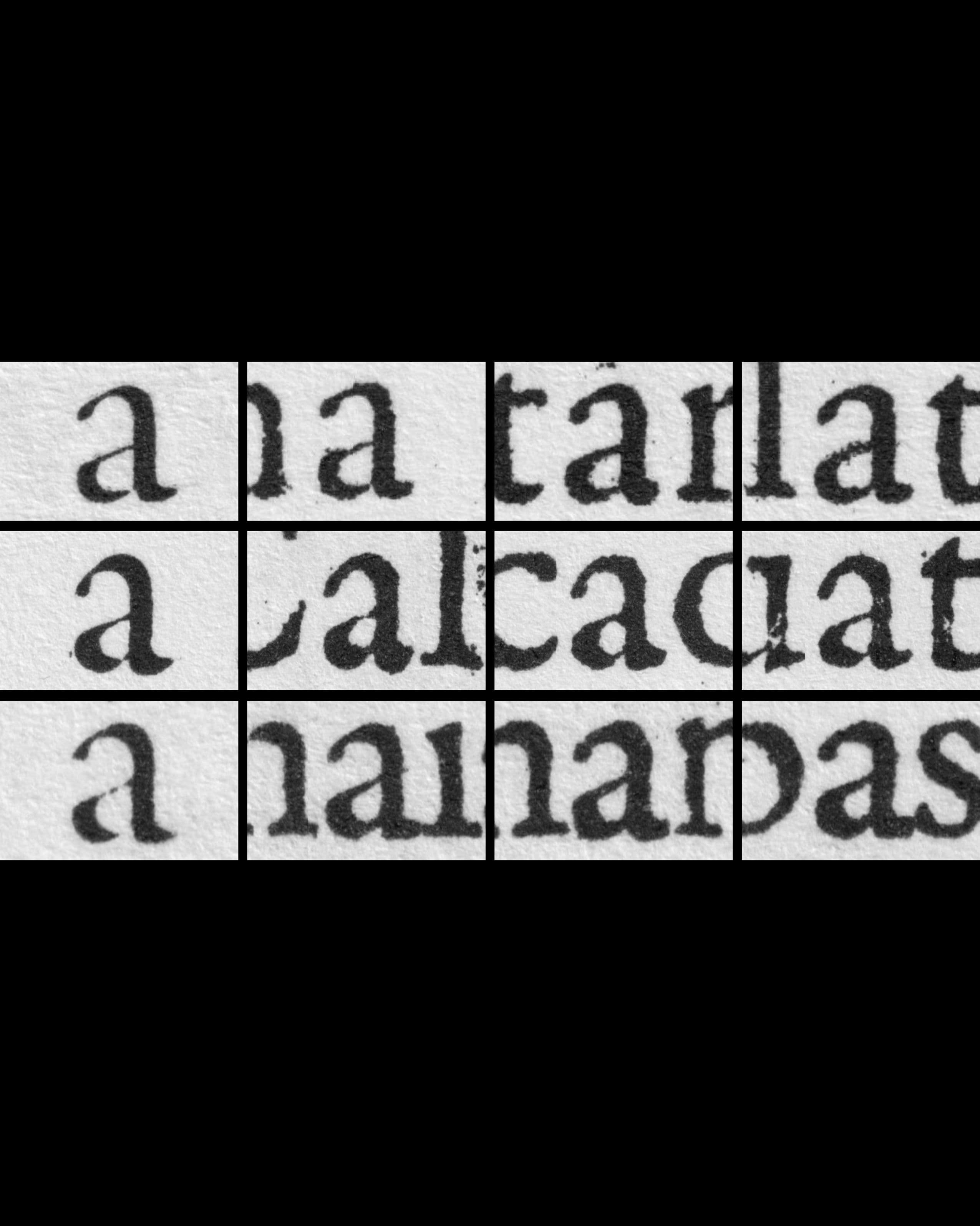
- img-025 Granjon’s lowercase a – Great Primer Roman (1566), Double Pica Roman (1570), Pica Roman (1569)
- img-026 Granjon’s lowercase a – Great Primer Roman (1566), Double Pica Roman (1570), Pica Roman (1569)
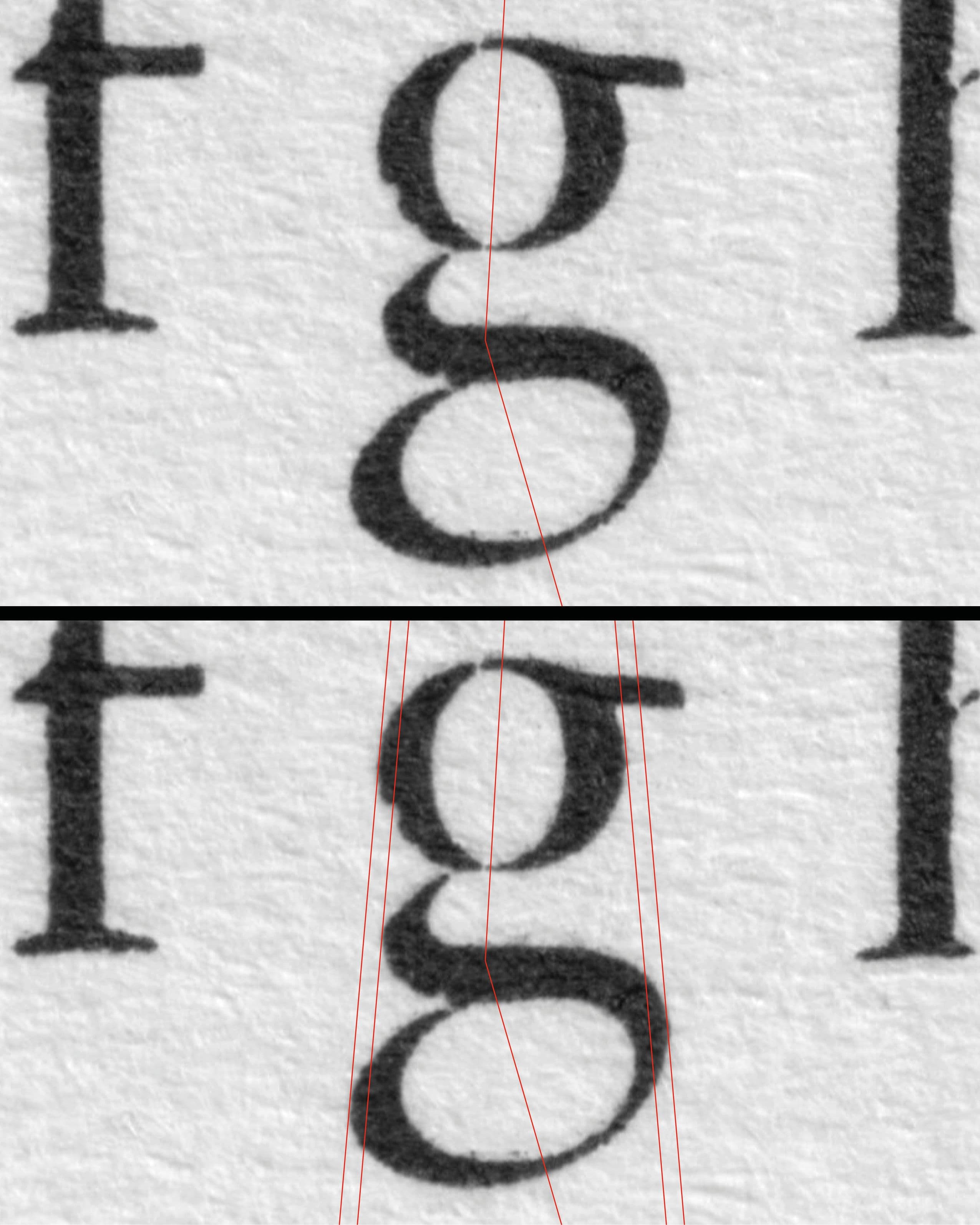
- img-027 Granjon’s Great Primer Roman (1566) – lowercase g
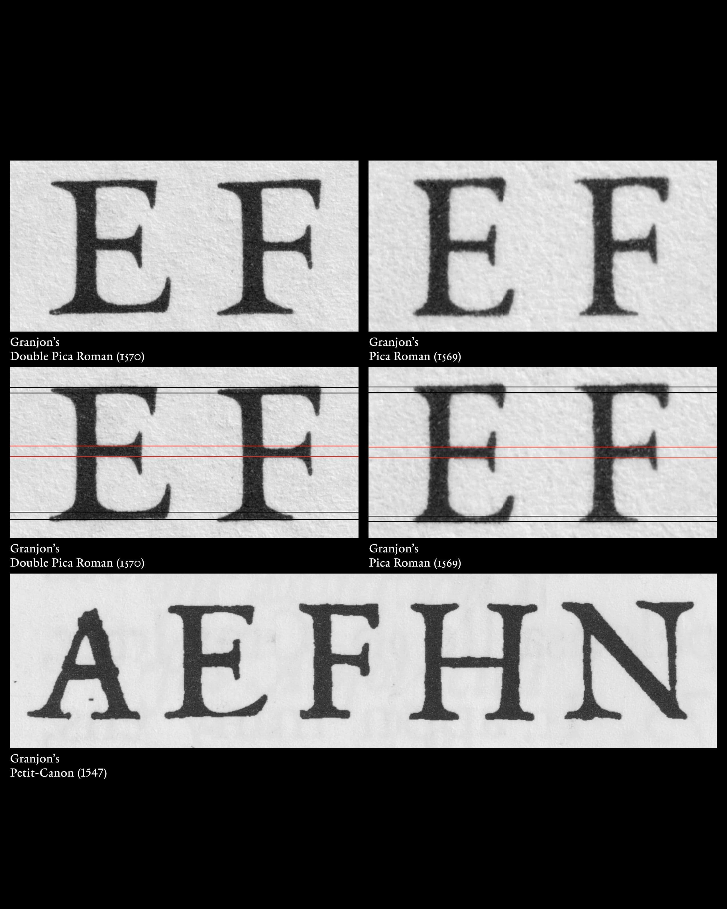
- img-028 Granjon’s hoizontal weights – Double Pica Roman (1570), Pica Roman (1569), Petit-Canon (1547)
![Boissard, Jean-Jacques. Pars Romanae Urbis Topographiae [...] , 1597.](/_next/image?url=https%3A%2F%2Fcdn.sanity.io%2Fimages%2F4h23sl44%2Fproduction%2F43e3da7e649737b88dcfb4207b206a55c01698db-2551x3189.jpg&w=3840&q=75&dpl=dpl_9QqWWDHTnBtFtKdAKvdUyCPocMt1)