- [01]
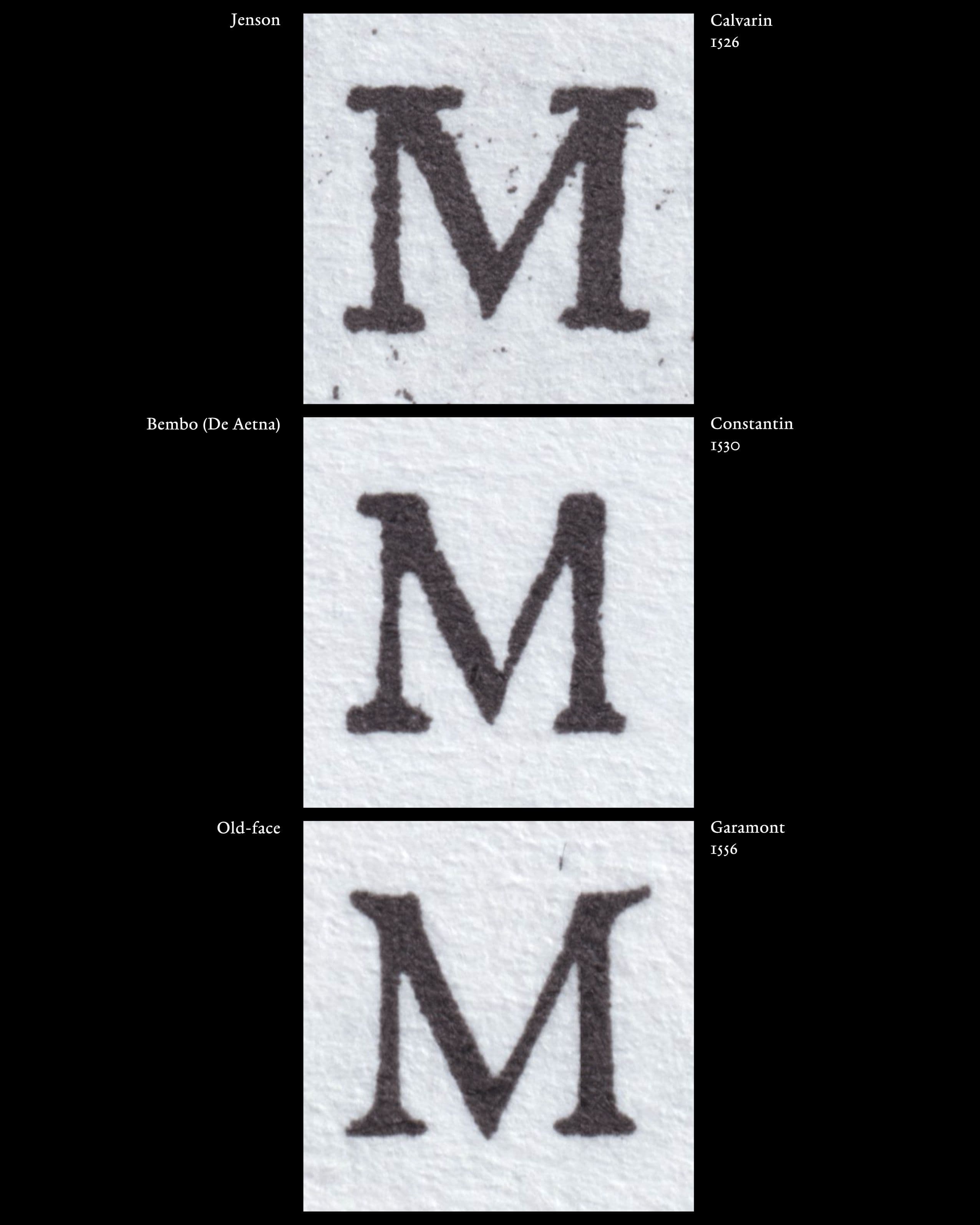
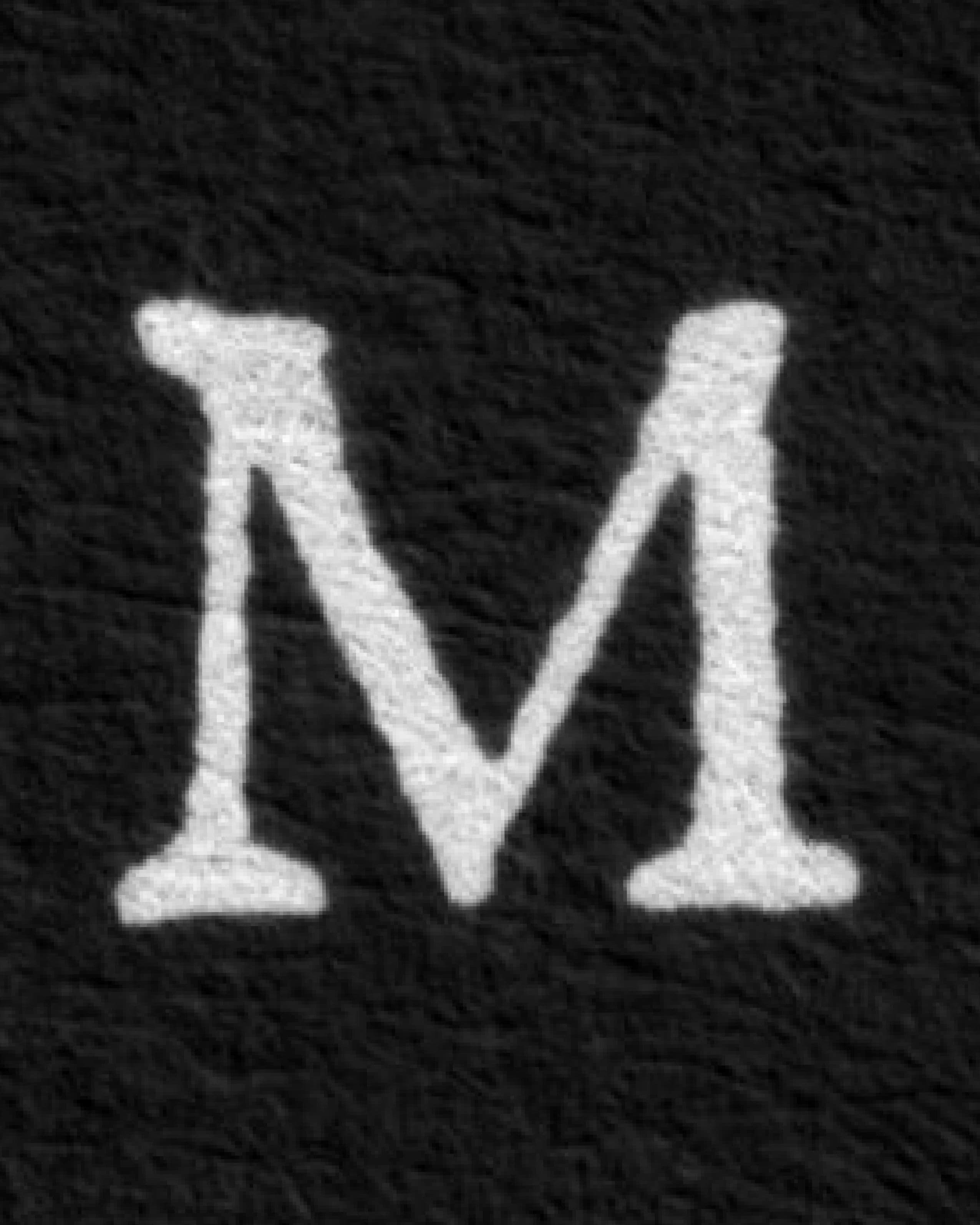
The transition from Bembo Roman to Old-face Roman was not a sudden replacement of one clearly defined style by another. Instead, different formal conventions remained visible and could coexist during the period in which Old-face Romans were developing. The capital M provides one of the clearest examples of this transition. Hendrik D. L. Vervliet distinguishes between Jenson Roman, Bembo Roman, and Old-face Roman through a number of characteristic letterforms. For the Bembo Roman, he identifies, among other features, „an M that is one-eared and lacking a right-hand upper serif“. In contrast, the Old-face Roman retains many characteristics of the Bembo tradition but develops an M that „becomes winged and outwardly seriffed,“ a form that subsequently became standard.
- [02]
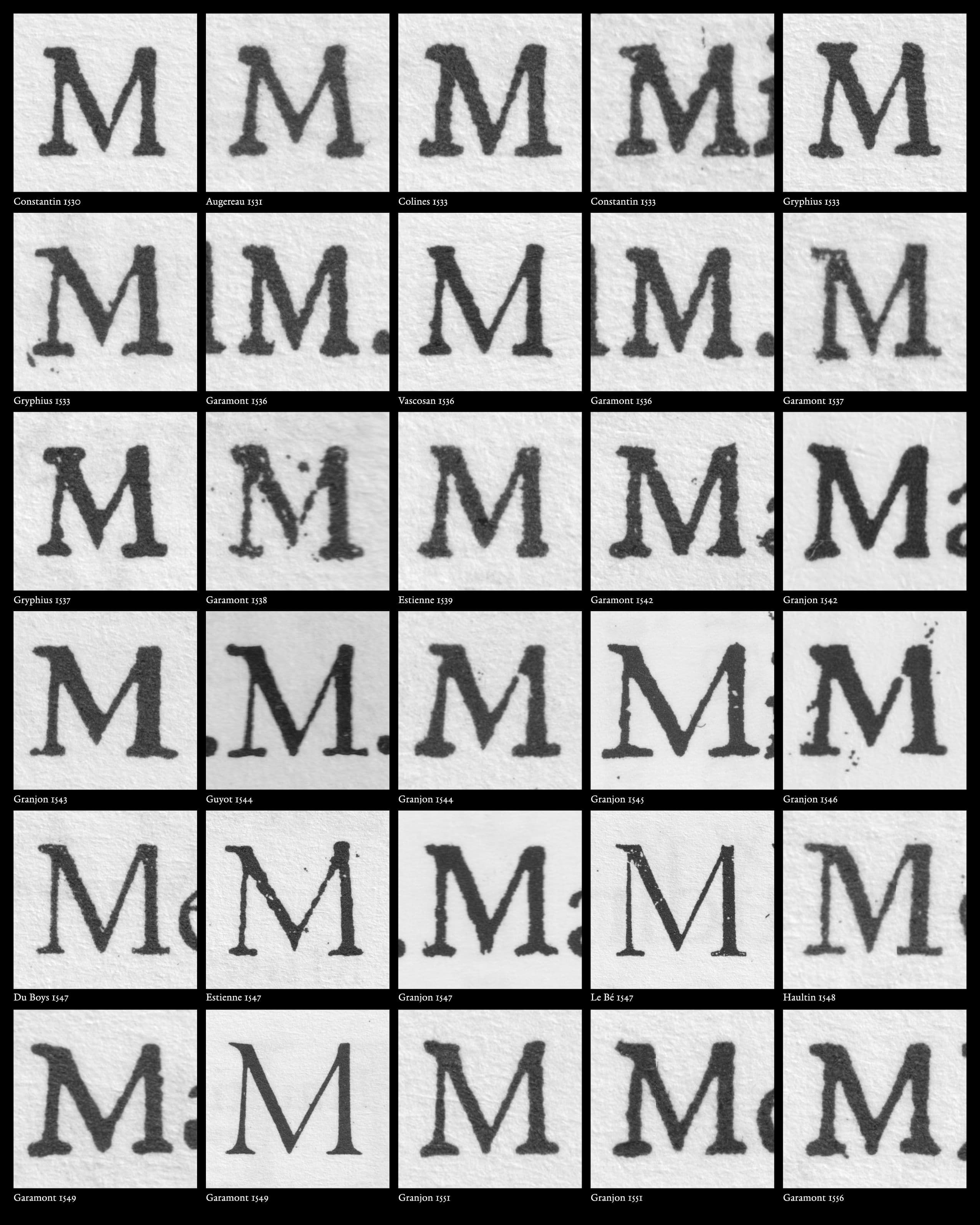
The M can therefore be understood as a particularly visible marker of the transition from Bembo to Old-face Roman. The difference is concentrated in a small but highly recognisable part of the capital: the treatment of the upper serifs (or their absence). The one-eared M preserves the characteristic Bembo construction, while the outwardly seriffed form belongs to the emerging Old-face vocabulary.This distinction becomes especially interesting when looking at several typefaces from approximately the 1530s to the 1560s. It shows that the transition did not happen uniformly across typefaces. Different punchcutters and different type designs could retain the older one-eared M while other Roman forms were already moving towards the Old-face model. Conversely, the newer M could appear in typefaces whose other characteristics still retain elements of the earlier Bembo vocabulary.
- [03]
The two visual examples used here show that different typefaces from this period can contain both conventions: the one-eared M associated with the Bembo tradition and the two-eared, outwardly seriffed M associated with the developing Old-face Roman. This coexistence is particularly important for the period between approximately 1530 and 1550. Rather than representing a single chronological change that affected all typefaces at the same moment, the visual evidence suggests a period in which different constructions of the M remained in use simultaneously.
The transition from Bembo to Old-face Roman should therefore not be understood as a clean chronological sequence in which one complete model disappears before another begins. Instead, older and newer conventions could remain available concurrently, across different typefaces and, in some cases, within the same typeface. The M makes this historical layering particularly visible. Because the difference between the two constructions is immediately recognisable, it provides a useful way of locating individual typefaces within this period of transition. Given that Robert Granjon’s most important stage of development took place in that time, one can clearly recognize this process of transition in Robert Granjon’s work. Rather than treating the M as an isolated historical feature found in the Romans and Italics of Granjon, it can be used as an entry point into understanding the approach of his work. - [04]
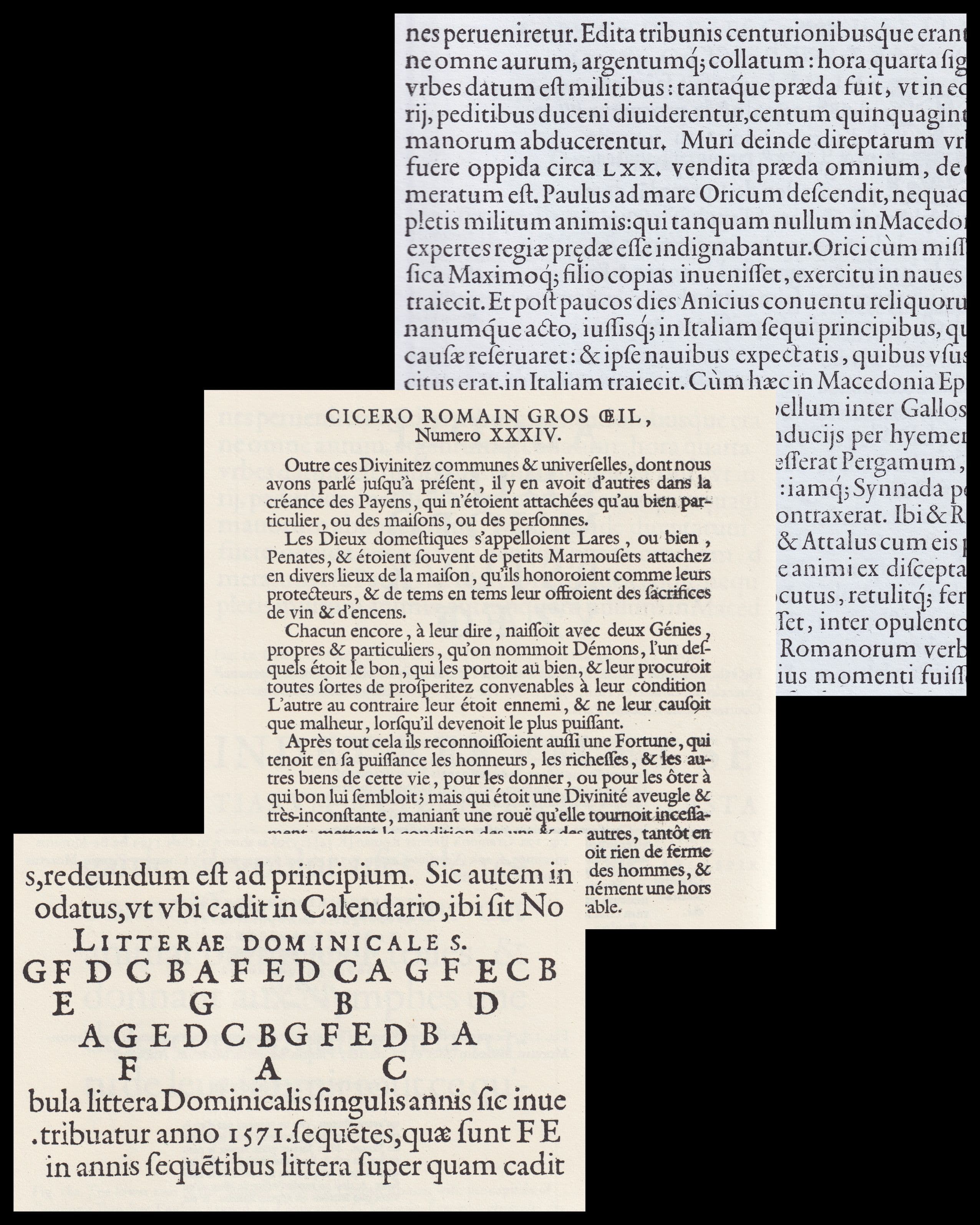
Robert Granjon’s Roman types played a significant role in the broader development of French Renaissance Types. Hendrik D. L. Vervliet distinguishes an early group of Granjon Romans from 1542–1550 and a later group from 1566–1583. He characterises the later Romans as „coherently and brilliantly designed,“ with „Baroque refinement, vitality and vigor“. The three Roman types considered here belong to this later period: the Second Great Primer Roman of 1566, the Pica Roman of 1569, and the Double Pica Roman of 1570. These three cuts provide a useful basis for formal comparison because they allow recurring principles to be observed across different sizes. Rather than treating each typeface as an isolated design, they can be read as variations within Granjon’s developing Roman vocabulary.
- [05]
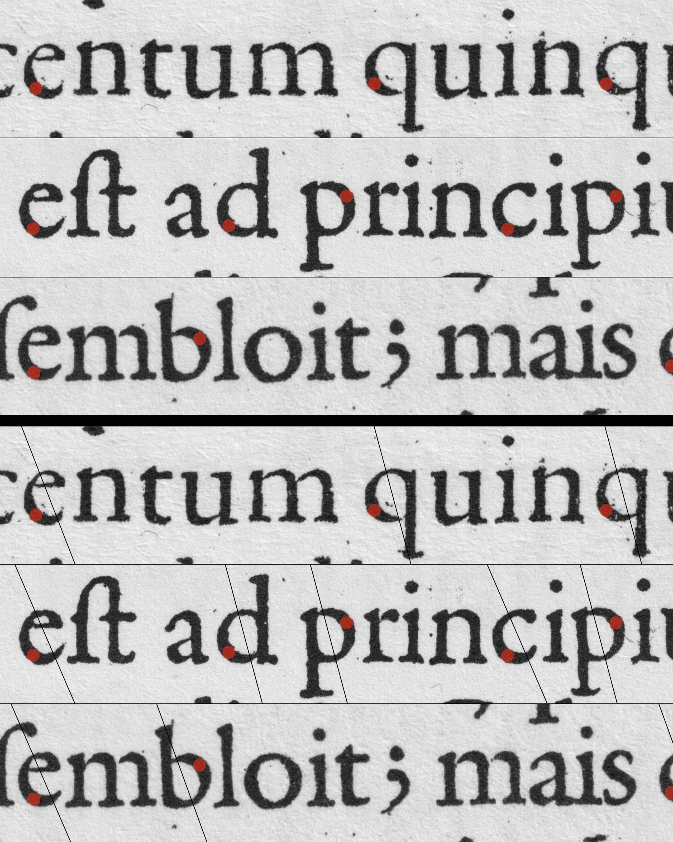
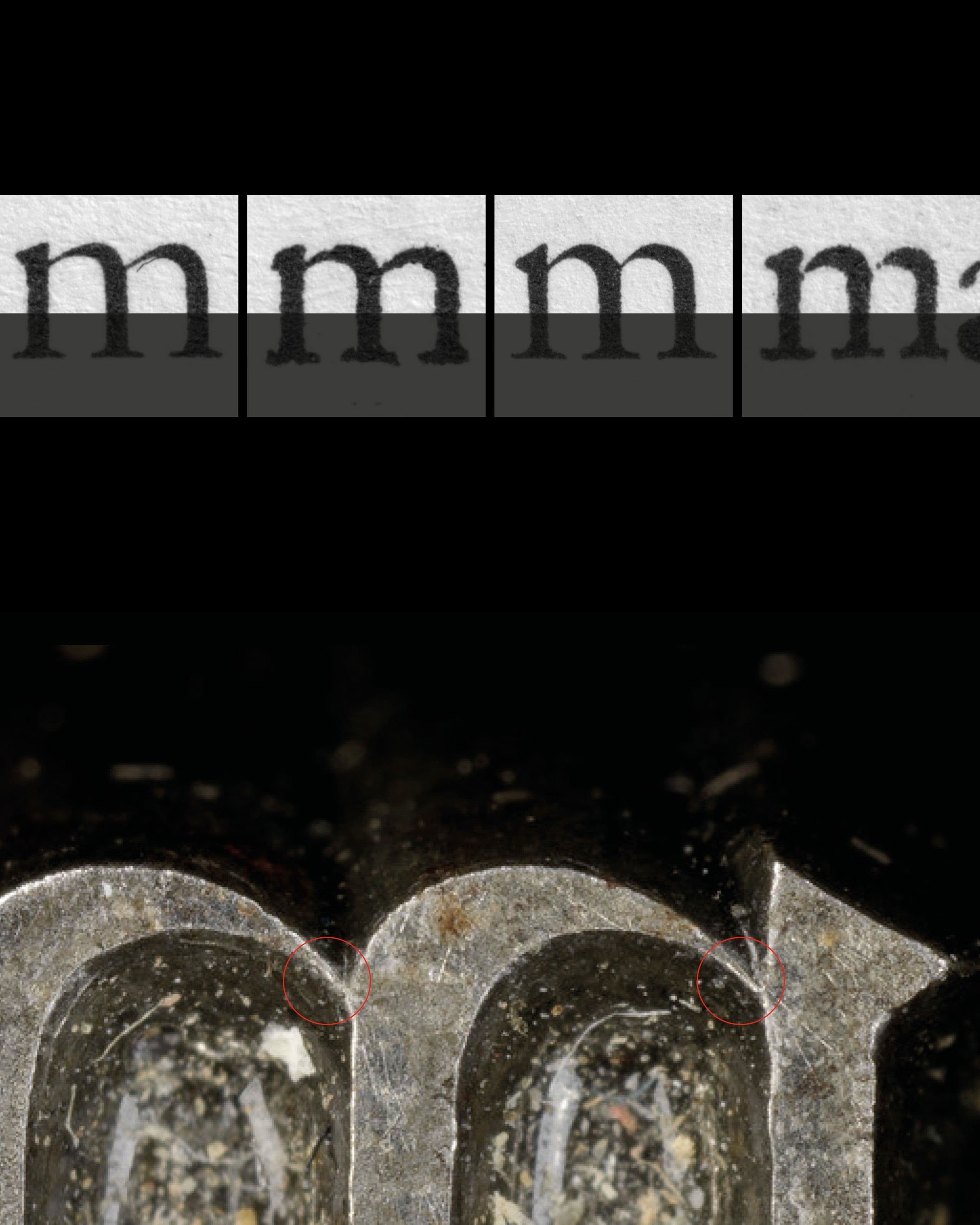
One of the most striking characteristics across Granjon’s Roman types is the distribution of weight. In rounded lowercase letters such as b, d, p, q, e, and c, the stress is relatively steeply placed. The angles that the countershapes imply are based on the movement of this ductus and give the letters a pronounced internal orientation. This means that the apparent weight of a letter does not come only from the thickness of its main stems. Curves, shoulders, joins, and intermediate strokes all participate in establishing the visual rhythm of the typeface.
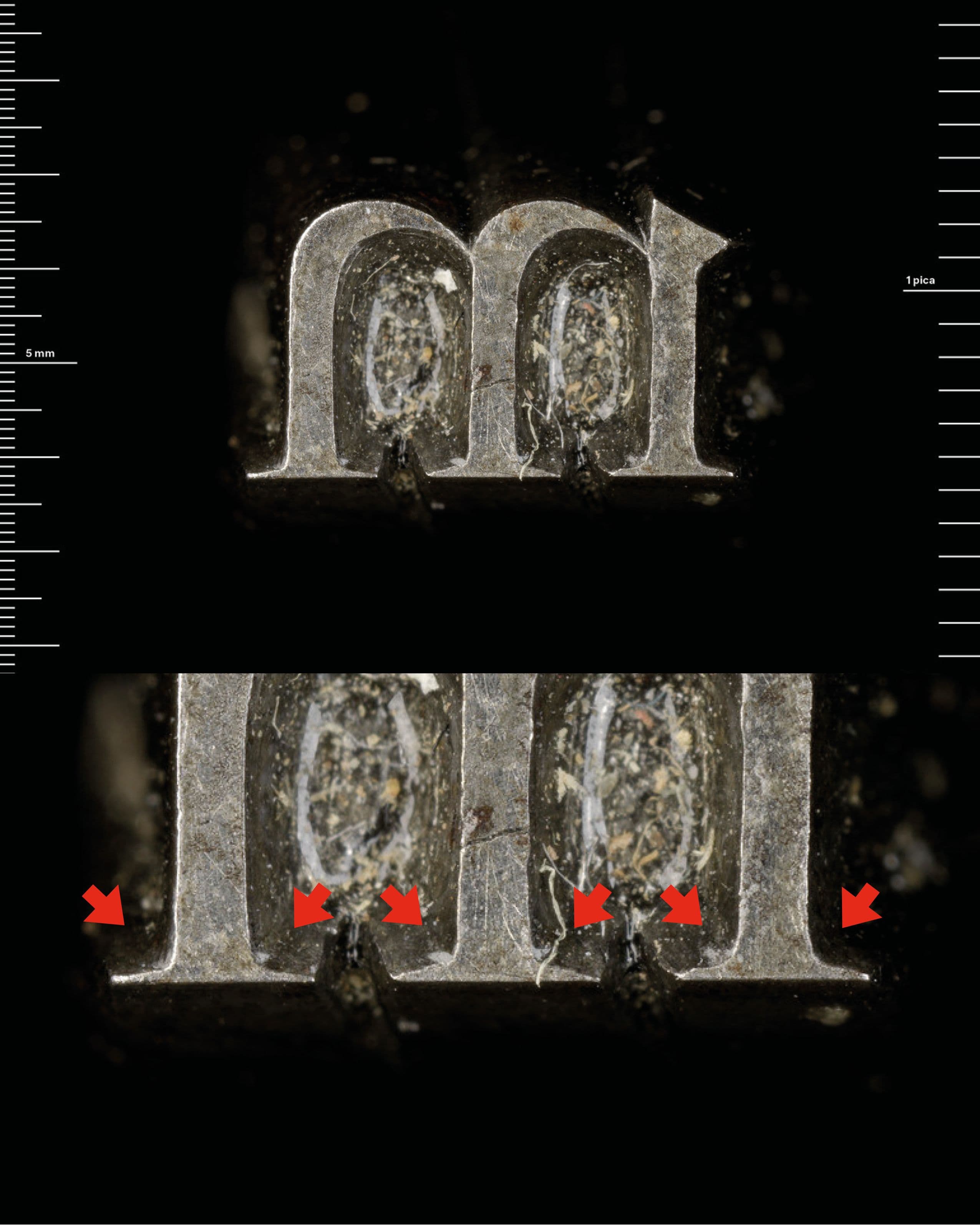
The shoulders of Granjon’s lowercase forms are particularly important. They often carry considerable weight, giving the letters a powerful and compact appearance. At the same time, this weight is carefully controlled: the forms do not simply become uniformly heavy, but distribute mass according to the movement of the letter. This relationship between ductus and weight helps explain why Granjon’s Romans can appear energetic without becoming unstable. The letters retain the proportions and relative order expected of a Roman, but their internal distribution of weight produces a stronger sense of movement. - [06]
Another characteristic of Granjon’s Romans can be found in the treatment of the serifs. Rather than fitting neatly into a simple opposition between rounded and square serifs, many of the serifs contain a degree of ambiguity. Depending on the scale and reproduction quality, their inner edges can appear angular, rounded, or almost linear. This is partly a consequence of the extremely fine cutting of the forms. The serif is not simply a geometric addition to the stem; its shape interacts with the pressure of printing and the surrounding white space.
- [07]
This produces a kind of visual „noise“ within the serif. At a large scale, the inner edge can appear relatively hard and angular, while at smaller text sizes the slightly softened upper edge can make the same form appear more rounded. The ambiguity is therefore not necessarily a lack of precision. On the contrary, it can be understood as a consequence of cutting a form finely enough that it remains optically functional under different printing conditions.
- [08]
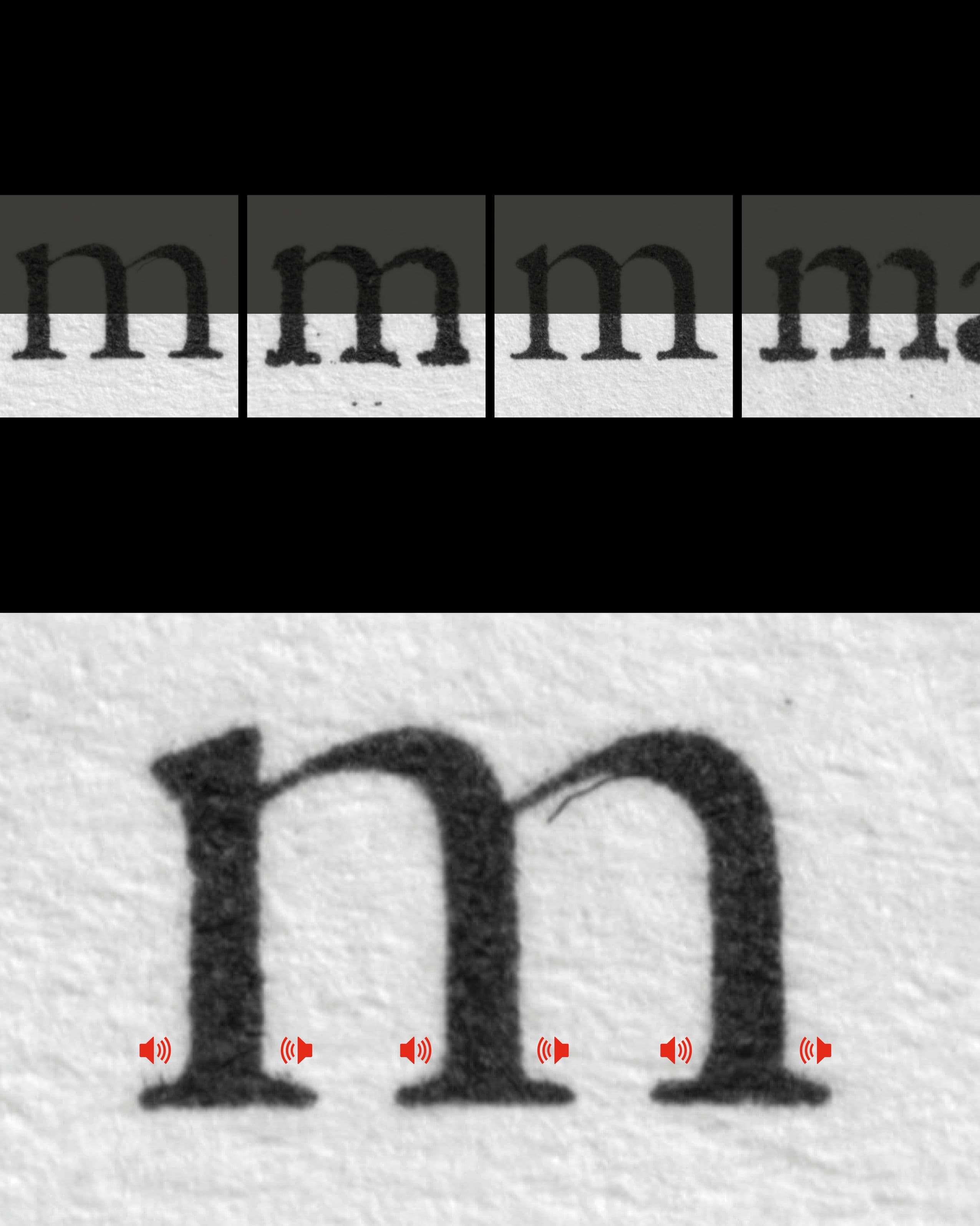
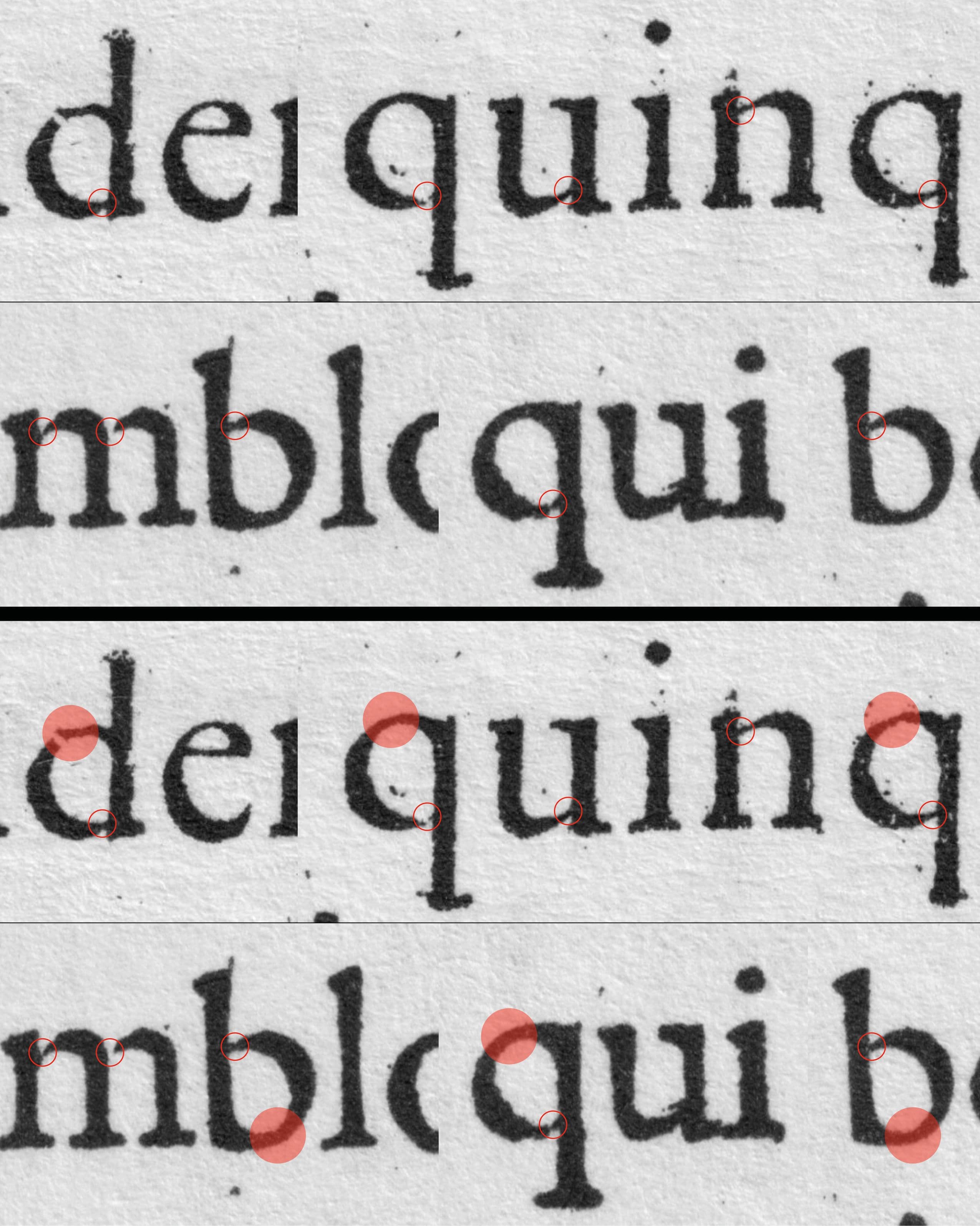
Another characteristic of Granjon’s Romans is the treatment of the junctions. The transitional areas where the stem meets the shoulder. These areas are cut particularly finely. Their delicate treatment can be understood in relation to the conditions of Renaissance printing: even when the amount of ink or the pressure of the press varied, the letter still needed to remain clearly recognizable.
- [09]
The junctions are therefore not isolated details, but part of a larger relationship between the different weights within the letter. They create a visual dialogue with the intermediate weights on the opposite side of the shape. These intermediate weights are just as important to the construction of Granjon’s letters as the heavier stems and curves. Rather than understanding the letter only through its strongest and weakest strokes, its form can be read through the interaction between these different levels of weight. This relationship becomes particularly relevant when considering the letters as printed forms. The fine junctions and the surrounding intermediate weights distribute visual information across the structure of the letter instead of concentrating it only in the main strokes. This helps the forms remain distinguishable even when the conditions of reproduction might change.
- [10]
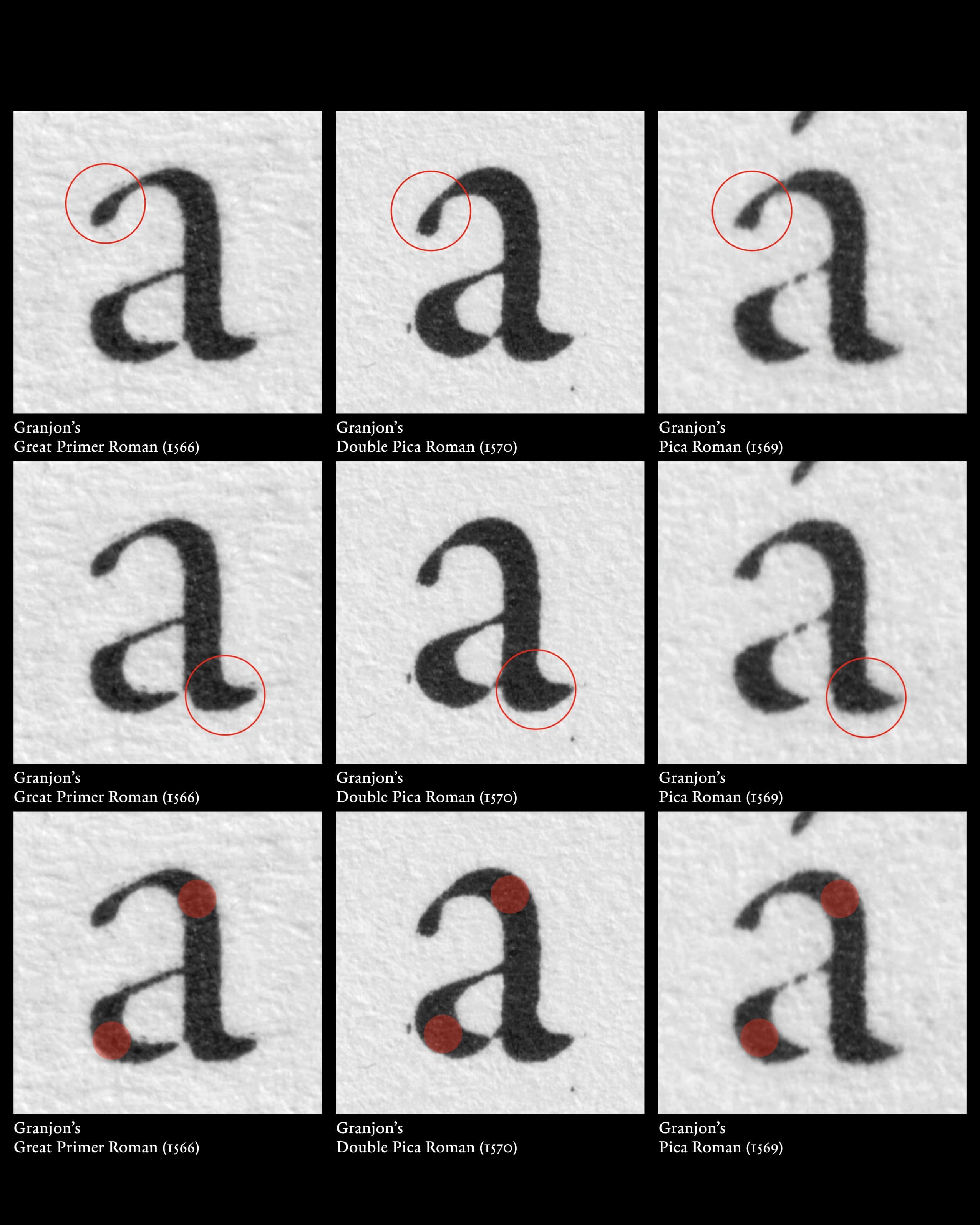
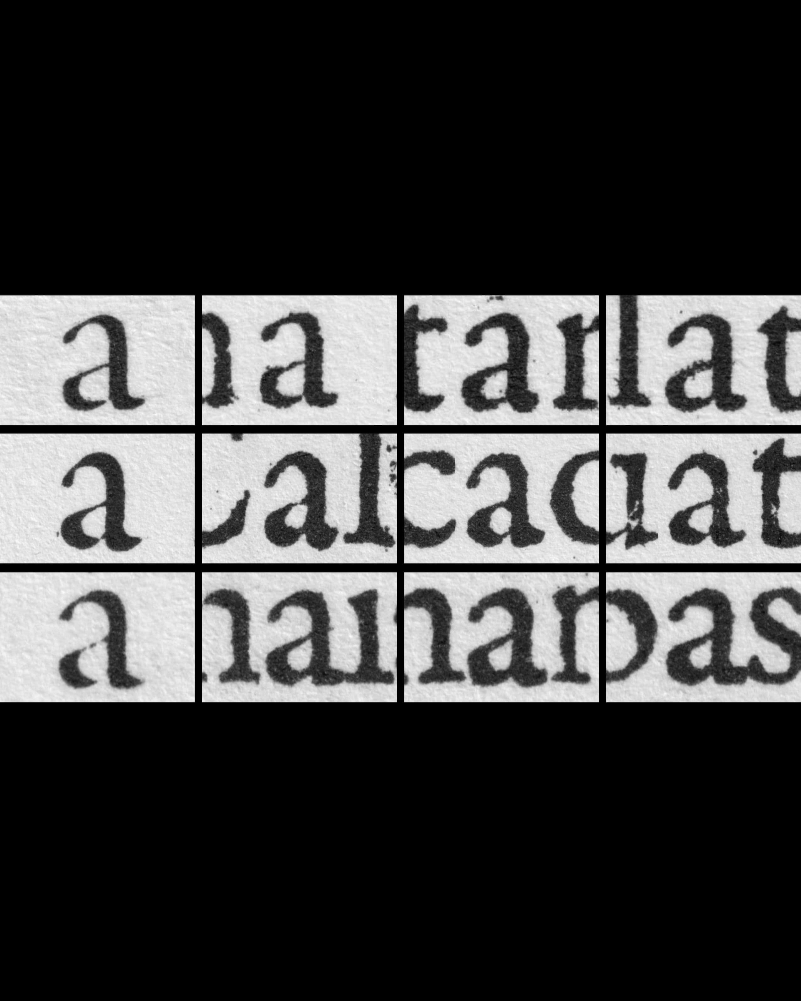
The lowercase a and g are perhaps among the most characteristic shapes in Granjon’s Romans. The a can be recognized immediately by its relatively small drop. Its tail is generally kept rather flat, leaving the principal emphasis of the letter to the diagonally positioned weights above and below the counter. Rather than relying on a strongly articulated terminal or a large drop, the form derives much of its character from the distribution of these diagonal weights within the letter. Depending on the printing quality, the small drop can become visually absorbed into the surrounding stroke. What remains is therefore less a clearly isolated detail than an implication of a drop.
- [11]
This construction is particularly revealing of the way Granjon balances weight within his lowercase forms. The relatively restrained terminal allows the upper and lower diagonal strokes to carry the visual emphasis, producing a form that remains compact while still having a strong internal rhythm. These characteristics may also have provided a point of reference for Hendrick van den Keere’s Roman types.
- [12]
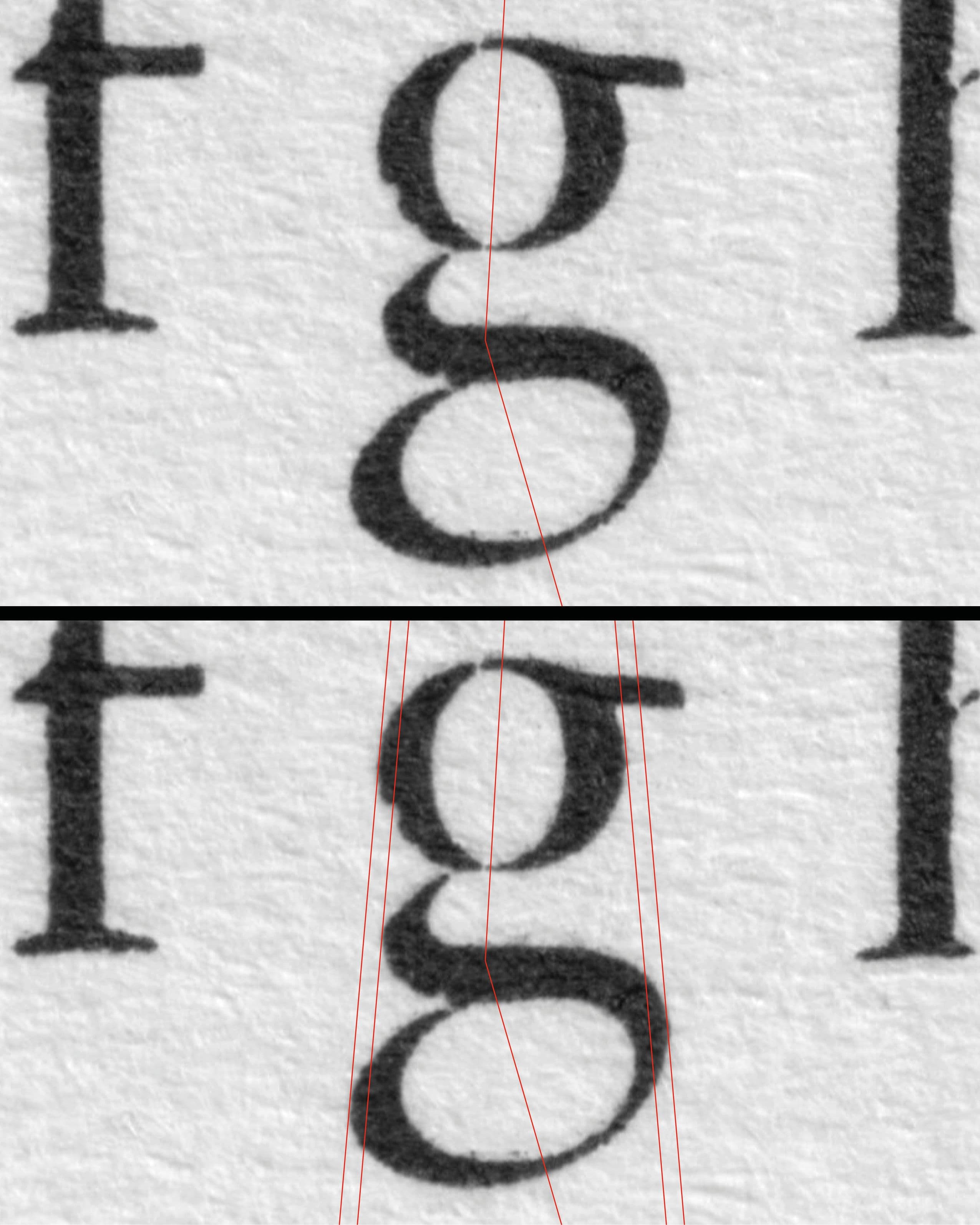
The g of Granjon’s Great Primer Roman is another particularly distinctive form. Its upper counter is inclined towards the right, a direction that is highly unusual for typefaces of this period. The lower counter, by contrast, follows the more conventional calligraphic ductus of the typeface. These two internal movements could easily make the letter feel visually unbalanced, yet Granjon counteracts this through the symmetrical alignment of the outer contour. The exterior form therefore brings the two contrasting counters into balance and gives the g a remarkably coherent overall structure.
- [13]
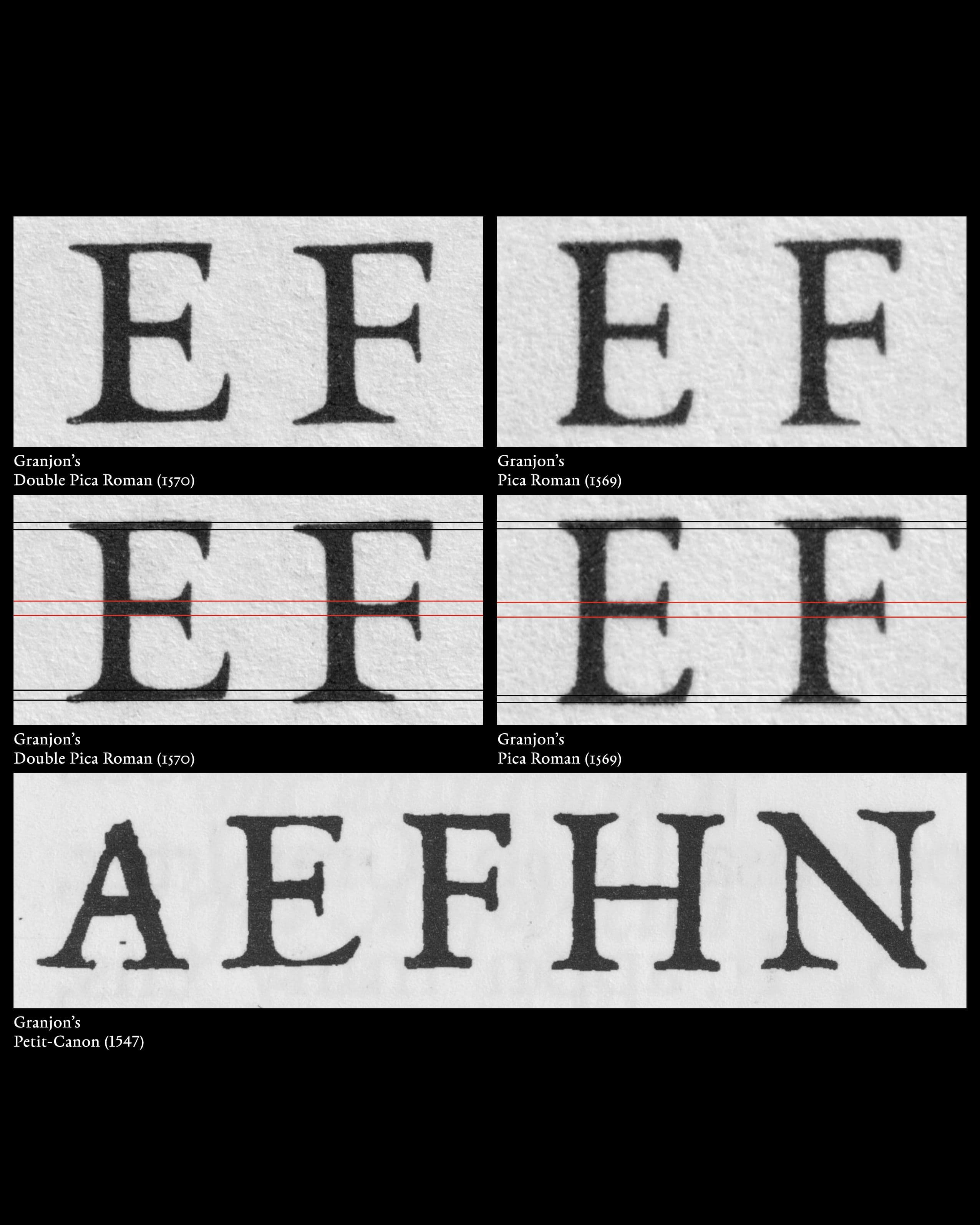
Some capitals also demonstrate Granjon’s unique approach in the distribution of weight. Their middle horizontal strokes can be relatively heavy, producing a strong internal emphasis within the capital. This feature can be also found in earlier Garamont Romans.This heavier middle stroke also has a functional effect. Because the horizontal can carry more visual weight, the serifs at its ends do not need to become excessively long or prominent. The result is a more open and legible construction. This feature is very clearly apparent in Granjon’s Petit-Canon (1547).
Returning to the M makes it possible to connect the historical transition with the formal analysis. The one-eared M is useful because its construction makes historical continuity immediately visible. It carries an earlier Bembo convention into a period in which other parts of the alphabet are moving towards forms associated with the Old-face Roman. The comparison of multiple typefaces from the 1530s to the 1550s also shows that these conventions could exist simultaneously. The one-eared M does not necessarily indicate that an entire typeface belongs exclusively to the Bembo tradition. Likewise, the appearance of the outwardly seriffed M does not mean that every other letter has already adopted a fully developed Old-face vocabulary. The important point is therefore not to classify a typeface solely according to its M, but to use the M as a visible indicator of a much broader process. It reveals that historical layers can coexist within a typographic system while the alphabet as a whole is undergoing formal change. What appears at first to be a single historical change is therefore better understood as a process of negotiation with inherited shapes.
- [01]Letter M development – Jenson, Bembo, Old-face
- [02]Transitional M – variations
- [03]Colines’s Saint Augustin (1533) / Garamont’s Gros-canon (1549)
- [04]Granjon’s Double Pica Roman (1570), Pica Roman (1569), Great Primer Roman (1566)
- [05]Granjon’s Great Primer Roman (1566), Double Pica Roman (1570), Pica Roman (1569)
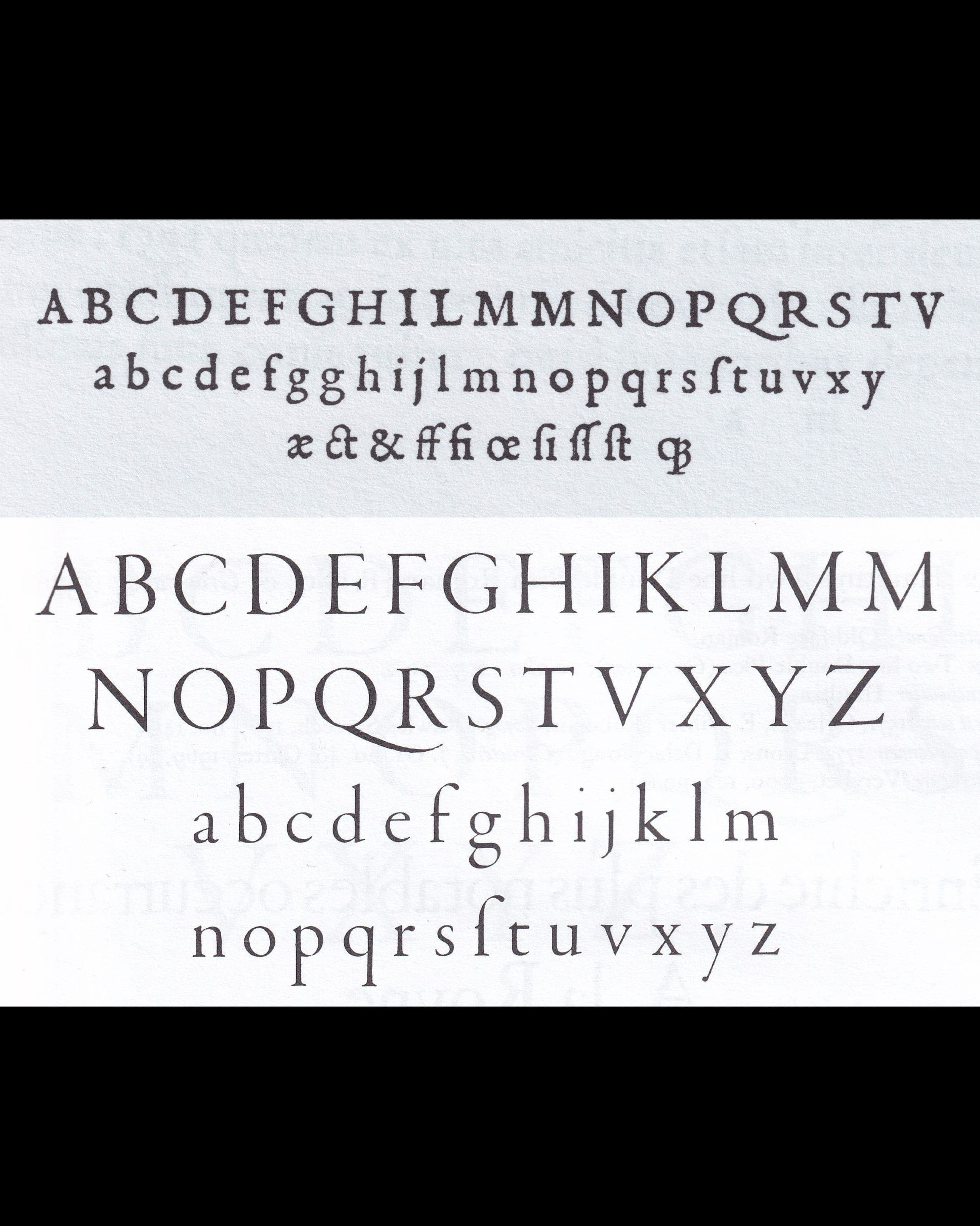
- [06]Stempel, Granjon, Museum Plantin-Moretus, object no. MPM_ST_009
- [07]Granjon’s Serif – Great Primer Roman (1566), Double Pica Roman (1570)
- [08]Granjon’s Junctions – Great Primer Roman (1566), Double Pica Roman (1570)
- [09]Granjon’s Great Primer Roman (1566), Double Pica Roman (1570)
- [10]Granjon’s lowercase a – Great Primer Roman (1566), Double Pica Roman (1570), Pica Roman (1569)
- [11]Granjon’s lowercase a – Great Primer Roman (1566), Double Pica Roman (1570), Pica Roman (1569)
- [12]Granjon’s Great Primer Roman (1566) – lowercase g
- [13]Granjon’s hoizontal weights – Double Pica Roman (1570), Pica Roman (1569), Petit-Canon (1547)
- (1)French Renaissance Printing Types: A Conspectus. London/New Castle, Oak Knoll Press, 2010, S. 55.
- (2)French Renaissance Printing Types: A Conspectus. London/New Castle, Oak Knoll Press, 2010, S. 55.
- (3)French Renaissance Printing Types: A Conspectus. London/New Castle, Oak Knoll Press, 2010, S. 55.
- (4)French Renaissance Printing Types: A Conspectus. London/New Castle, Oak Knoll Press, 2010, S. 55.
- (5)Vervliet, Hendrik D. L. „Roman Types by Robert Granjon.“ De Gulden Passer 76–77 (1998–1999), S. 5-7.
- (6)Vervliet, Hendrik D. L. „Roman Types by Robert Granjon.“ De Gulden Passer 76–77 (1998–1999), S. 5-7.